I wrote this post while listening to this song. Hit the play button and enjoy!
Today we will see how to create a dynamic Reference Line using Parameter in Tableau Desktop.
While there are many ways to add reference lines in Tableau, using a parameter to control the reference line provides a great way for end users to interact with your dashboard. A reference line might help show users what happens before or after a particular data they input or might enable your colleagues in regional offices see whether their shifting sales targets have been met.
In this blog post, I’m using Sample – Superstore data available in Tableau. I’m going to look at creating a reference line to see whether or not a sales target has been met.
Step 1: Create your desired chart
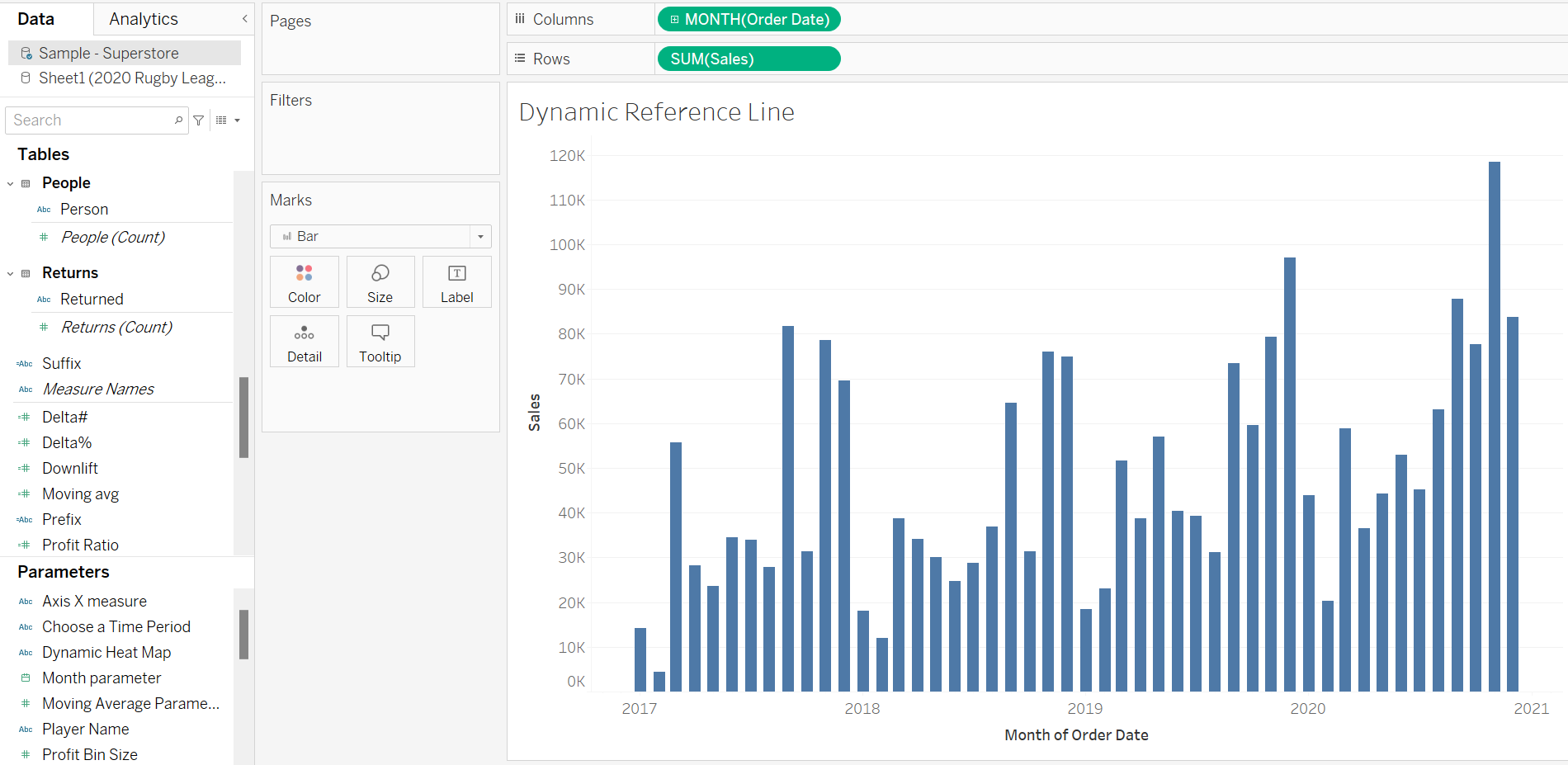
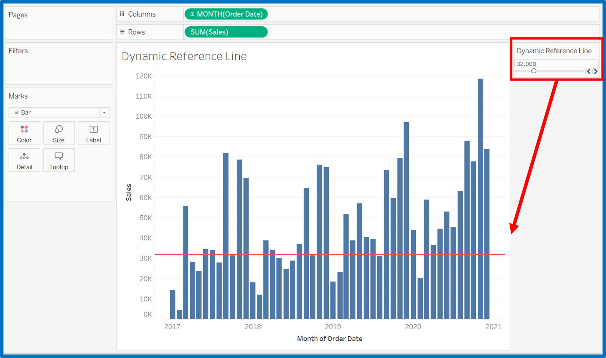
I’ve created a bar chart, looking at Sales over time.
Step 2: Create a Parameter called ‘Dynamic Reference Line’
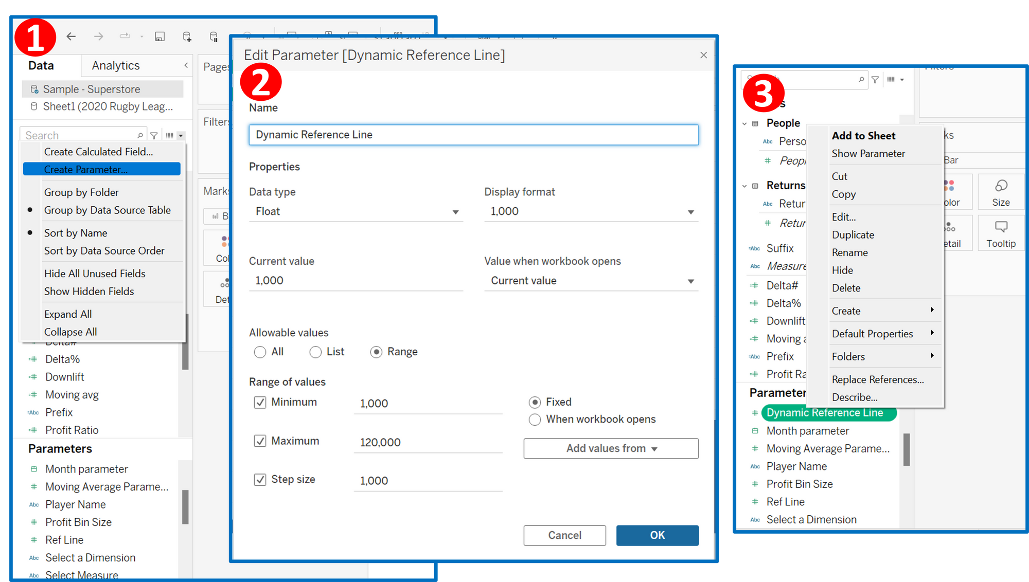
For this, you will need to click on the drop-down menu on the Data Pane and click ‘Create Parameter’. This will open up a dialog box as show below.
Within this dialog box, you will need to name the Parameter, select the data type and the display format you want. You can also alter the other settings if you wish.
Once this is created, it will show up as a field under the ‘Parameters’ section in the Data pane. Right click on this field and click ‘Show Parameter’ to view the parameter field on the left side of your visual.
Step 3: Create a Reference line to match this ‘Select a Reference date’ parameter.
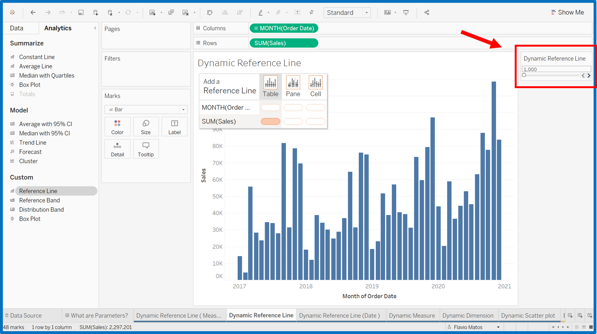
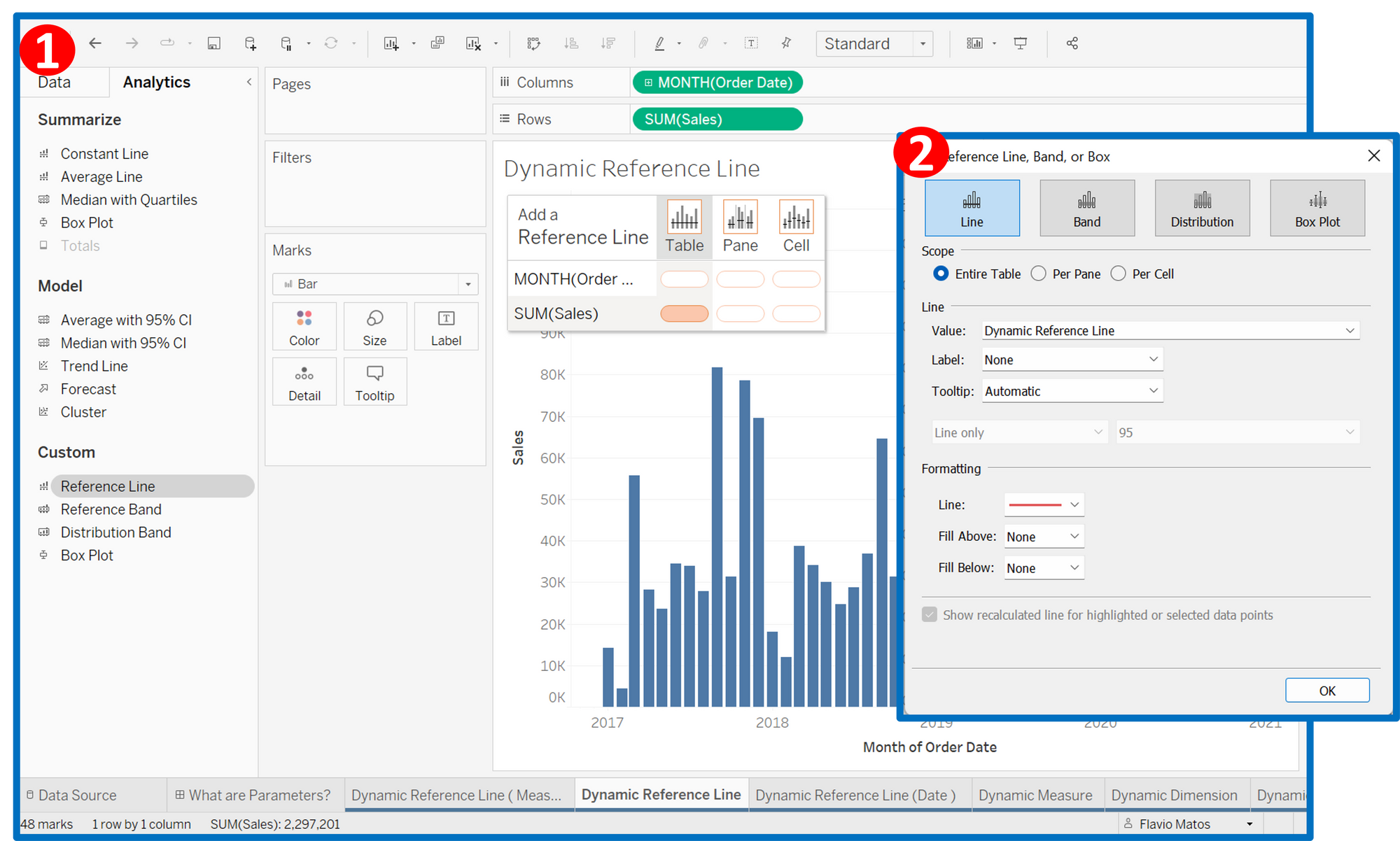
Navigate to the Analytics pane on the right side. Under the ‘Custom’ section, drag the ‘Reference Line’ to your visual to match the Order Date. This will open a new dialog box that will allow you to edit the Reference Line as shown below.
Change it so that you can see the reference line moves on the chart depending the value you choose.
Step 4: Colour the bar chart "before and after" the selected reference value
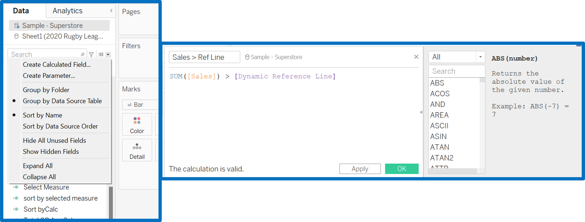
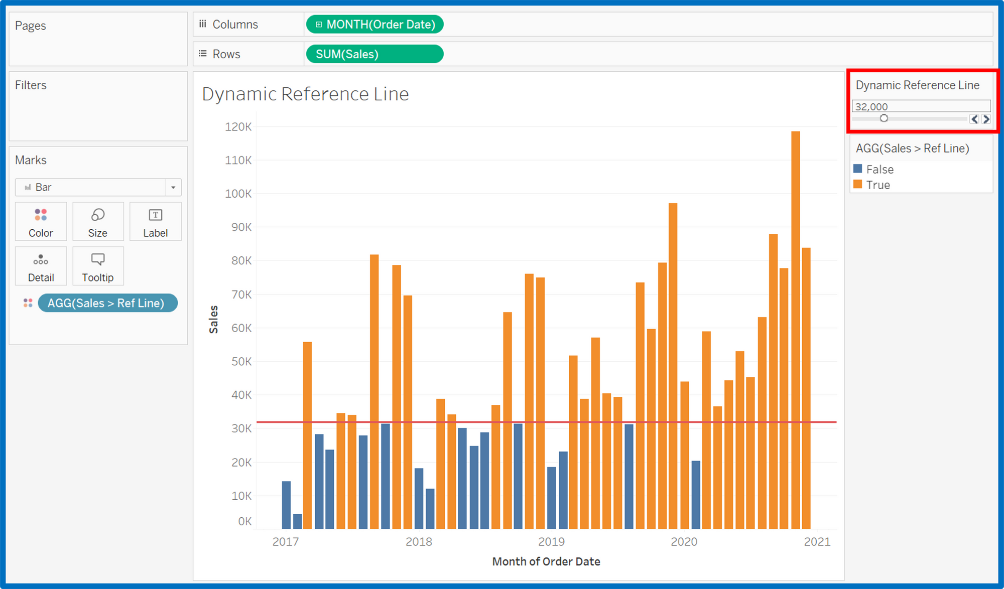
Create a calculated field called ‘Sales > Reference Line’, which has the calculation Sum(Sales) is less than the ‘Dynamic Reference Line’ parameter. This will create a boolean true or false field. So now, when you drag this calculated field into the colours shelf in the marks card, it colours the view accordingly.
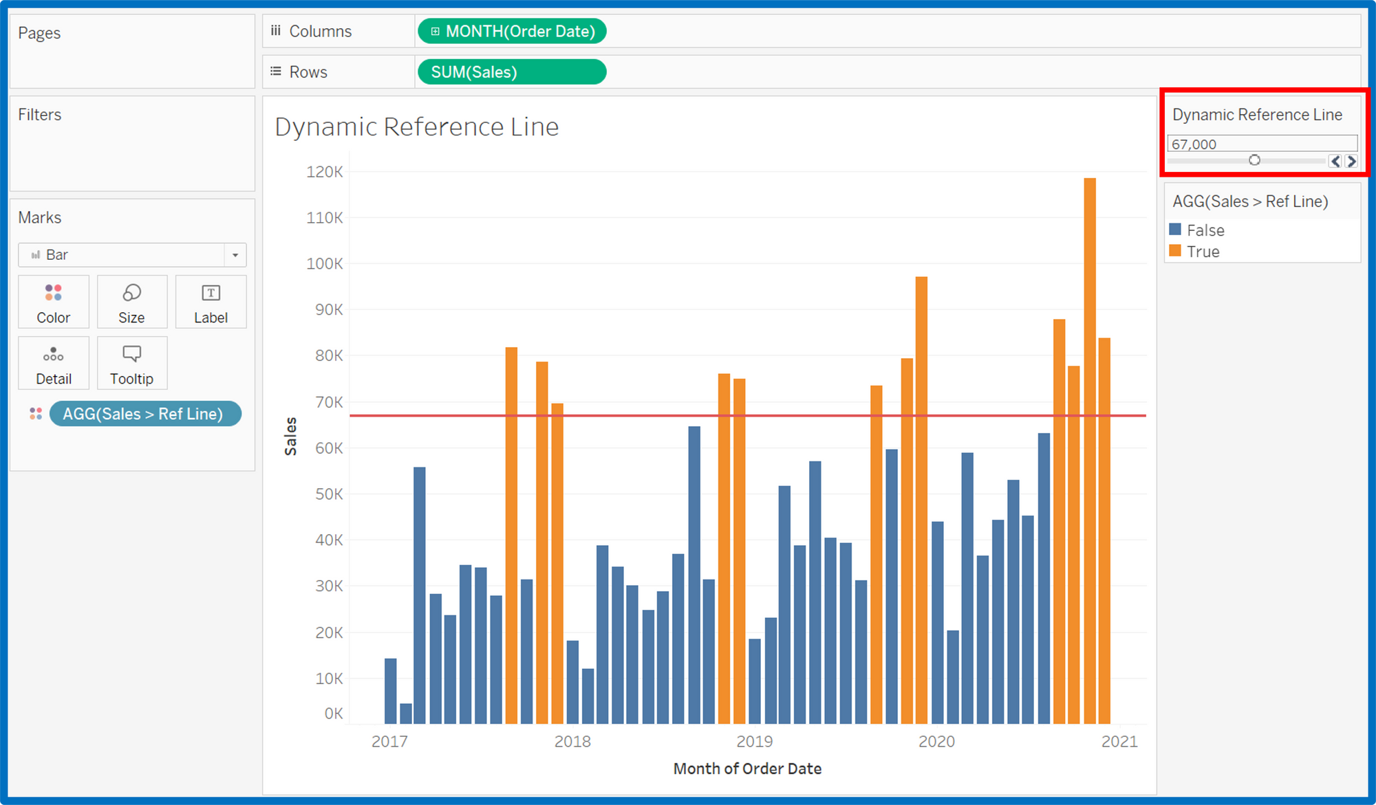
Change the values of Dynamic Reference Line to see the bar chart changing colours as the reference line moves up and down.
Using Parameter to create a dynamic reference line is useful and can turn your dashboards more interactive.
Give it a go with your data and If you have any question, just drop me a message!
- For more tips, you can follow me on LinkedIn.
- You can check out my portfolio on my Tableau Public.
