In the last week of 2023, we got some time to practice our skills and work on personal projects. Consequently, I decided to build Tableau Dashboards with the data of my NBA Fantasy League. Hopefully, this will create a small competitive advantage which will bring me my first fantasy title after losing the consecutive finals. Here is how I have done it.
Data Acquisition
Before collecting data, I thought about which data I would like to include. I came to the conclusion that the most important data sources are the weekly results of the fantasy matchups and the player statistics based on their real-life performance.
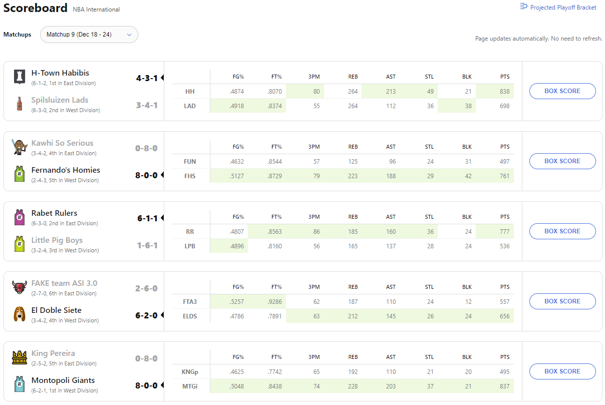
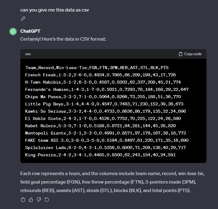
Firstly I copied and pasted the weekly results from fantasy.espn.com into ChatGBT to create CSV files. I am confident that scraping the data directly from the website is possible as well, however, too advanced for me due to the fact that you need to log onto the website to get to the data.
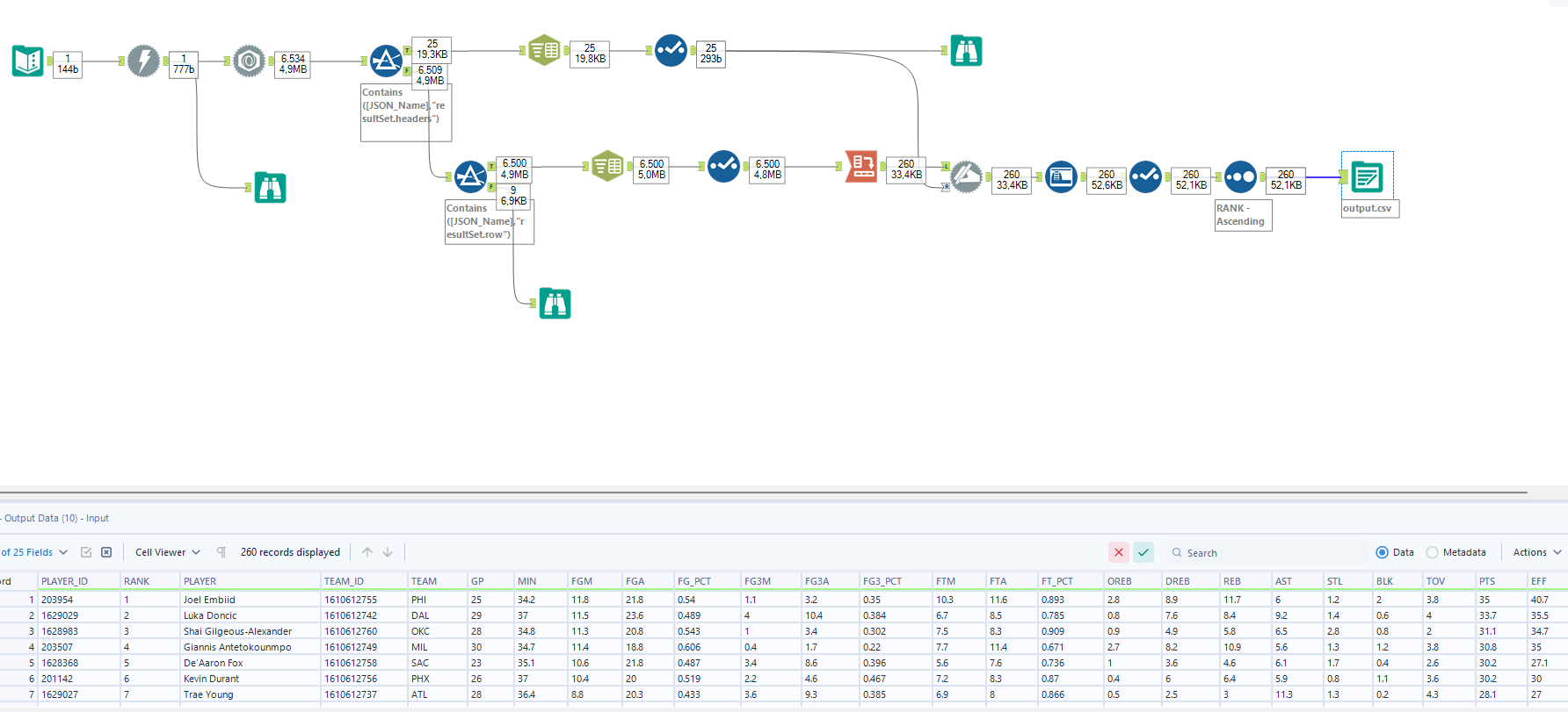
Secondly, with some external help, I created an Alteryx workflow to scrape the player data from nba.com/stats/players. Hence I ended up with an Excel file of all the player data.
Data Preparation
Fortunately, little data preparation was necessary for the analysis since both data sets were ready to use. Merely, matching the players to the correct team was essential. Here, I created a third document that contained the player names and the fantasy team they are part of. Afterwards, I performed a join in Tableau via the player names to create one file that contains both the player statistics and their fantasy team.
Dashboard Planning
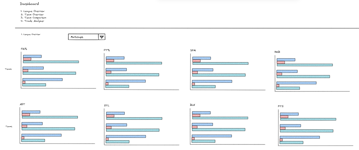
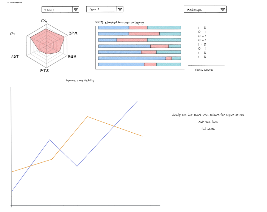
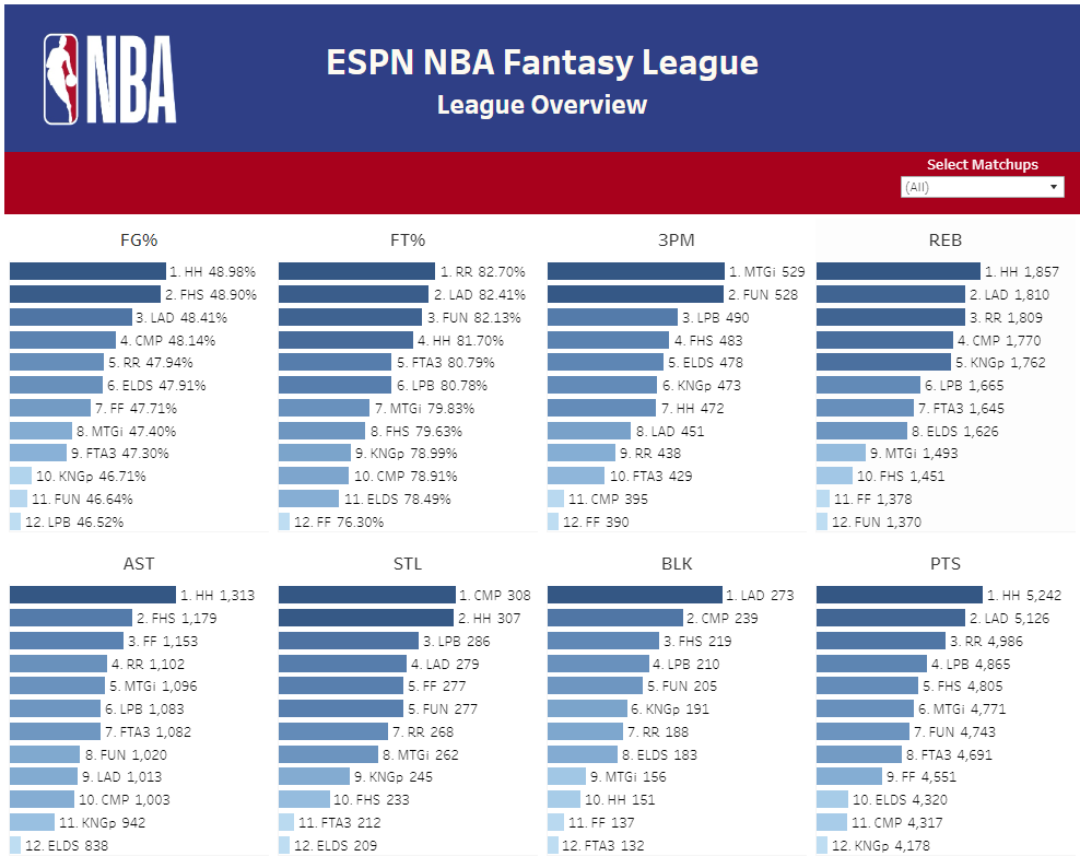
After completing the data acquisition and data preparation, I used Excalidraw to document my progress and create sketches of what I wanted the Dashboard to look like. The first dashboard is a league overview which enables me to see how my fantasy team is doing compared to the other teams in each category. Furthermore, I can filter out matchups where my team underperformed due to injuries or other circumstances. The second dashboard allows me to compare my team directly to an opponent. This can help me in the preparation for a matchup to see which categories will be crucial to winning the matchup.
Dashboard Building
Using Tableau Desktop, I more or less implemented the planned dashboards. However, before creating the dashboard itself I created a dashboard layout including headers and containers to facilitate the later assembling of the dashboards.
Afterwards, I build the first dashboard. Here, I didn’t struggle very much since I created bar charts for each category. These were ranked from top to bottom with the possibility to highlight teams across different categories/graphs. I also added a filter for matchups enabling more interactivity which may be useful, especially during the later stages of the season.
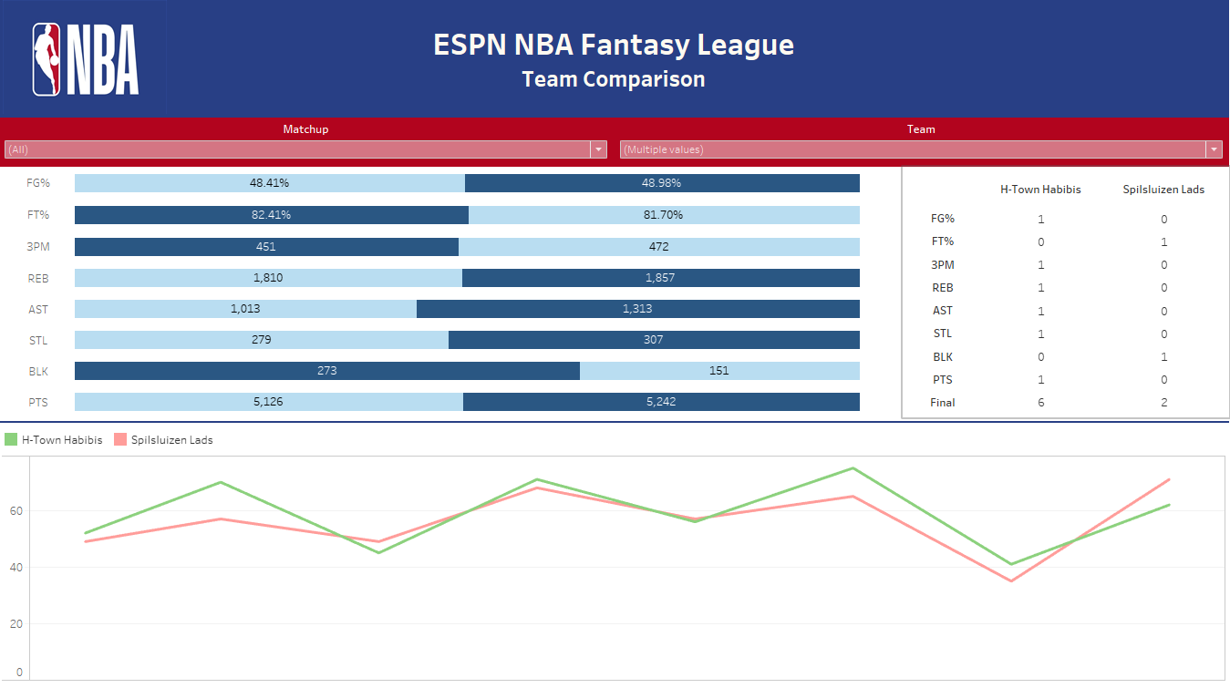
Subsequently, I focused on the team comparison dashboard. Here I managed to build the stacked bar chart comparing my team to another team and colour coding it in a way that visualises which team is better in each category. Next to it, I build the table. However, computing a total sum for each column was not possible which is why I had to create a calculated field to show the final score. The line chart was finished as well. However, the dynamic zone visibility I had planned to show the line chart for each category when selected in one of the graphs above has yet to be implemented. Another major challenge was building the radar chart because I did not manage to standardize the values for each category. Furthermore, the introduction of parameters to change the teams, which are compared to each other, was not successful. Overall, the dashboard is not in a satisfactory state and merely represents a most viable product. Hence, more work needs to be done to complete the dashboard.