How to create lollipop charts in Tableau
Lollipop charts are a great way to spruce up your regular bar chart in Tableau. By making your graphs more eye-catching your audience will hopefully be more drawn to what you are trying to show with your data. Sometimes you may have to sacrifice the accuracy of the data to create a more engaging Viz that catches someone’s attention to explore your work further. In this guide I will be showing how to view two measures, one measured by the bar and another by the end of the lollipop.
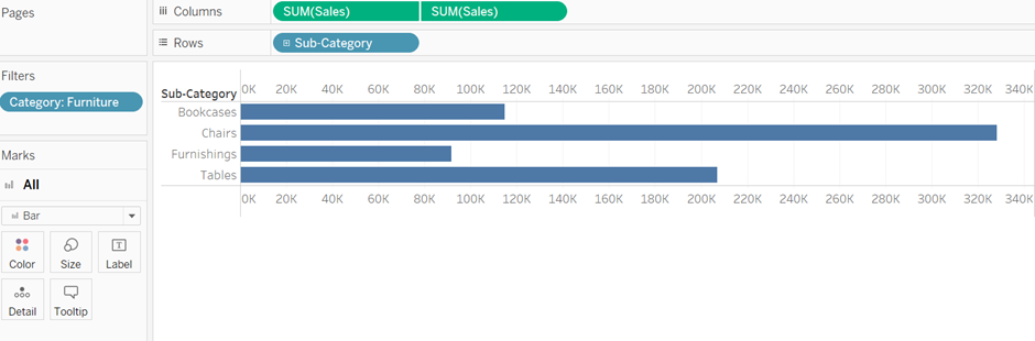
1. First you want to create a simple dual axis bar chart. Choose your categorical variable that you would like to use and drag this into your rows. Then the variable you want to be measured in the length of your lollipop, add this field twice to your columns box. Then right click on the columns box and select dual axis to merge your two separate bar charts into one like below:
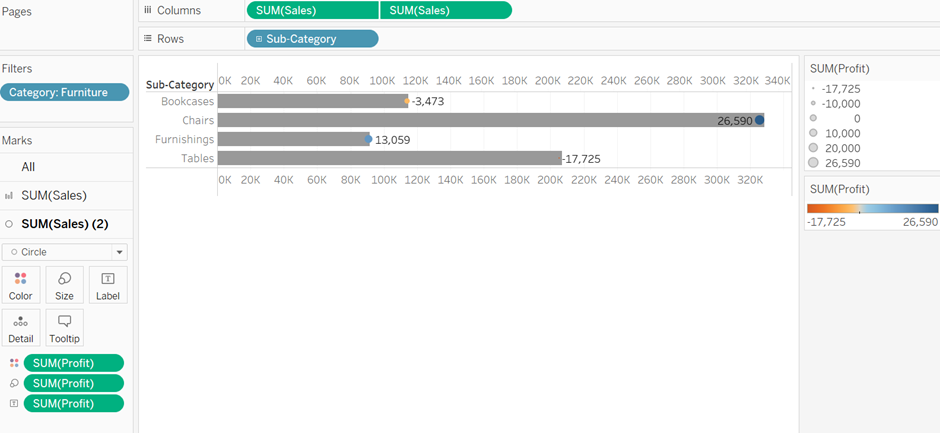
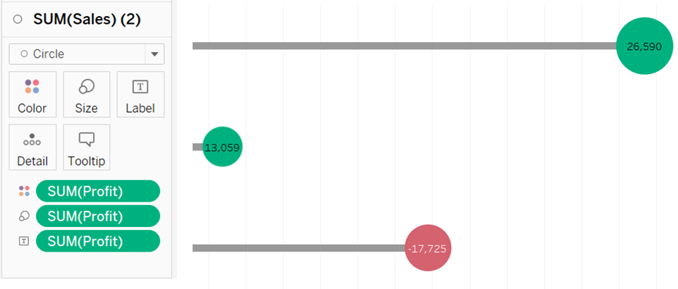
2. Next we are going to add a second numeric field, the field we want shown by the lollipop itself. In this instance we are going to use profit, we will use different sizes of circles to show the different amounts of profits. Color will be used show losses or gains of profits. In this step we have to drag the profit variable into Color, Size and Label all into the 2nd iteration of the SUM(Sales) under the Marks heading.
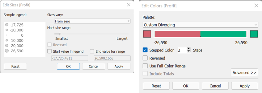
3. From our previous step we can see our lollipops ends are barely visible and the color scheme is very confusing so we will need to review this formatting. By selecting the dropdowns on the scales right hand side of our workbook we can select Edit Sizes or Edit Colors respectively. In Edit Sizes we must change the ‘Sizes vary:’ dropdown from ‘Automatically’ to ‘From zero’ and then OK. In Edit Colors we must tick ‘Stepped Color’ and reduce the Steps from 5 to just 2. Then pick a color scheme you would like to represent negative and positive profit and then OK.
4. Next inside the SUM(Sales) (2) shelf using the Size and Label options you can change the size of your lollipop and move or change the font size etc. of the profit value.
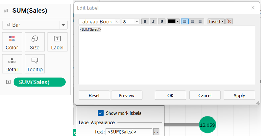
5. Now you can add the Sales field to the Label option in the Sum(Sales) shelf. This will allow you put the sales value next to you bar which keeps consistency with the profit value shown in the lollipop. Click on the label option after you have dragged in the Sales field and select the ellipsis box on the ‘Text:’ line. In the text box that opens you should press enter for the next line, hit the spacebar and then OK. This will shift your label up so it now sits on the line making it more visible.
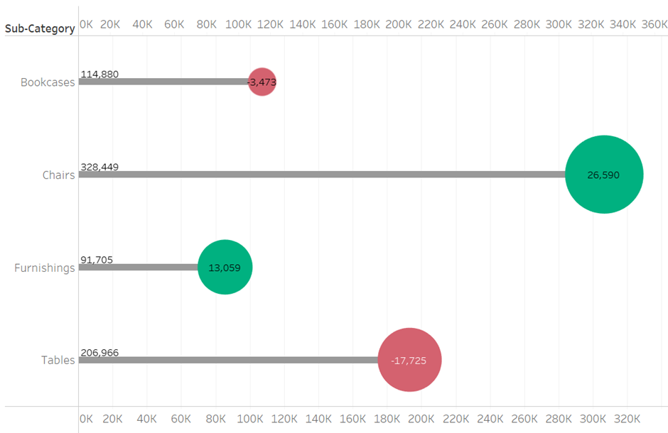
6. Further formatting is up to you but after you have completed the steps your lollipop chart should look something similar to the below: