Stacked area charts are usually used to visualize how a measure, observed through multiple categories, changes over time. We're often advised to avoid stacked area charts whenever possible because:
- They can hide trends in the data - it's difficult to read the precise change over time in any of the categories stacked above the bottom-most line
- Using many categories over time can create complexity in the view, and it's impossible to compare categories where the values overtake one another
Now, these charts do have some advantages, for example:
- They're great for showing overall trends over time, especially when you want to give a rough idea of the numbers, and not necessarily exact values
- They're a familiar chart type to many people
In many cases, a stacked bar chart is the alternative we reach for when a stacked area chart doesn't work very well. Thinking about when to use stacked area charts today, I was reminded of an exercise I completed a few months ago by Storytelling with Data: Are stacked area charts and stacked bar charts interchangeable? Hint: they're not.
I found the exercise really useful for thinking about a situation where a stacked bar chart shines in comparison to a stacked area chart. I'm sharing the exercise below, along with my answers.
Instructions
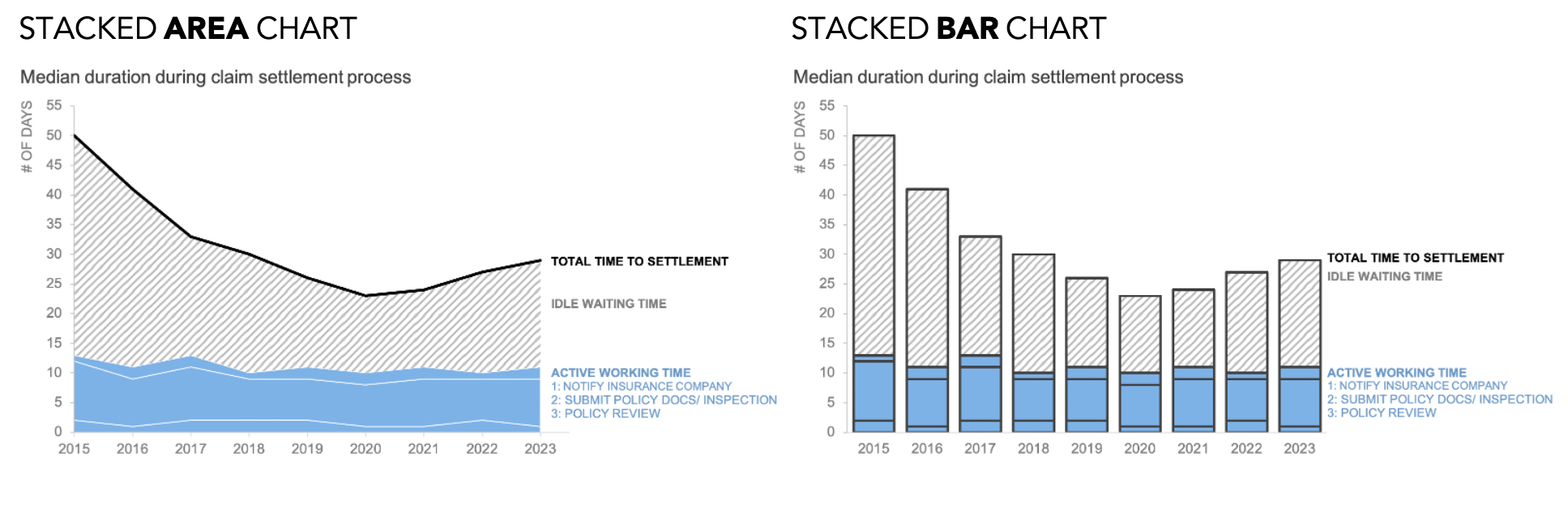
STEP 1: Examine both graphs above and outline the pros and cons of each. Are you drawn to one chart over the other? If so, consider why. Jot down a few notes for yourself.
STEP 2: Download the related Excel file, and remake the above stacked area and bar charts in your graphing tool of choice—emulating the formatting as closely as possible. Once finished, update your pros and cons list in light of this effort.
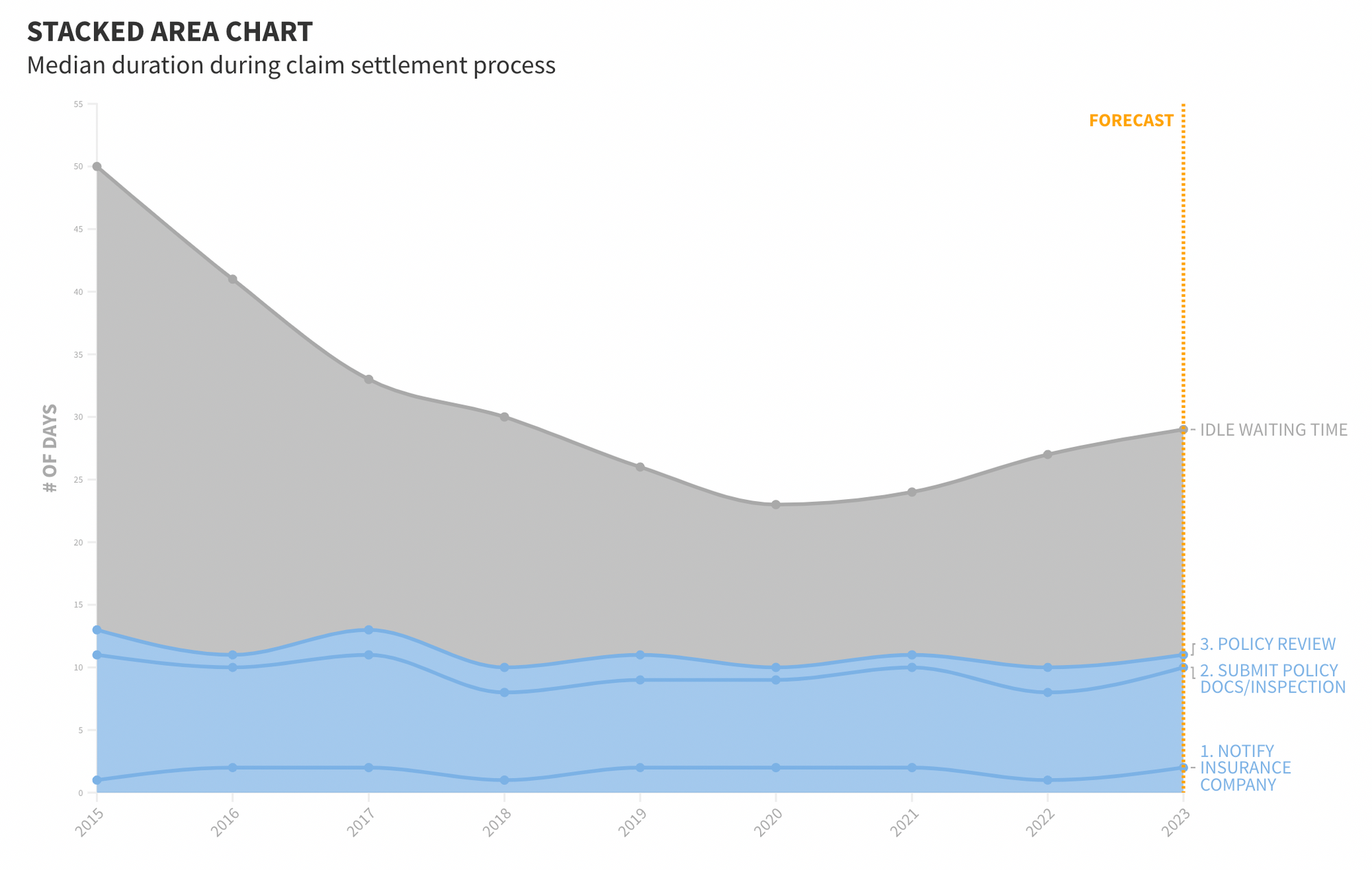
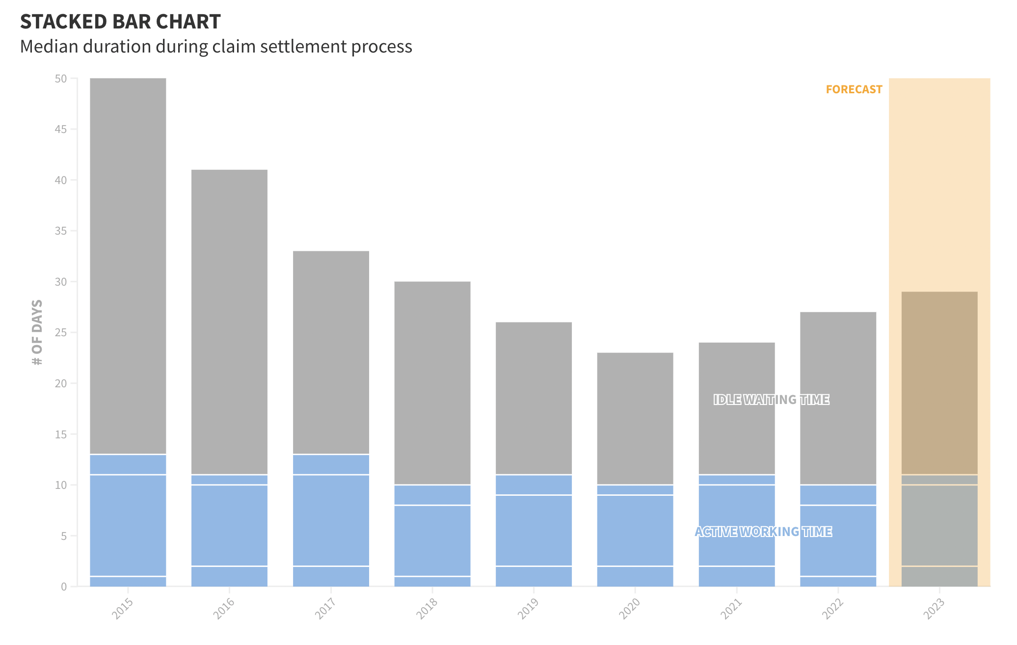
STEP 3: Now imagine that the 2023 values are forecasted. Modify the stacked area chart and bar chart to visually distinguish actual versus predicted data. Does the introduction of forecasted data influence your opinion? If so, update your pros and cons list for each graph.
STEP 4: Imagine that instead of visualizing data on an annual frequency, you need to show things at a quarterly cadence. Doing the math, that means there would be 36 time periods along the horizontal x-axis—or if we consider the five categories, that’s 180 data points. Even if you could limit the historical data to the past few years, would changing the frequency influence your preference for stacked areas versus bars?
STEP 5: Now that you’ve practiced creating both charts in your tool, assessed their effectiveness, and experimented with formatting, revisit the original question. Are stacked area charts and stacked bar graphs interchangeable? Are there specific scenarios where one chart is preferable over the other?
My Responses and Findings
At the beginning of the exercise, I thought there'd be a clear winner: that area charts are the ultimate go-to option for charts with time variables. Going through the steps, however, I came to realize that:
- Stacked area charts, while the intuitive option for charting a variable over time (and the better option for dealing with a higher level of granularity, e.g. months or quarters), don't show forecasted data very well.
- Stacked bar charts on the other hand make it easier to distinguish between forecasted vs actual data.
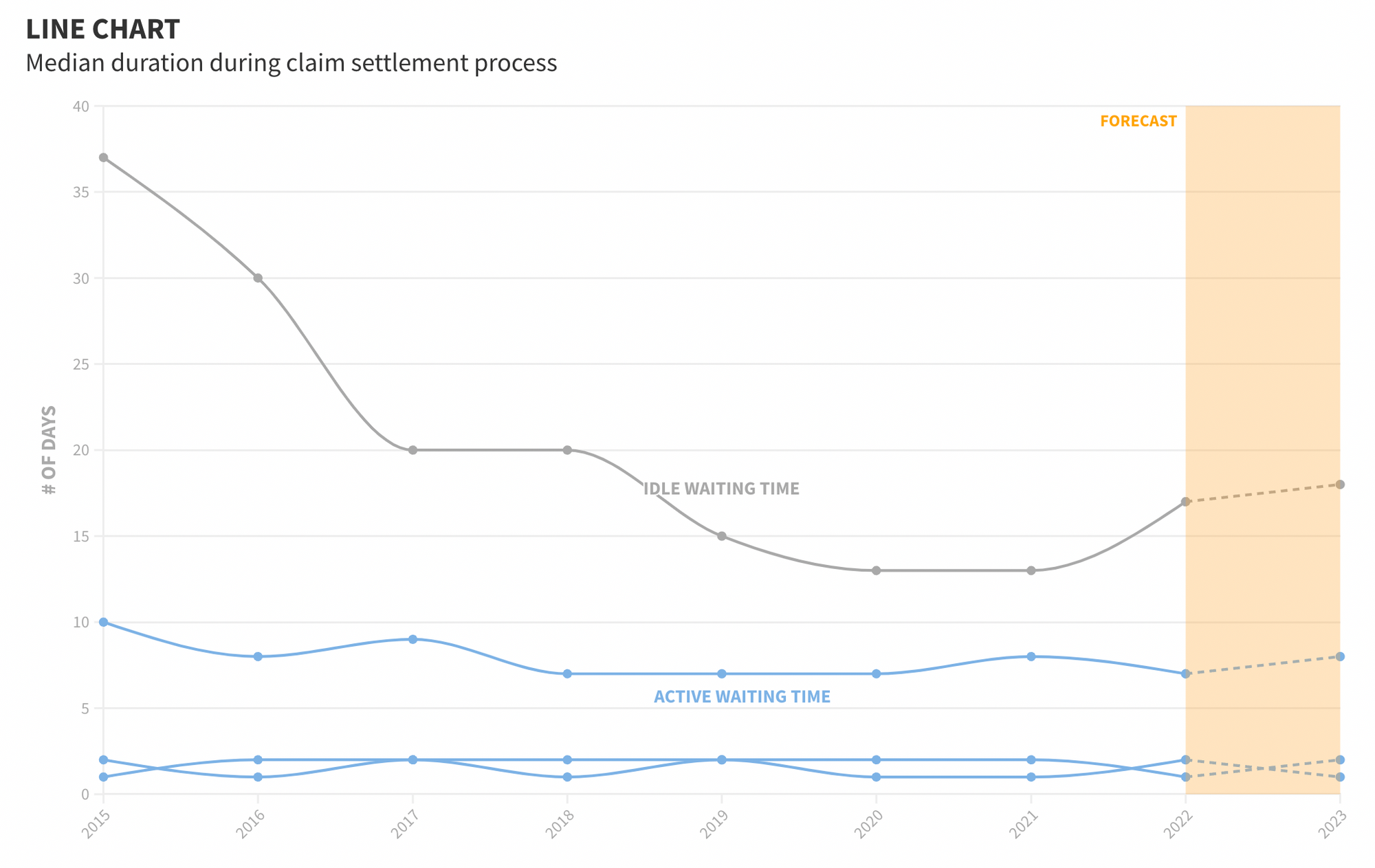
- I also tried using line charts because I've seen them used in forecasting elsewhere. And found that even though they make it easy to distinguish forecasted data from actual data, they work better when the forecast spans more than one year (or one unit of the time period in use: month, quarter, etc.)