


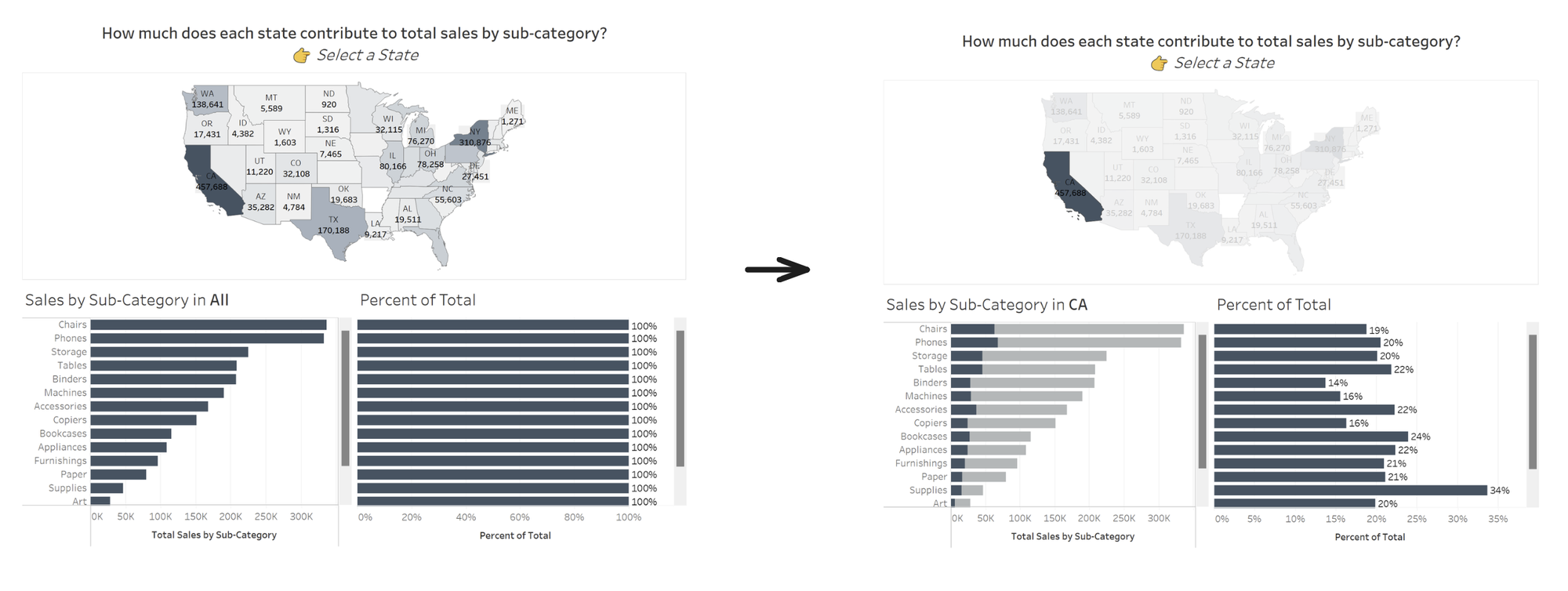
Proportional brushing - or proportional highlighting - is a technique for interacting with data on dashboards. Instead of filtering other charts when marks are selected in one chart, the remaining charts show the relative proportion of the selected items compared to all items. This allows us to see valuable context that would otherwise be removed from the view when data is filtered.
For example, see the dashboard below looking at sales in the US based on the Sample Superstore data. When you select the state of California on the map, the sales for each sub-category for California is highlighted in the bar chart at the bottom right, while still allowing us to see how the values compare to the total sales per sub-category for the whole country.
There are two ways (that I know of : D) to do proportional brushing on Tableau:
- Using Sets and Dashboard Actions
- Using FIXED LODs
In this blog, I'll cover the second method. I have another blog for the Sets method here.
Below are the steps to create the dashboard you saw above, adapted from one of Tableau's examples of LOD expressions.
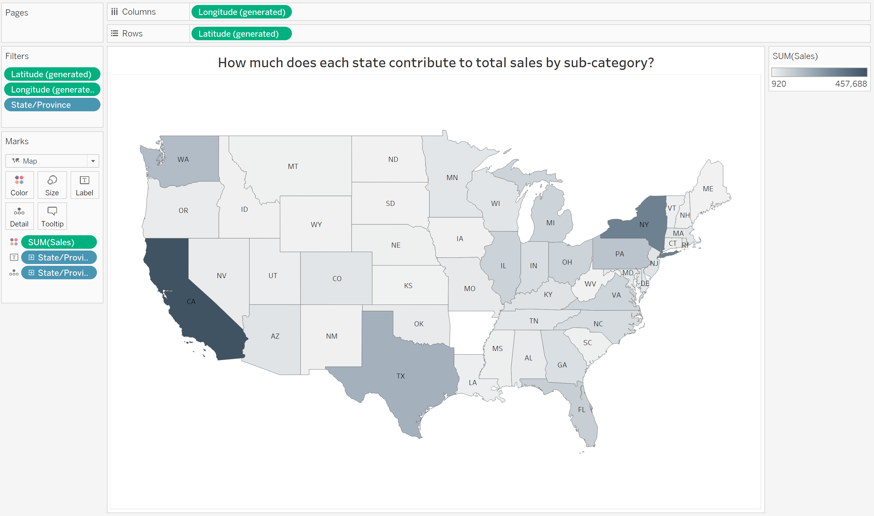
Step 1: Build the map
- Double-click on 'State/Province' to create the map. Drag 'Sales' to the Colour shelf. (To remove Canadian states, drag 'Country/Region' out of the Marks card. Afterwards, exclude Alaska to keep this simple.)
- Edit the labels and colours as needed.
Step 2: Build the bar charts, and FIXED LOD expression
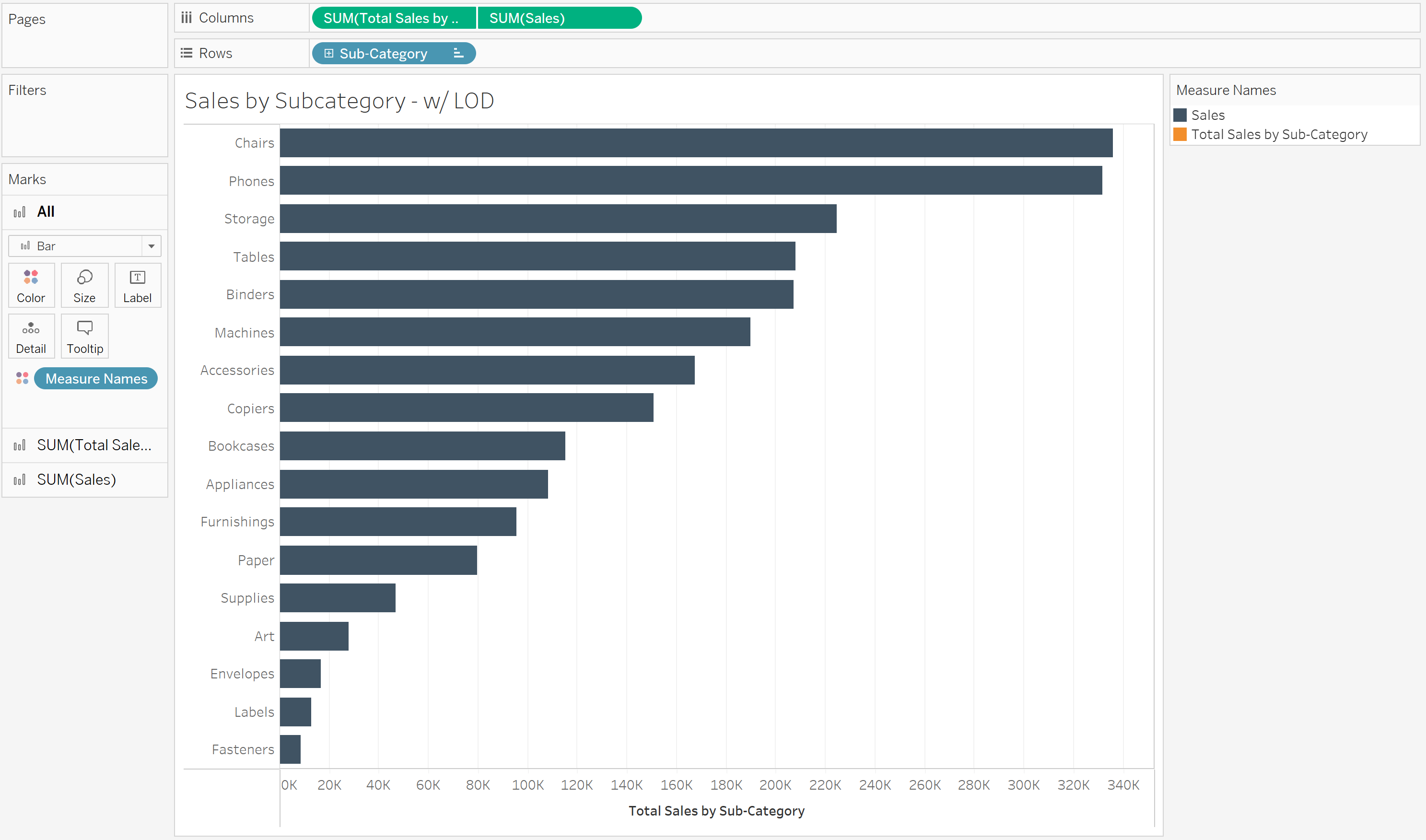
For the first bar chart, Sales by Sub-Category:
- Drag 'Sub-Category' to Rows, and 'Sales' to Columns.
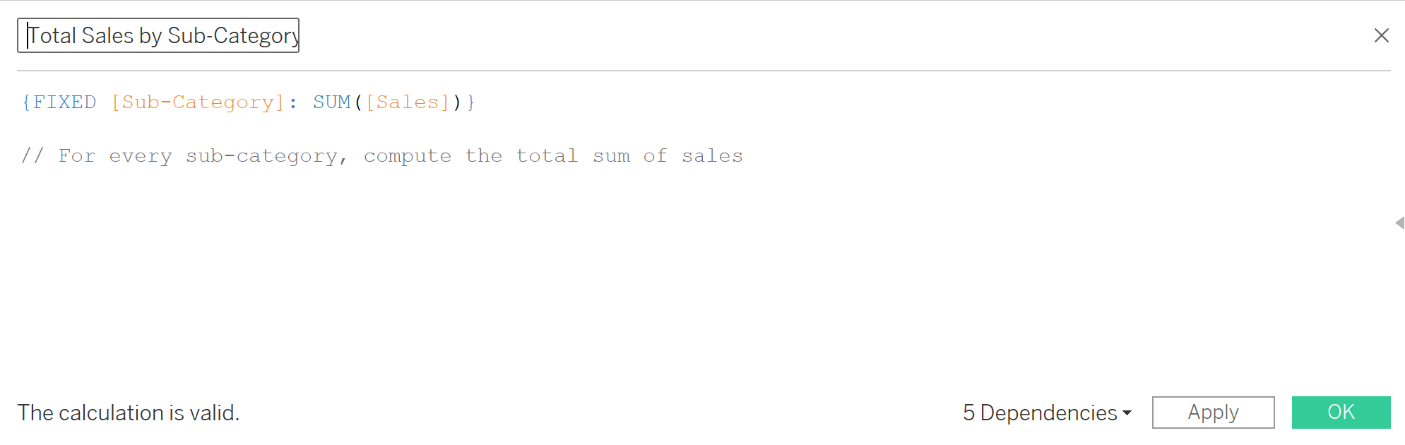
- Create a FIXED LOD calculation for total sales by sub-category. The LOD expression fixes the sum of sales to the sub-category, and doesn't change even when data is filtered from the view.
- Bring the 'Total Sales by Sub-Category' calculation we just created to Columns. (Place it to the left of
SUM(Sales)on the Columns, so it can be stacked underneathSUM(Sales)when we create a dual axis.) - Create a dual axis chart by right-clicking on the
SUM(Sales)pill and selecting Dual Axis. - Right-click on the top axis ('Sales') and select Synchronize axis.
- Right-click on the top axis again and uncheck Show Header.
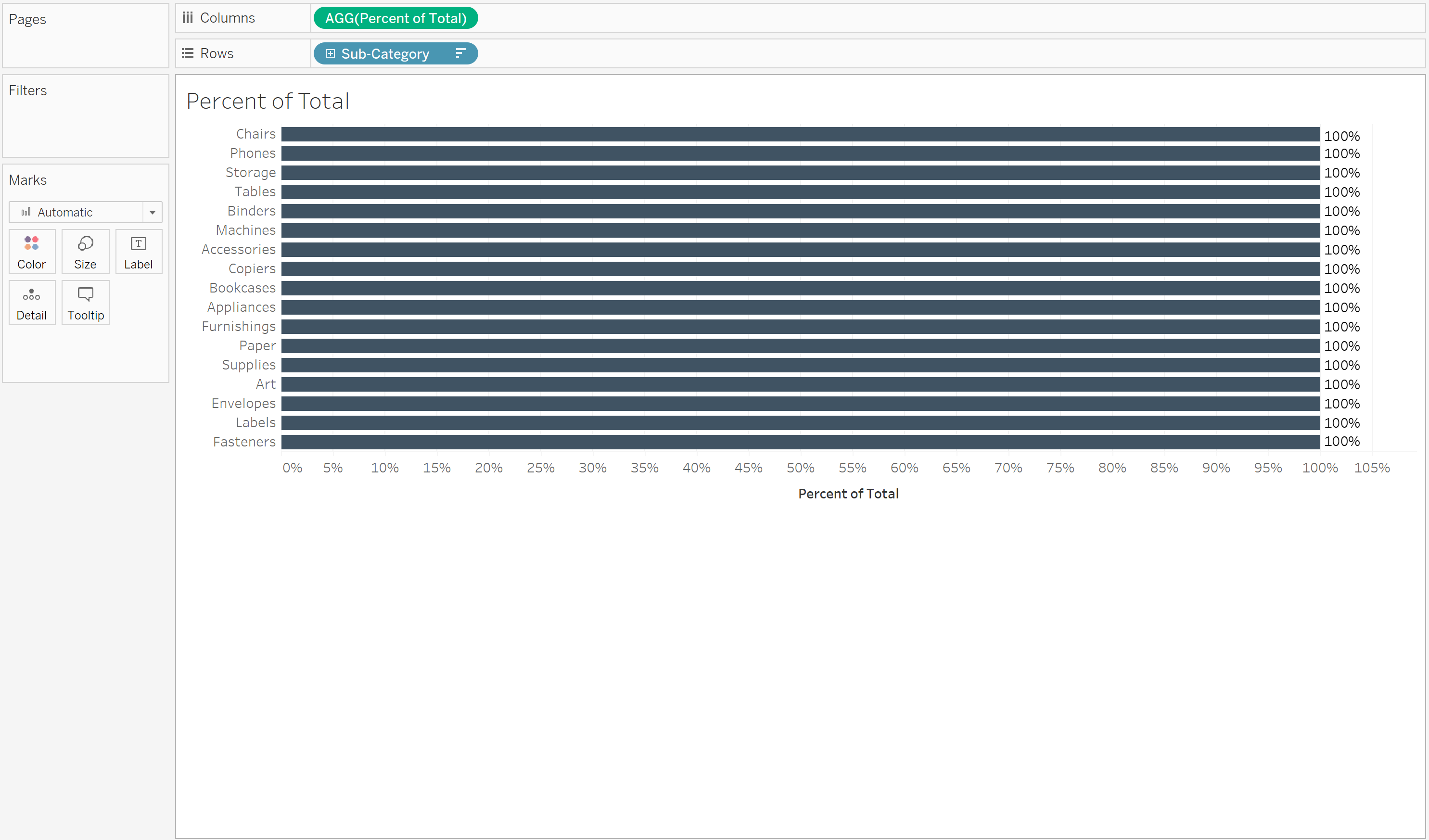
For the second bar chart, Percent of Total:
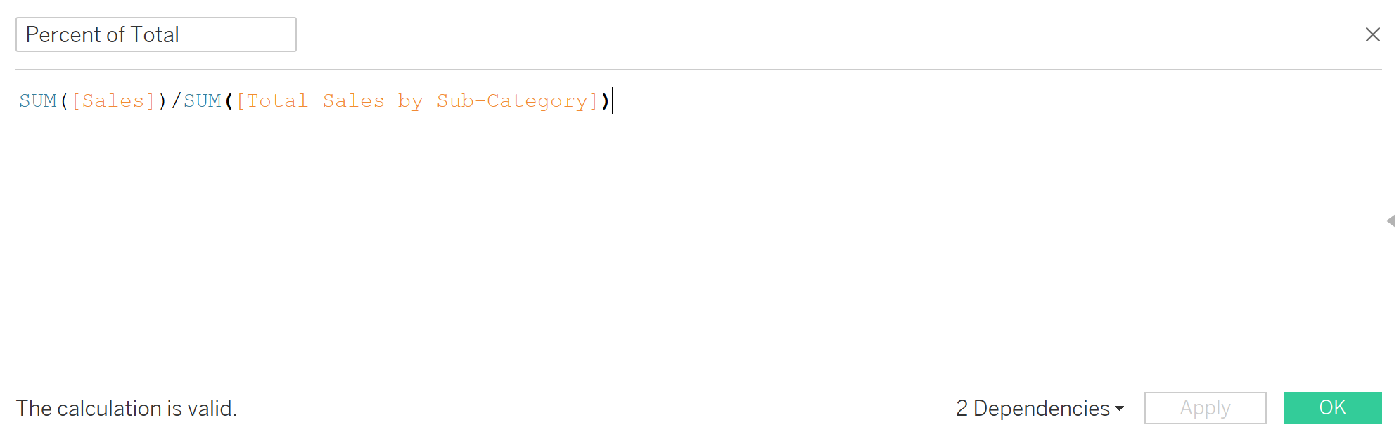
- Create a calculation for the the percent of total, and drag it to Columns.
- Drag 'Sub-Category' to Rows.
- Sort the 'Sub-Category' by the field Total Sales by Sub-Category (the LOD calculated we created earlier), in descending order. This will allow us to line up this bar chart with the previous one on the dashboard, even when data is filtered.
Step 3: Bring all the charts together in a dashboard and configure the filter
- Bring the map, Sales by Sub-Category, and Percent of Total charts into a new dashboard.
- On the Percent of Total chart, right-click on the header and clear Show Header.
- On the map, select Use as Filter
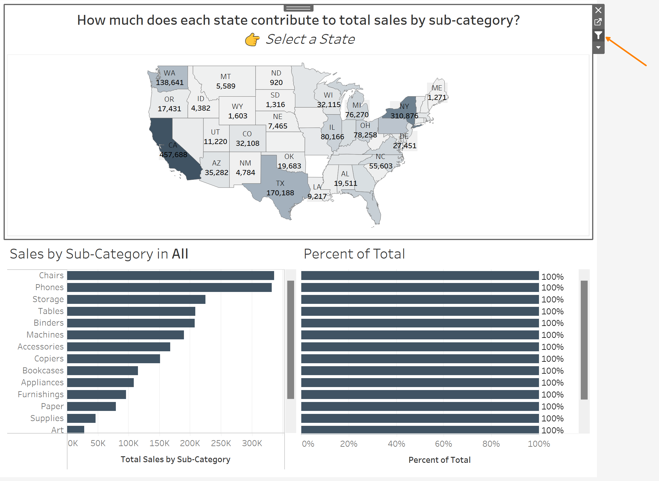
And that's it! Try selecting a state on the map and see how the bars are highlighted proportionally.
Now, you could configure this kind of proportional brushing with sets and set actions (see my blog on this here), but doing it with a FIXED LOD calculation allows you to go one step further and show a separate Percent of Total chart on the side for additional context.