


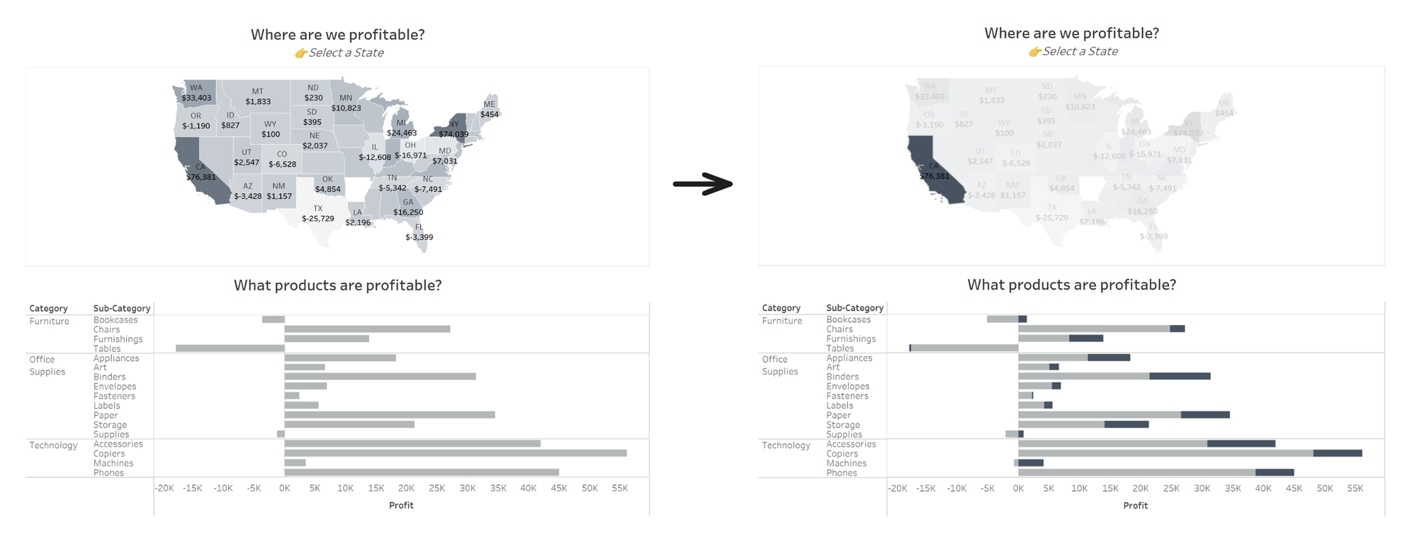
Proportional brushing - or proportional highlighting - is a technique for interacting with data on dashboards. Instead of filtering other charts when marks are selected in one chart, the remaining charts show the relative proportion of the selected items compared to all items. This allows us to see valuable context that would otherwise be removed from the view when data is filtered.
For example, see the dashboard below looking at profit in the US based on the Sample Superstore data. When you select the state of California on the map, the profit for each sub-category for California is highlighted in the bar chart at the bottom, while still allowing us to see how the values compare to the total sales per sub-category for the whole country.
There are two ways (that I know of : D) to do proportional brushing on Tableau:
- Using Sets and Dashboard Actions
- Using FIXED LODs
In this blog, I'll cover the first method. I have another blog for the FIXED LOD method here.
These are the steps to create the dashboard you saw above:
Step 1: Build the charts needed
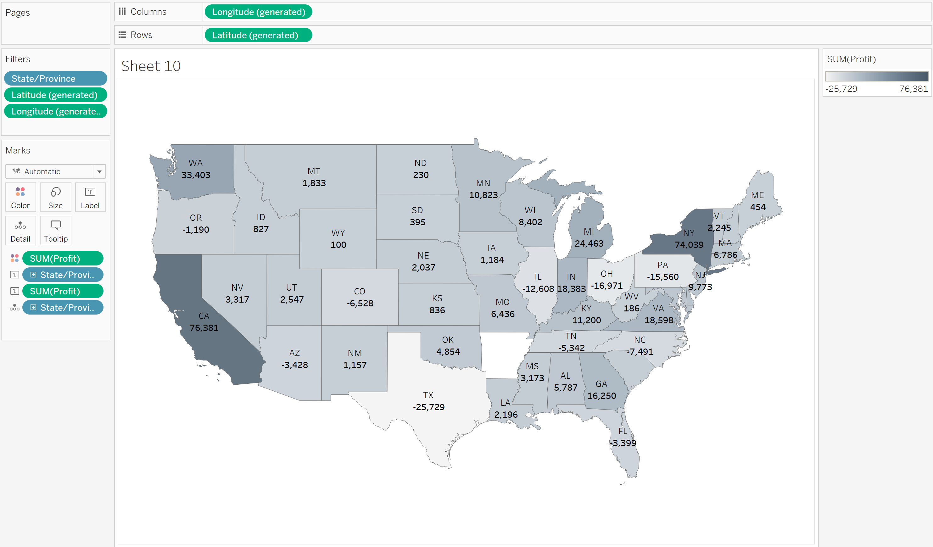
- Double-click on 'State/Province' to create the map. Drag 'Profit' to the Colour shelf. (To remove Canadian states, drag 'Country/Region' out of the Marks card. Afterwards, exclude Alaska to keep this simple.)
- Edit the labels and colours as needed--I changed the palette from diverging to sequential.
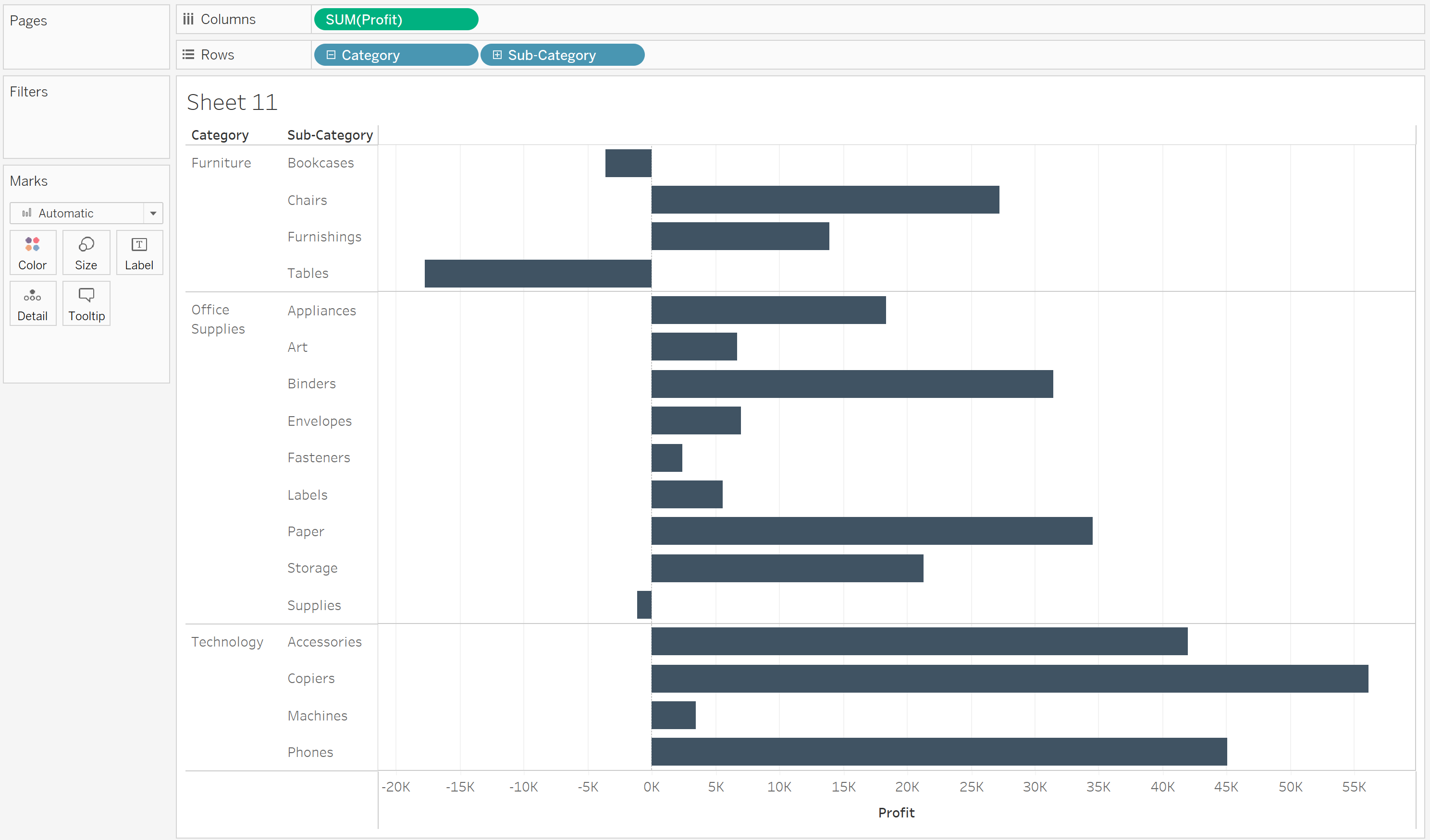
- For the bar chart, drag 'Category' and 'Sub-Category' to Rows, and 'Profit' to Columns.
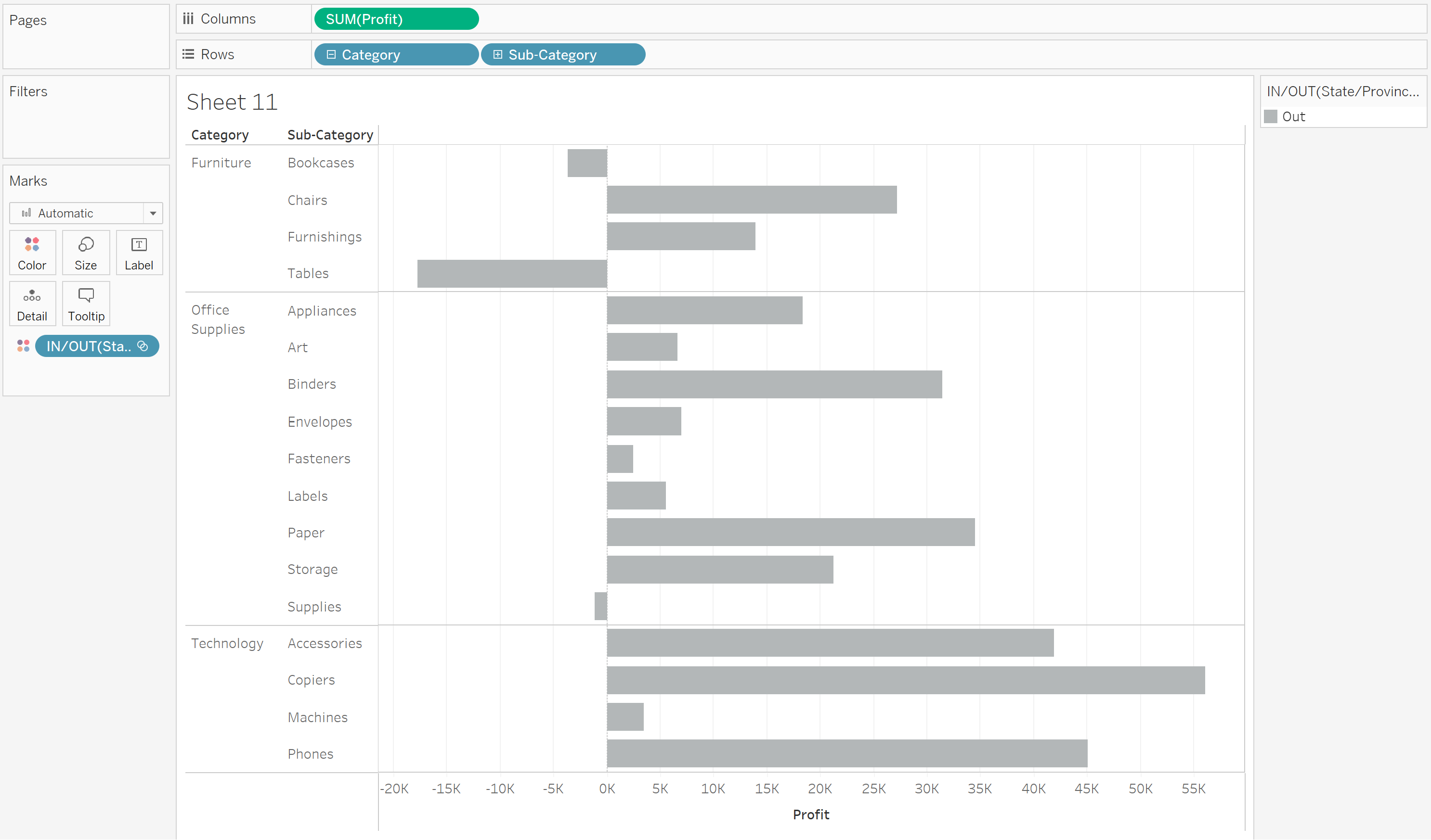
Step 2: Create the set
- To create the set, first identify the dimension you want to use for proportional brushing. In this case, it's 'State'--when a state is selected on the map, the corresponding values for the selected state would be highlighted in the bar chart, showing how much of the total profit per sub-category the selected state contributes to.
- Right-click on the 'State/Province' field on the data pane and select Create then Set. Leave the set empty and select OK. The set will be populated later using Dashboard actions.
- In the sheet with the bar chart, drag the created 'State/Province Set' field to the Colour shelf.
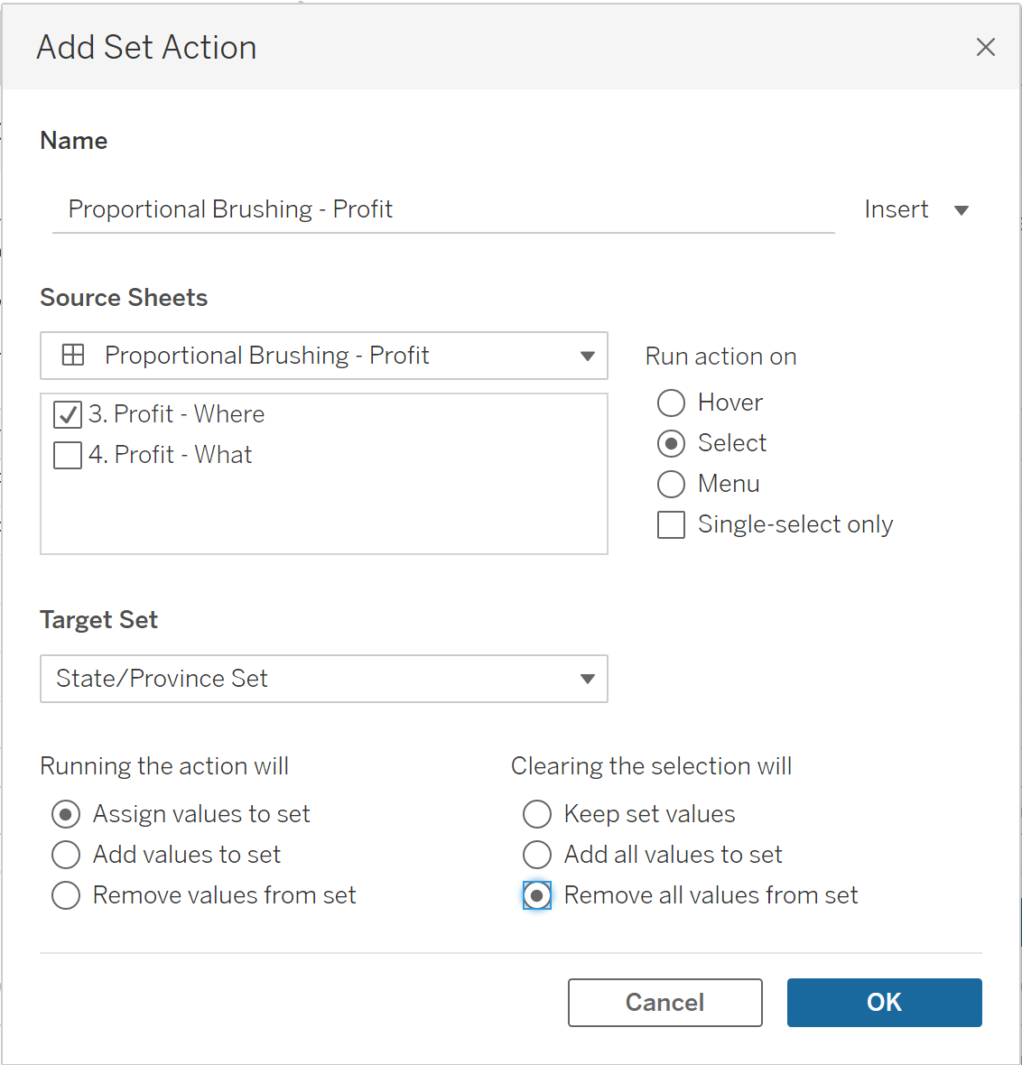
Step 3: Configure the dashboard action
Once you've brought the two sheets into a dashboard, set up a dashboard action as follows:
- On the Dashboard Menu at the top, go to Actions > Add Action > Change Set Values
- For Source Sheets, select the sheet with the map
- For Target Set, select the 'State/Province Set'
- Configure the actions as follows: Running the action will: Assign values to set; Clearing the selection will: Remove values from set
- Select OK
And you're done! Try selecting a state on the map and see how the bars are highlighted proportionally.
If you want to learn how to set up proportional brushing with FIXED LODs, check out my other blog here.