For MakeoverMonday this week I used Alteryx to create a tile map which I then used to make a density map in Tableau. This is a step by step guide on how I created my tile map in Alteryx using the MakeoverMonday week 39 dataset on San Francisco evictions.

Step 1: Creating my centroids
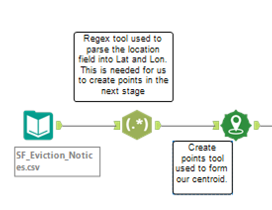
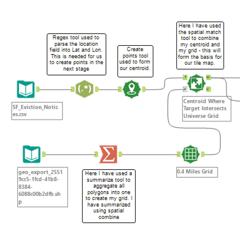
First, input your dataset using the input tool.
In this dataset the ‘location’ column needed to be split to give me columns for latitude and longitude (I need these to create my spatial points!)
To do this I have used the regex tool and parsed the data. I have then used the create points tool to create my centroids using my parsed Lat and Lon fields.
Creat points workflow section 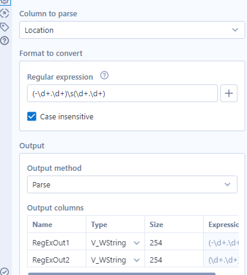
Configuring the regex tool
Step 2: How to create a grid using a shapefile
For this example I used a free shapefile of San Francisco found on https://data.sfgov.org/Geographic-Locations-and-Boundaries/SF-Find-Neighborhoods/pty2-tcw4.
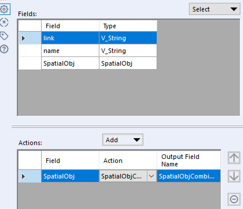
After loading the data into Alteryx using the input tool, I aggregated/combined all of the polygons contained in the shapefile into one polygon using the summarize tool. The summarize tool can be used to alter a spatial object – there are 5 different spatial summarize actions that you can use to alter spatial objects – in this case I am using the most common which is ‘combine’.
I have then used the make grid tool to divide the polygon into a grid – in this case I split my grid into 0.2 mile squares. The size of the squares may vary depending on the size of the area you are gridding (e.g. for London I would consider using 1 mile squares). I also chose to tick the clip to polygons box which will draw an accurate outline of the different San Francisco neighbourhoods. Personally I feel that this gives a cleaner finish however this is personal preference.
Configuring the summarize tool 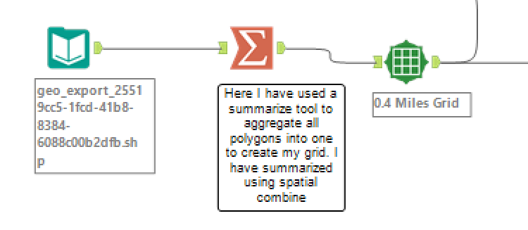
Make grid workflow section
Step 3: Combining my datasets
At this point I want to combine my grid to my original dataset. To do this I used the spatial match tool. By using this tool I am effectively layering the original data with my grid.
Step 4: Cleaning up the data ready for Tableau
After using the select tool to take out the columns I wouldn’t need to create my dashboard, I needed to transpose my data. For this I used the transpose tool. A transpose tool is used to pivot the orientation of a data table. In this case the ‘reasons for eviction’ headers and measures were put into two columns to be read along the row. This makes the data easier to work with in Tableau.
Lastly, I once again used a summarize tool to count the number of evictions within each grid.
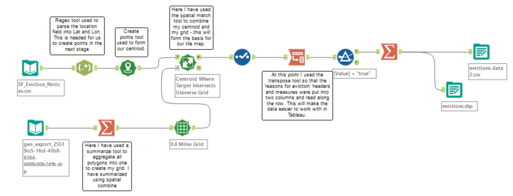
Lastly, output your data using the output tool – now you’re ready to get started in Tableau!
Here is the link to my final viz complete with the completed map: https://tabsoft.co/2mJTP8a
