


So here we are already at Dashboard week – the last 2 and half months has flown by!
Today we were tasked with looking at survey data from the 2019 Design Census. I’ve always hated working with survey data as I always seem to make something involving bar charts, and as you can see today’s viz was no exception!
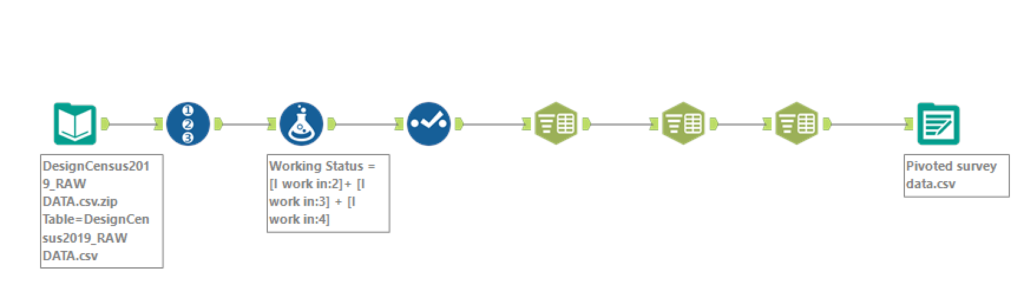
I did limited data prep on this one as I didn’t need to use all of the data for the initial idea that I had in mind – this did in fact cause me some issues later on when I had to re-scope – here is a screenshot of the workflow I created in Alteryx:
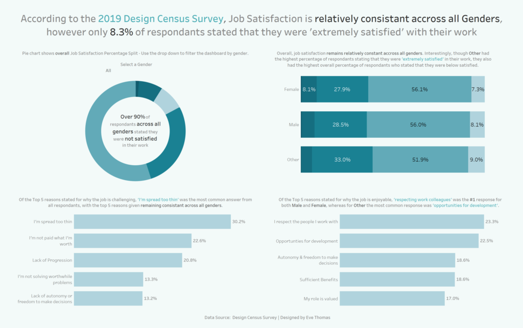
For my Viz I initially wanted to look at different priorities between age groups broken down by gender, however I was unable to find any interesting trends in the data and my initial idea just wasn’t quite working with the data that we had. I therefore decided to re-scope and just focus on gender. In the end I created quite a simple dashboard which just focuses on overall job satisfaction and gender. Not overly please with the result but I have learnt a lot to take forward over the next 4 days of dashboard week!
Lessons learned:
- In future, I try and re-scope sooner rather than trying to stick with an initial idea that was never quite going to work!
- Ask for help sooner – had I asked for help before lunchtime I would have probably realised a lot sooner that my initial plan wasn’t feasible.
- Try and write my blog whilst building my dashboard – not at the end – to write these last couple of works is cutting it fine – the grammar is probably diabolical!