


Its great to have a useful dashboard but its even better to have a useful and cool looking dashboard, so I will be sharing the top 5 tools I use to either remove some of the decision fatigue from dashboard designing or that I use to elevate designs and make them a bit more fun.
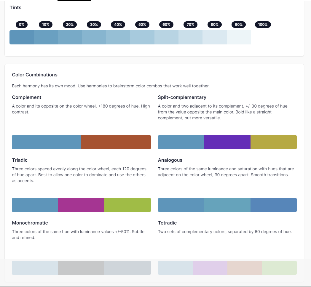
-Coolors pallet visualizer
This website has many dashboard and design stencil options you can autogenerate color pallets for, great if you are not the best at color matching or if you want to use different colors from the ones you normally do. It will also let you save the color scheme to reuse for future dashboards, as well as having other handy settings like letting you lock in some of the colors in the palette while still generating new options for the ones you don't completely love.

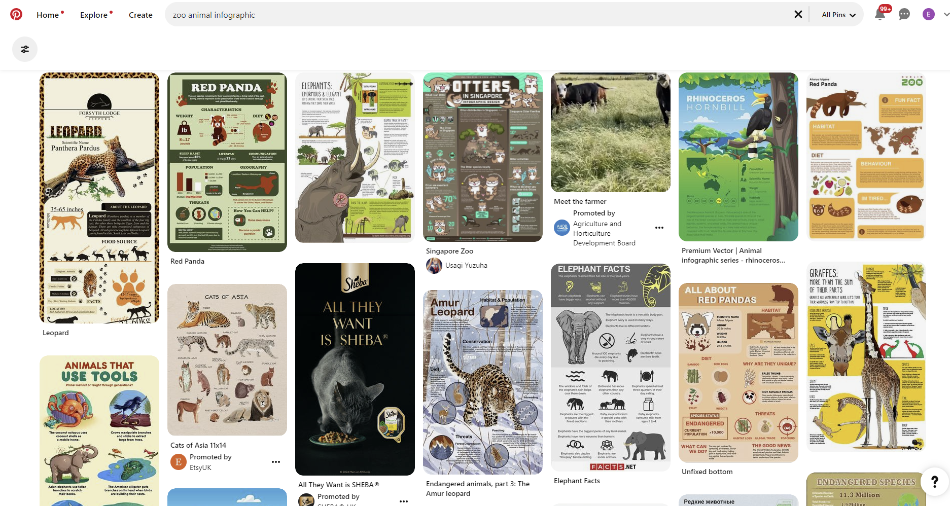
If you're ever in need of inspo for designing a dashboard, i recommend you look the topic on Pinterest followed by "Dashboard" or "infographic" and you will find super cool design ideas you can use as inspiration. Recently I wanted to make a dashboard on zoo animals and this is all the results that came up:
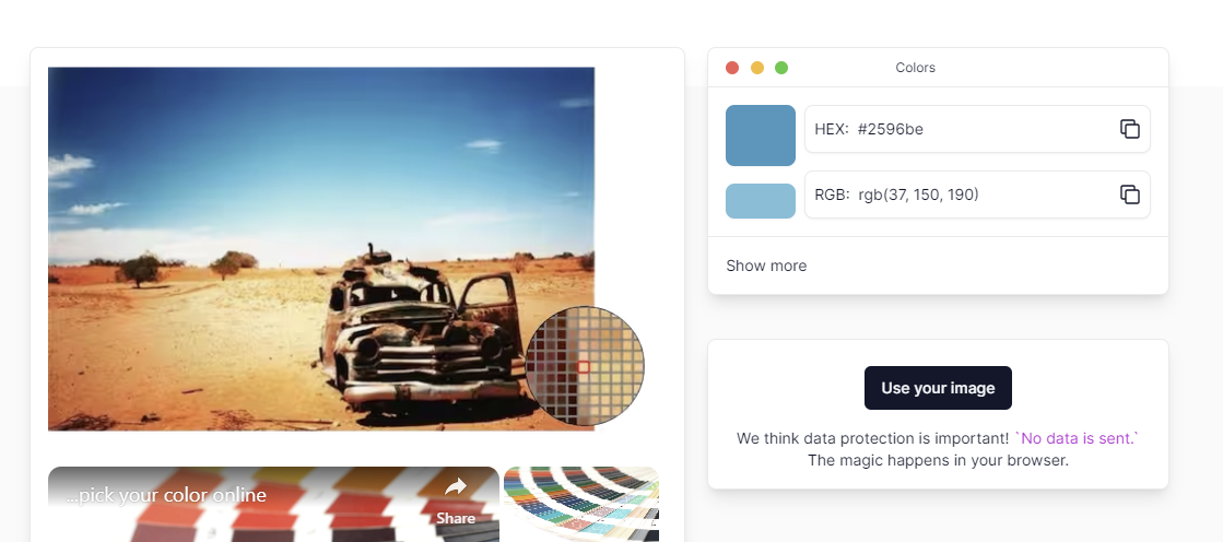
-Imagecolorpicker.com
This one comes in handy especially if you
are working with branded content. You can essentially upload any image and it
will tell you the exact hex codes you can later use in tableau and will show
you other colors that match it so you don't have to overthink your color
choices. This is what it looks like:
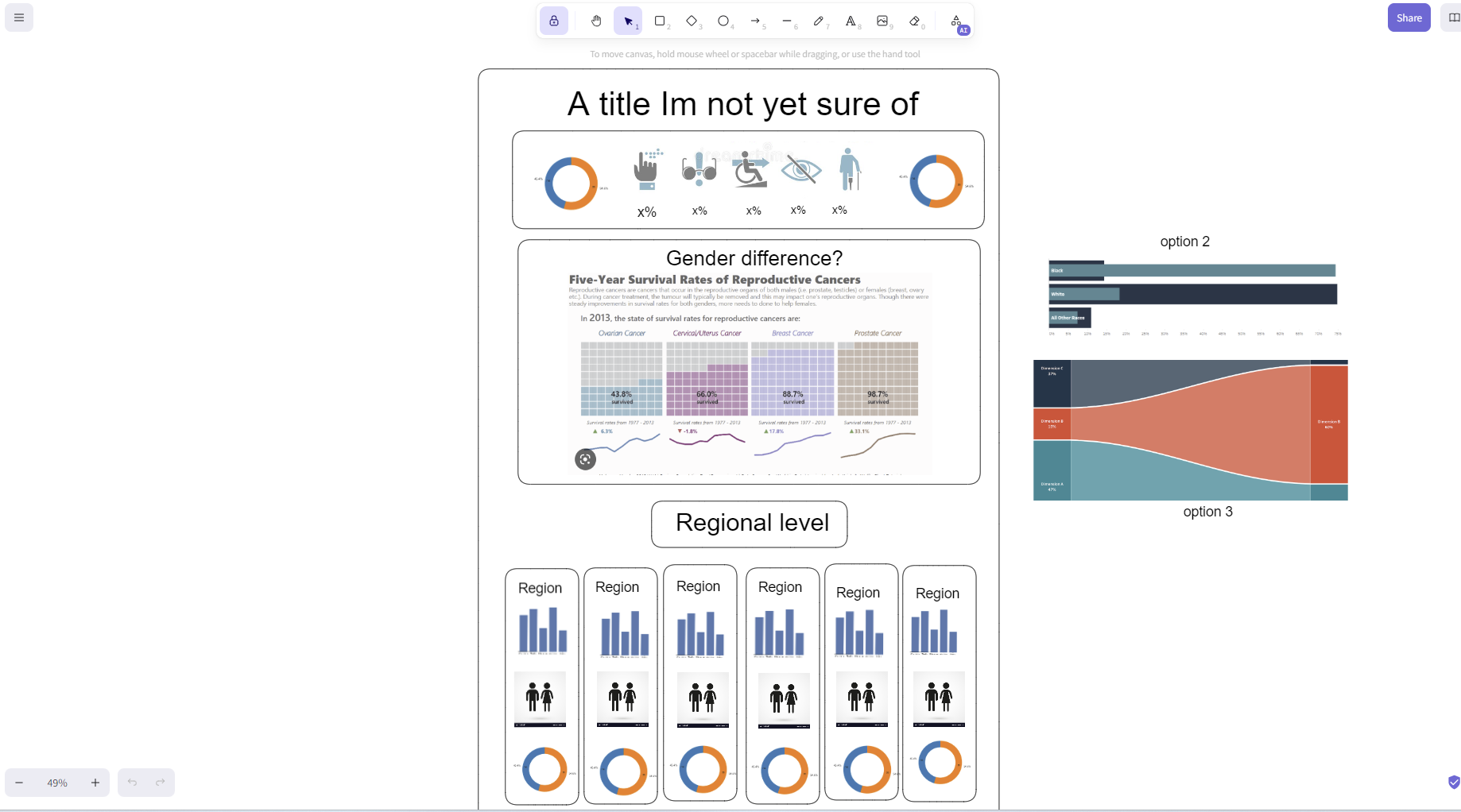
-Excalidraw
This drawing tool is the one I use when I
need to make a quick layout sketch of what I want a dashboard to look like. Its
super easy to use and has only the basic needed functions so you don't have to
spend a while learning how to use the tool. Here is an example of a sketch i
made in Excalidraw to later build out in tableau:
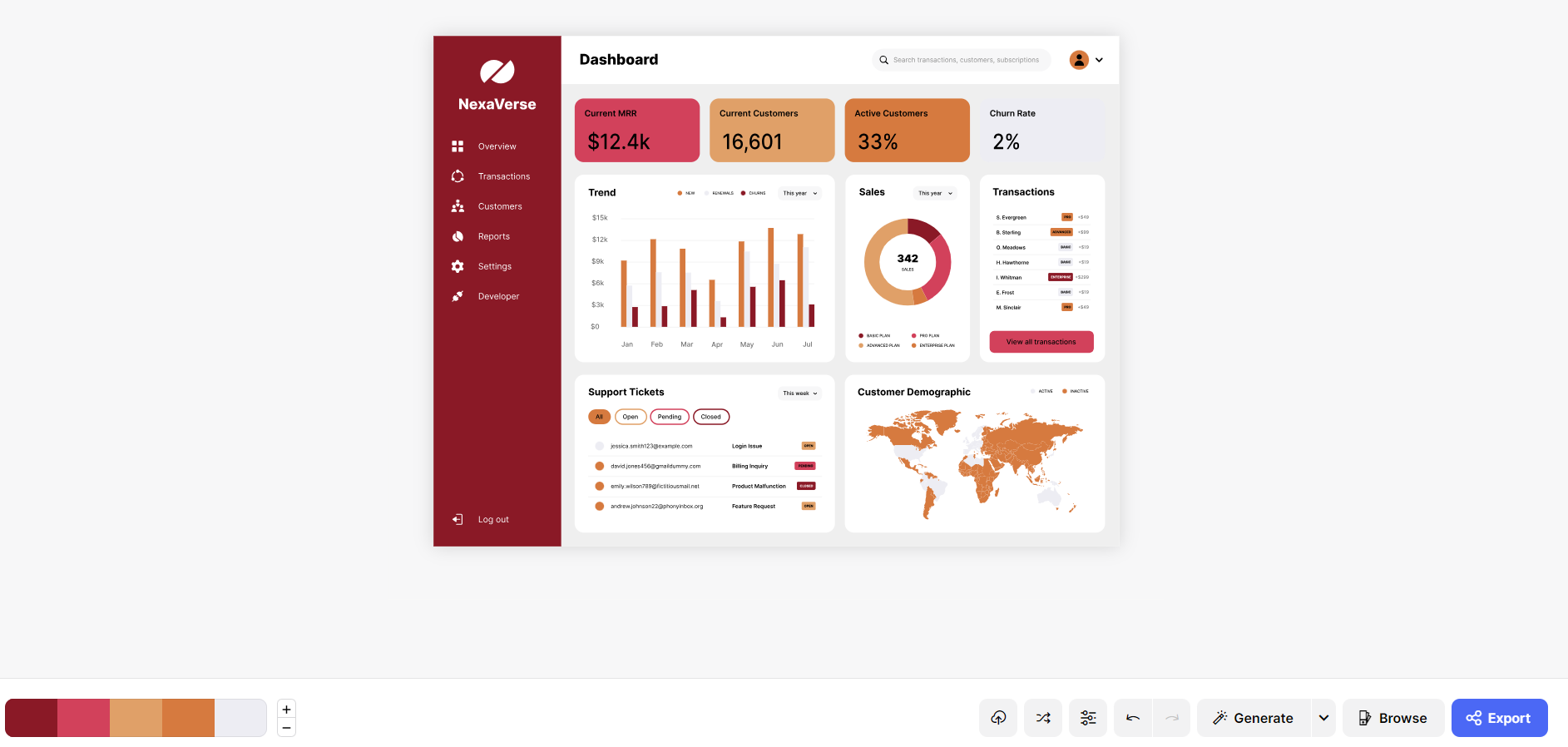
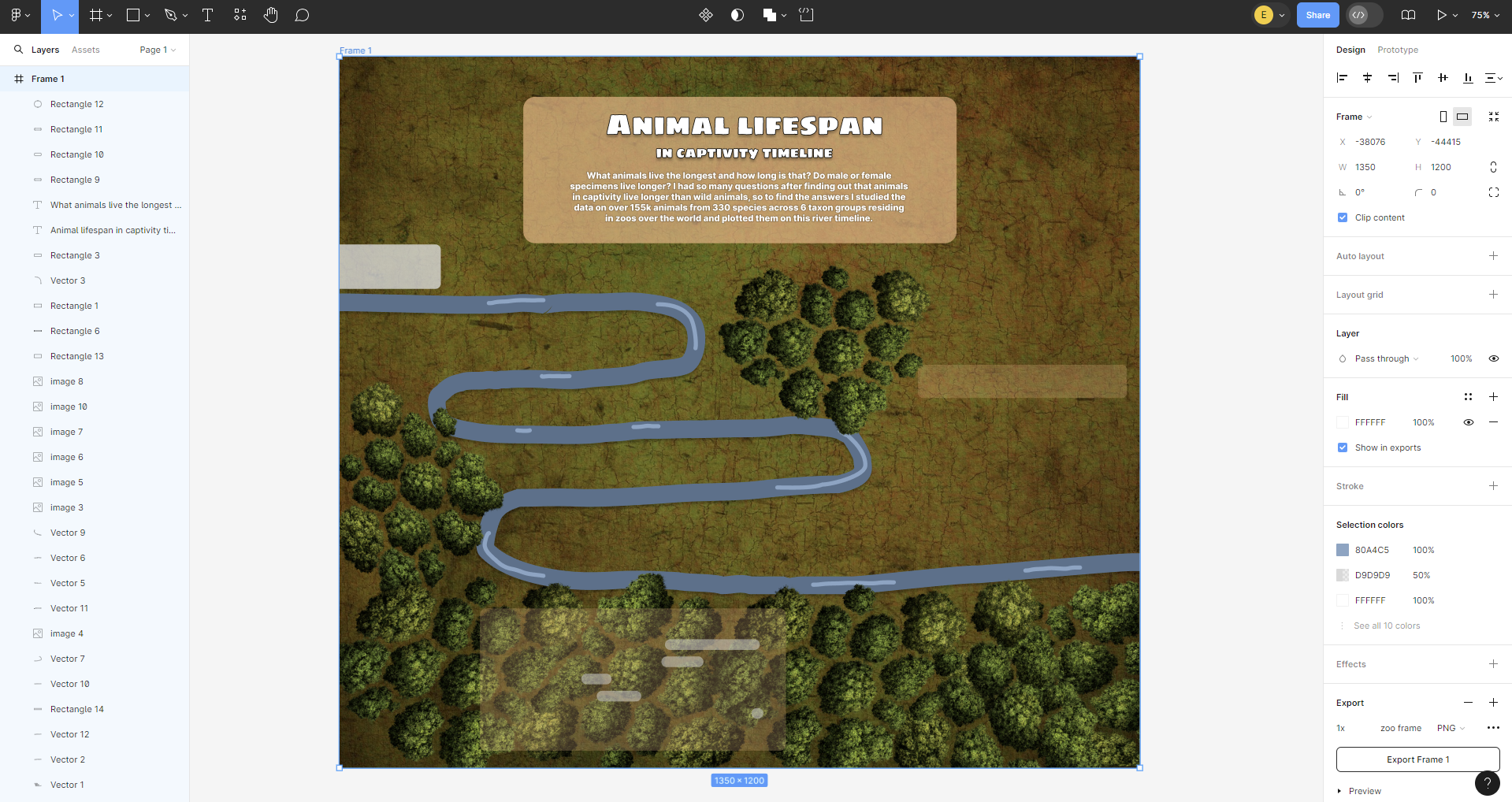
-FIGMA
I've spoken about it before and Ill speak
about it again, any design focused dashboard I make always has something I made
in Figma as I believe its a tool that greatly compliments Tableau. I use it to
make backgrounds, as well some extra chart formatting and can even be used to
draw your original dashboard design sketch. Here is what the base of one of the
last dashboards I made looks like while in Figma:
Knowing all of these tools are available to help you elevate your tableau dashboards, the key element to have in mind is the objective of the dashboard you are creating. By this I mean; sometimes you want the dashboard to be more analytical, or other times you just want a cool looking design, bur regardless keep in mind the end user and make sure it fulfills its purpose.