Today we revisited our original application viz on shark attacks in Australia with the new knowledge we had gained over these two weeks. There was a specific section that had a few things that could be improved, so I will be talking about these so others don't make the same errors as I did. You can also access the full viz on my tableau public profile HERE
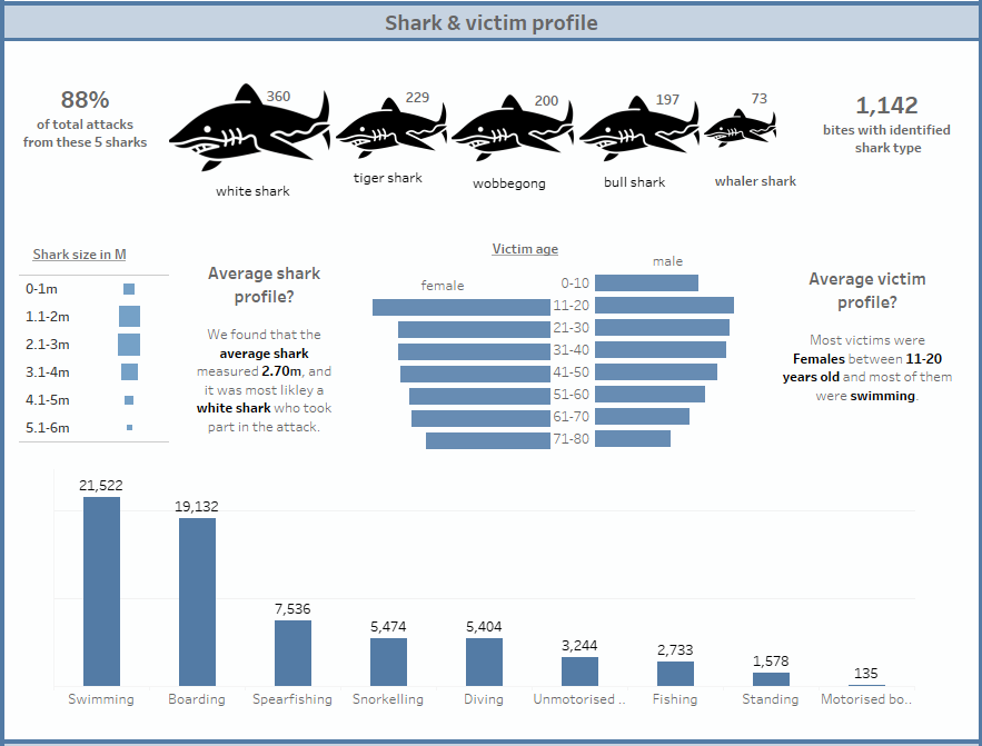
The original one looked like this:
You may ask yourself, what could you improve it looks so pretty? well, that's the whole point, I prioritized aesthetic over data functionality. In the end it does depend on what kind of project you are working on, but in most cases you should always prioritize data quality and functionality. To make the changes needed clearer I made a user story which is as follows:
AS AN Australian public safety advisor
WHEN LOOKING AT THIS VIZ I want to be able do identify the underlying trends in shark attacks
IN ORDER TO find where the problematic areas and shark species are to put in place more safety measures
SO I CAN reduce the amount of attacks that occur and the amount of fatalities.
For this reason, here are some things that could be improved:
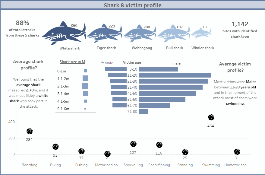
-Remove shark coloring: Since the icon size is already scaled to the amount of attacks, the color detail doesn't add any new info, so it can be removed.
-Scale victim age: The ratio was not to scale, so even though it looks like the males were the most affected, it was actually the females. this would confuse a reader so this shows the importance of scaling.
-Too crowded: The victim and shark charts are too close to each other making the viz look very crowded. A way to fix this would be splitting them with text in between.
-Change chart choice: Previously the chart on activity the victims were partaking in had beach ball icons, but I switched it to a bar chart as it is less confusing and there is a clear distinction between each activity. This was also done throughout the viz with other charts which for example looked like sections of a whole when in fact they were just different per capita ratios, or picking a tree map instead of a bar chart to make the viewer find the most prominent injury type faster.
-Sort charts: When charts, and especially bar charts are left in random order it takes the viewer just a little bit longer to identify the minimum and maximum figures, so to avoid this extra time it is best to sort the charts in ascending or descending order depending on what trend you want to showcase.
This is what the final version would look like: