


Today we were tasked with creating a dashboard from the data we extracted using the Rick and Morty API.
Having only used APIs once these past four months, I referred back to my Yelp API workflow from the time we learned APIs. However, that only got me so far as I did not implement pagination back then (if I have time in the future, I hope to go back to this Yelp API workflow, so that I may hopefully extract more rows of bubble tea stores in NYC and create a dashboard out of the data). Some people in my cohort suggested Liam’s blog, which you can find linked below, guiding on how to use the Rick and Morty API. This blog helped a lot and I was able to move onto joining the data. Ideally, I would have liked to join all three sections of the API together (characters, episodes, and locations). But I was only able to figure out how to join together Characters and Locations. If I ever have time in the future, I would definitely love to work on combining all of the sections together for further analysis.
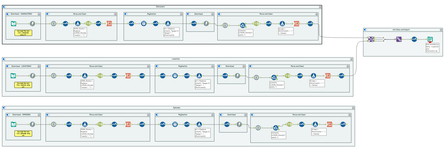
Being unfamiliar with the content, it did pose a bit of trouble navigating what each field meant in the cleaning process and what to do with the data in the analysis process. Luckily, there were a few NYDSers who were familiar with the show and were able to help answer any of our questions (Shout out to Kinley and Bianca in DSNY2 <3).
Once I finished with my workflow, I moved onto dashboarding. I’m the type of builder that likes to work backwards, specifically in the sense that I like to come up with an aesthetic for my dashboards in my head before figuring out what to build. After a bit of Googling, I was able to find the below image and envisioned a night sky theme to implement onto my final product.
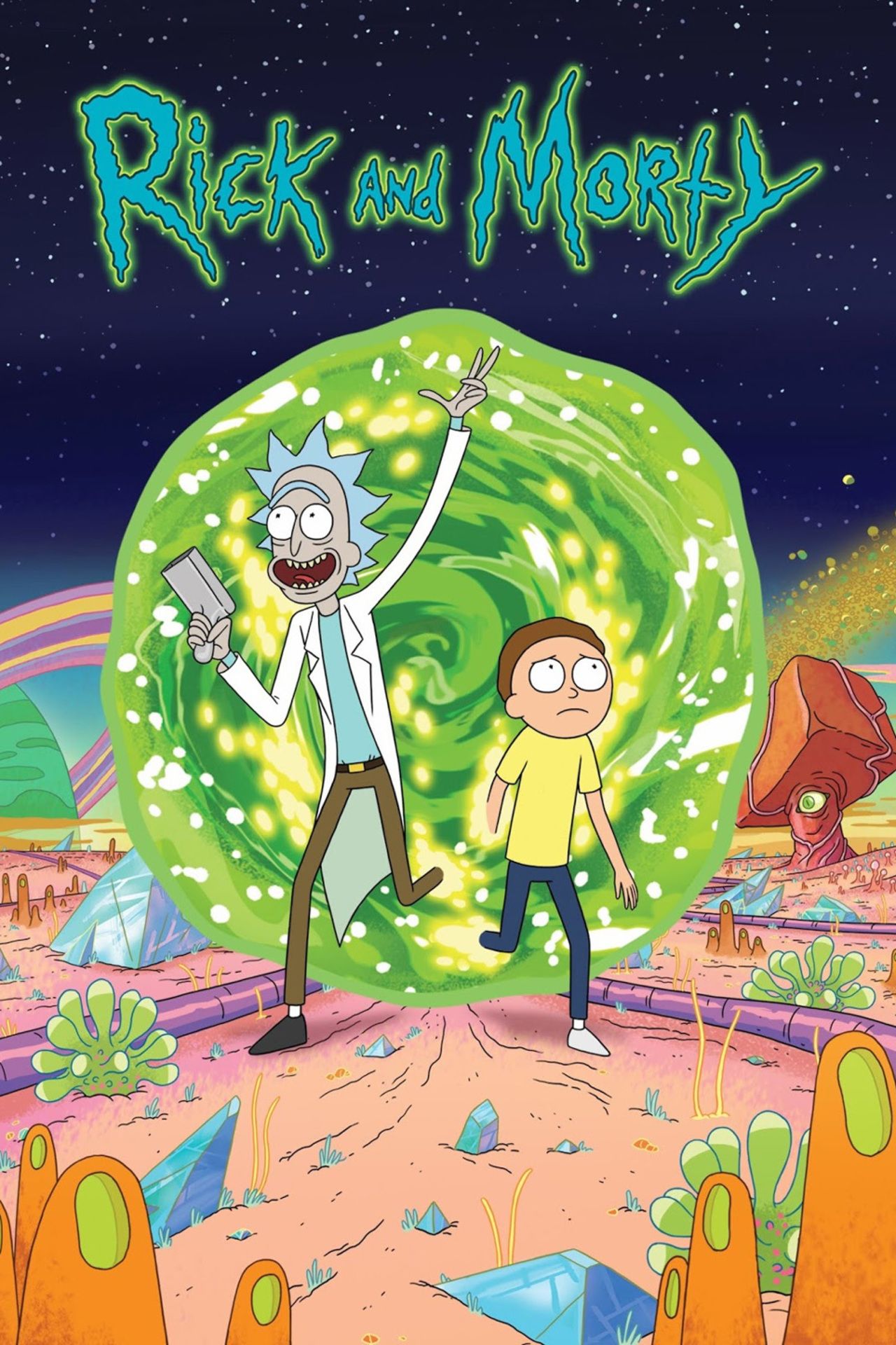
From this photo, I retrieved the below 3 main colors for my palette.
#74c141 - Green #009dbf - blue #212147 - starry sky
Once I had the aesthetic in mind, I did some data exploration and played around with some different chart types. However, I was running out of time and could not think of a question to base my analysis on. So, I focused on what I had first and put it all together--aesthetic and big numbers, resulting in the below output.
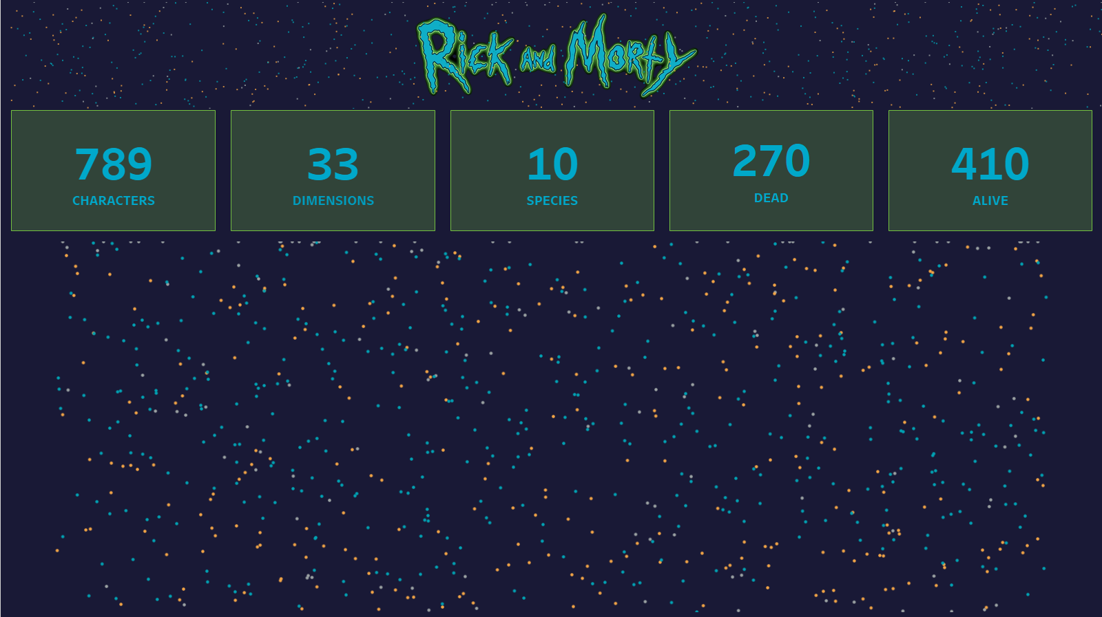
Now it might looks like all I have are BANs and a starry background, but the stars on the bottom right are actually individual characters on a jitter plot, using random() and Character ID on my axes. When you hover over a dot, it includes information about the character (birth location, current location, name, life status, etc. and an image of Doopidoo). Ideally, I would have liked to have an image of each character, but currently each character shows an image of Doopidoo because I was not able to figure out an efficient way to utilize the hyperlinks as images. So, I used the tableau repository and created a new folder for Rick and Morty characters. However, it is possible by changing the data type of the links to image!
On top of the jitter plot, the current version has BANs that shows some charts representing each of the fields when hovered over through tooltips. In the future, I would like to implement the BANs as buttons, which directs the users to another dashboard breaking down the fields in more detail.
As you can tell, there are a lot changes that I would like to implement. So, look out for a second version in the future!
References:
Liam’s Blog: https://www.thedataschool.co.uk/liam-wood/r-m_api
Public Dashboard: https://public.tableau.com/app/profile/erlina6186/viz/Book1_16746840294780/RickandMortyDash?publish=yes
Rick and Morty REST API Documentation: https://rickandmortyapi.com/documentation/#rest