


Welcome to the first blog of the series for Dashboard Week. This week we are tasked each day to produce a dashboard and blog as well as other deliverables such as a documented data prep workflow and wireframes. Today’s task was vague as we were given cheese.com and the rest was up to us.
Cheese.com
First steps I took involved looking through cheese.com to try to identify any aspects that I could create a valuable data set with. I then decided to compare types of cheeses by their origin, milk, aroma, and texture.
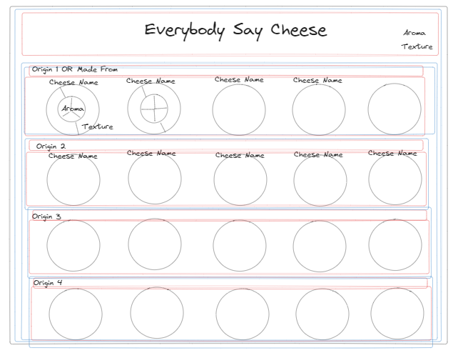
Wireframing
From there, I started sketching what my dashboard could look like. I knew I would be comparing dimensions as my data set had no measures, so I chose to keep it simple by creating nested pie charts.
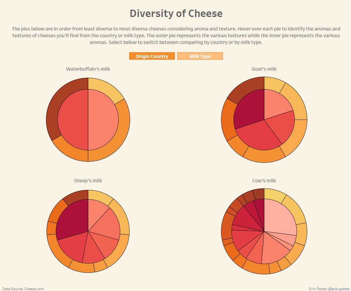
My first idea was to have a pie chart for each cheese with the intention to allow the user to interchange the view/grouping of the pies depending on origin country or milk used.
The blue and red squares represent the containers I planned to use for each part of the dashboard.
Web Scraping
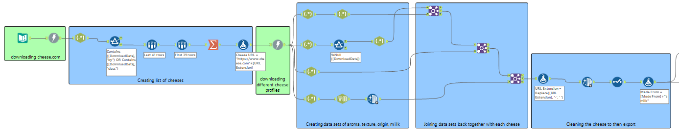
I then navigate to Alteryx to web scrape the data I needed from cheese.com. I started off downloading from just https://www.cheese.com and then using RegEx pulled a list of 20 different cheeses. Once I had that list, I scraped from each individual cheese’s profile and collected info on their origin, milk, aroma, and texture.
After further cleaning up the data set in Alteryx, I then exported the file as a Tableau Hyper Data Extract to load that data set into Tableau.
Dashboard
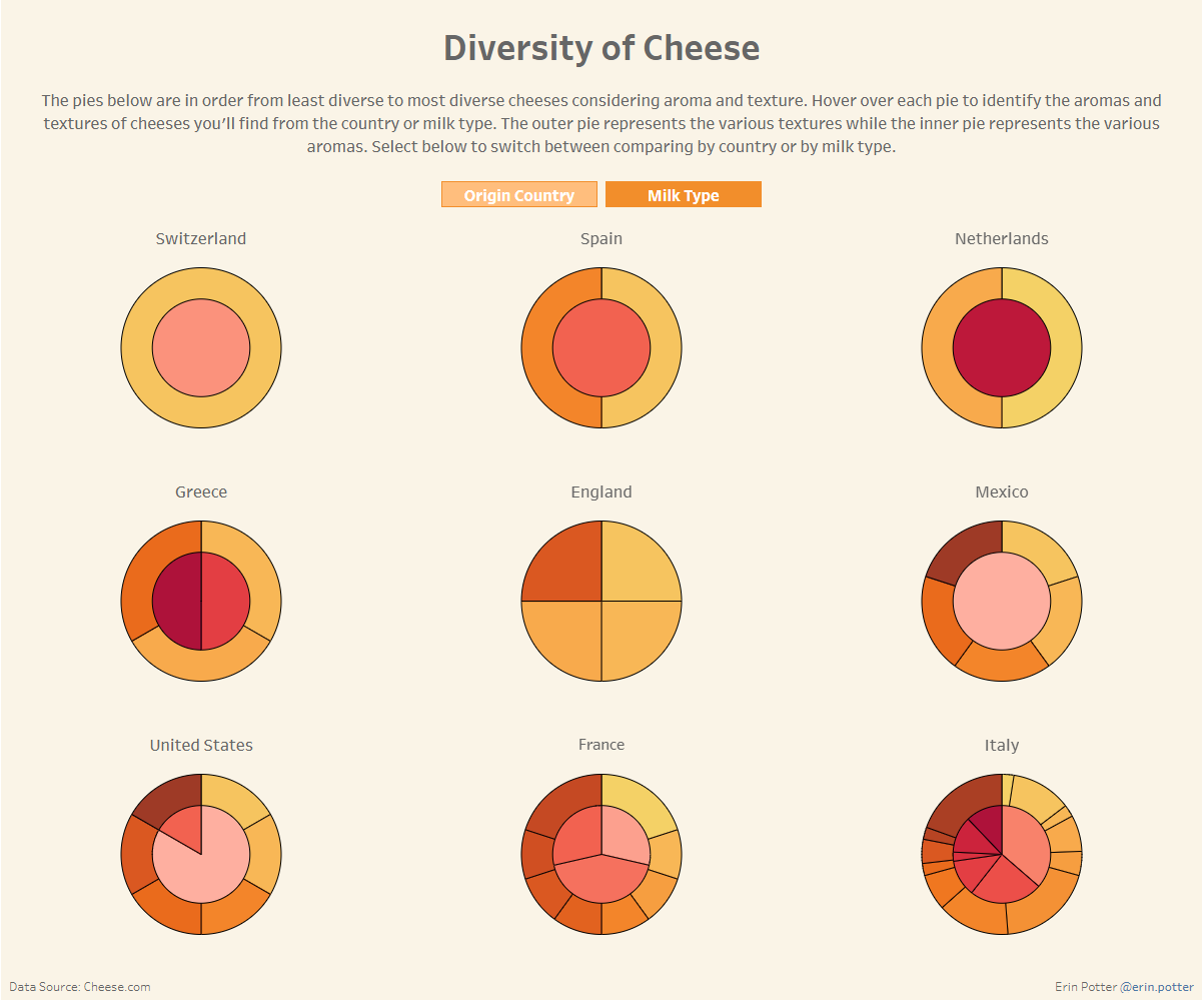
Finally, once I imported my data from Alteryx, I started creating my pie charts. At first, I wasn't too happy with how the dashboard was going because it didn't feel like I was building a strong analysis. It just felt like I was creating a bunch of pointless pie charts. Due to time, I decided to continue with the route I was going, however, instead of a pie chart for each cheese, I created a pie chart for each country and milk type.
From there, I was finding certain countries and milk types had more cheeses, and therefore seemed to have more diversity when it comes to aroma and texture. Once I felt okay-ish about the story I planned to present I made the final touches to my dashboard, published to Tableau Public, and started writing this blog.
Next steps: start prepping for the presentation! Ahh!