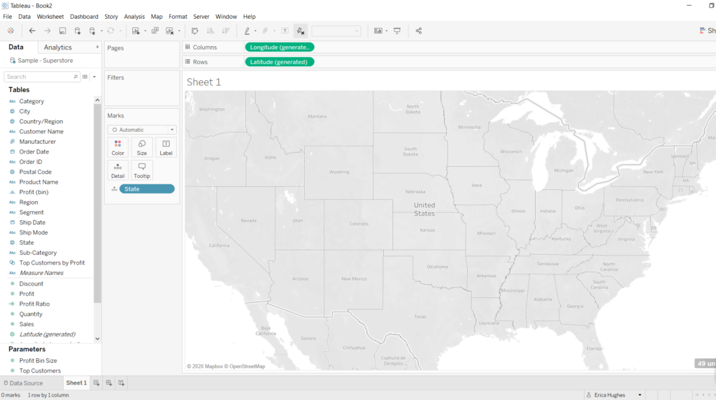
When I first downloaded Tableau, I started double-clicking around the page to try to figure out what was what. I was drawn to it immediately, but later I realised how limited I would be without some extra help from blog posts and videos. Even then though, there was one thing that I could not figure out. How do I get the ‘State’ to appear on my map? For everyone else it seemed to be a simple question of drag-and-drop or double-click. It turns out, there’s more to it.
The problem here is that when you want to visualise states on a map, Tableau needs to know what country those states are in. If this information is not contained in the actual data, Tableau’s default location will be the country you are in (or at least it does for me, in the UK).
Once I realised this, I resolved the problem by creating a Calculated Field and manually typing in the country. I would then drag this Calculated Field onto the Filter Shelf. This works, but today I learned a better way.
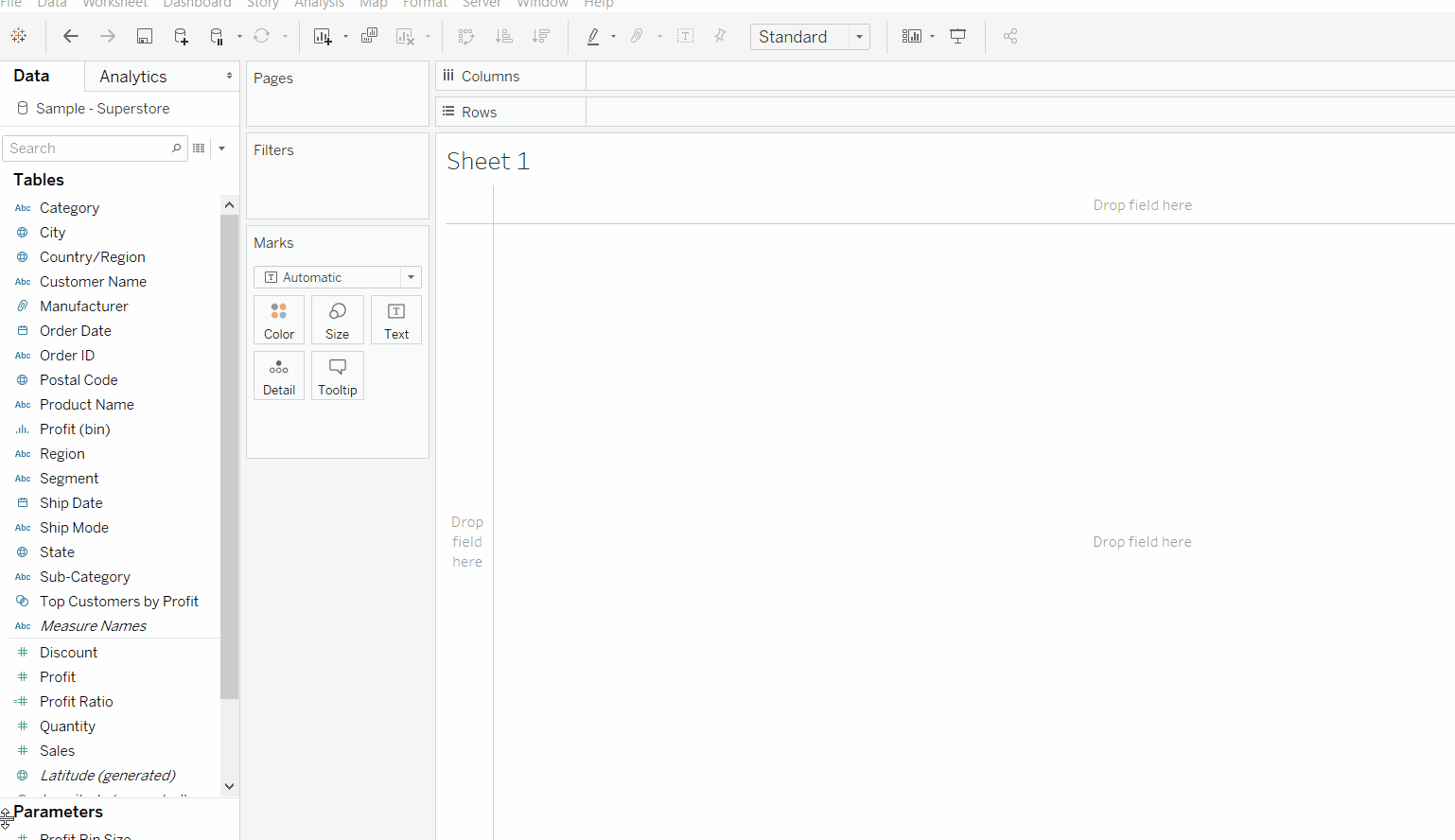
Before you do anything, if you double-click on the ‘State’ field you might see a blank map with no dots or colouring, like this:
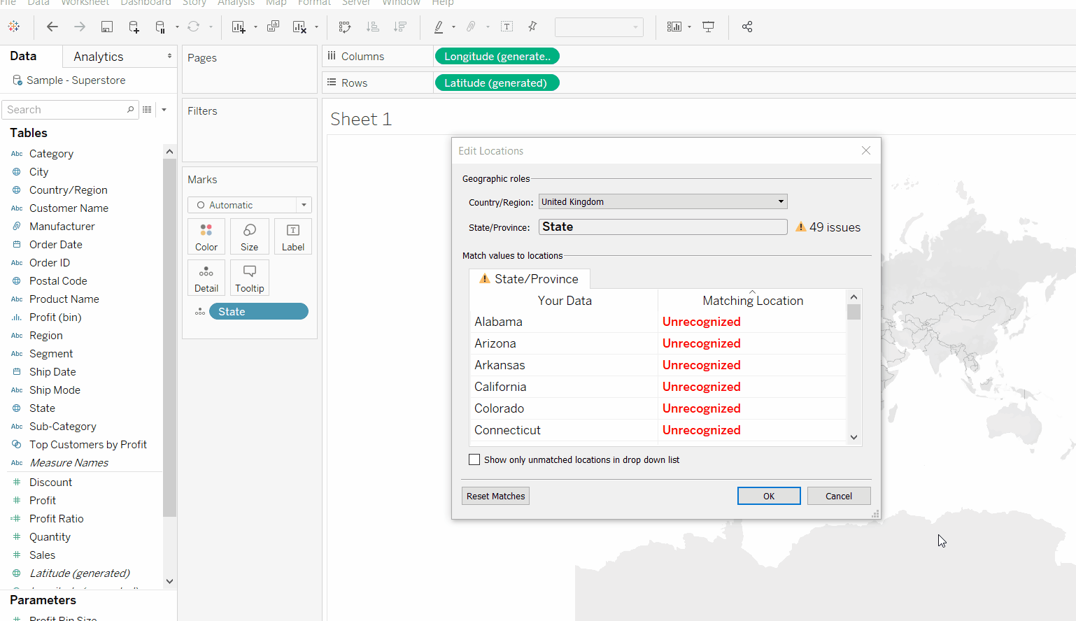
The simplest way to fix this is to move your mouse over the map, right-click and select ‘Edit location’.
Now go to the drop-down menu for Country/Region and select ‘United States’ (or it may also appear as USA):
And that’s that! A dot should appear at the centre of each state. This method should work just the same for data from other countries (e.g.: Counties in the UK).
Optional: Depending on what you are visualising, you may want the whole state to be filled with colour. In that case, you want to go to your Marks Card and click on where it says ‘Automatic’, then change this to Map (as seen below):