Stacked bar charts are useful charts. They can visually show more information than a traditional bar chart.
In this instance we want to make a stacked bar chart showing the quantity sold in each year by category and sub-category.
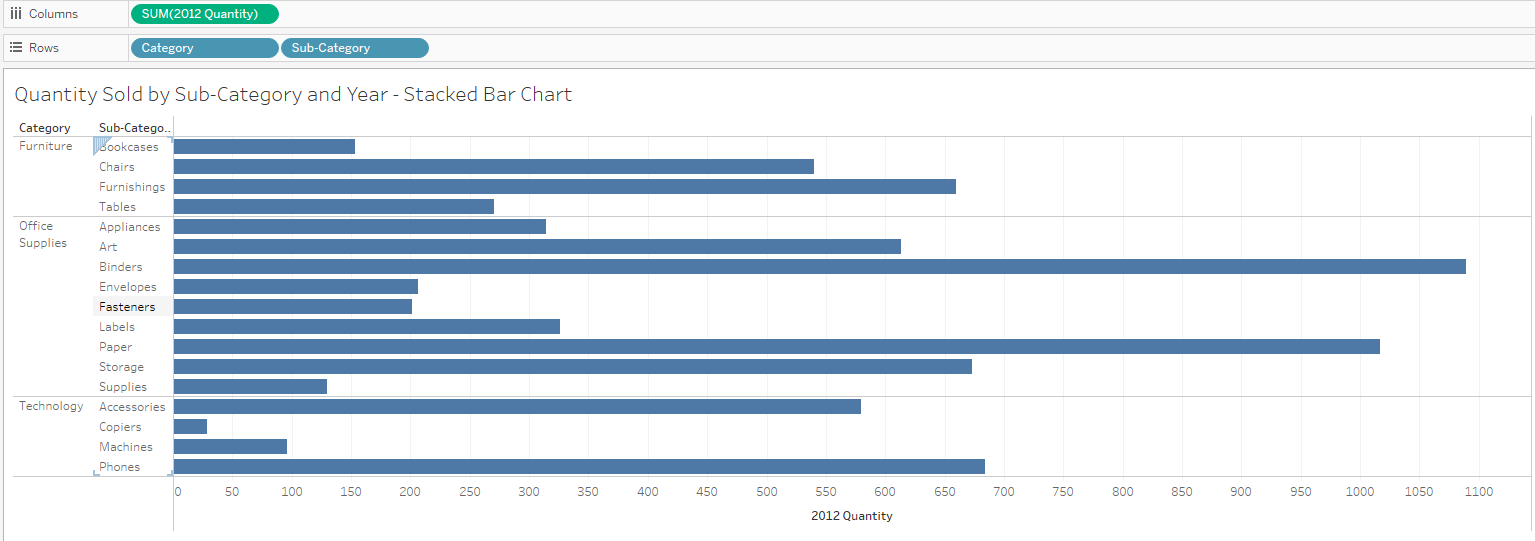
First bring your first measure onto columns. This will create a simple bar and in this case it shows '2012 Quantity'.

Then bring your dimensions onto rows. In this case the dimensions are 'Category' and 'Sub-Category'. These are the categories we want to act as they would in a normal bar chart.

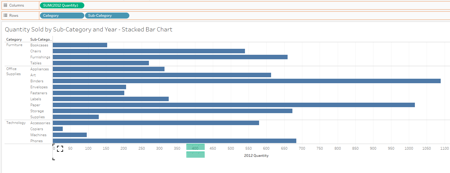
Bring your next measure onto your x-axis to show 2 green bars. This will allow you to drag the remainder of your measures into the view by using measure names and measure values. In this case we are bringing '2013 Quantity' onto the 2012 Quantity axis to create the 2 green bars as seen below.

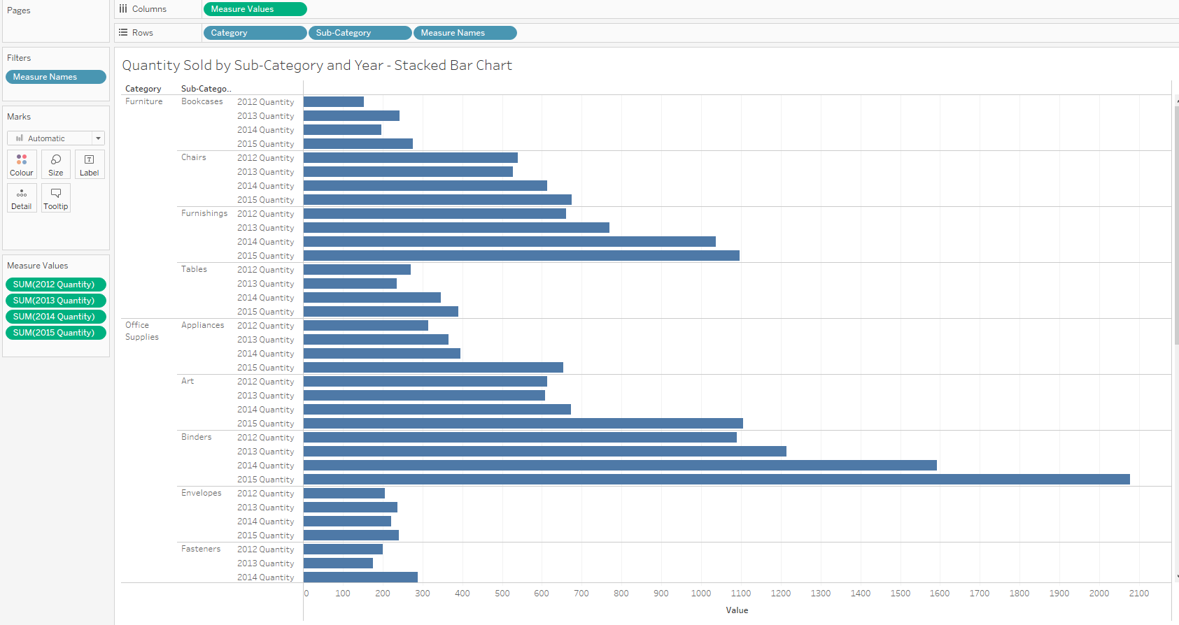
Bringing each of the remaining measures into the 'Measure Values' card will create a view like this.

Drag the 'Measure Names' pill from rows and drop onto the colour in the marks card to create the final stacked bar chart with adjustments made to the colours.

