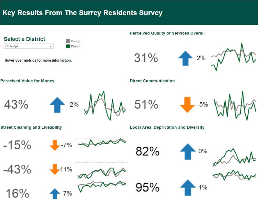
One of the coolest things to do with dashboards is dynamic shapes for good news/challenges. This is a unique visual cue that I utilized for the Surrey Council Project. I’m going to use the superstore dataset to show you how you can build it too!
Plus it’s very exciting that this project was featured as part of Viz of the Day! Here’s a quick view of the Surrey Council Project.
Getting back to this Tableau Tip, let’s assume we wanted to create the view below, where green arrows reflect good news and red arrows are challenges in Year over Year Sales by Category.
Step 1: Make sure your table calculations are configured properly
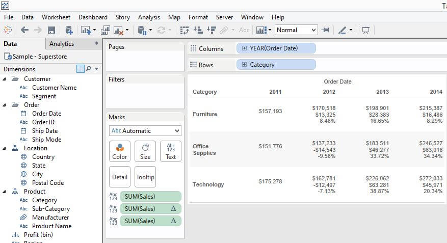
Here’s the crosstab view for some of the data above. I find this view helps me track if the table calculation is working as expected.
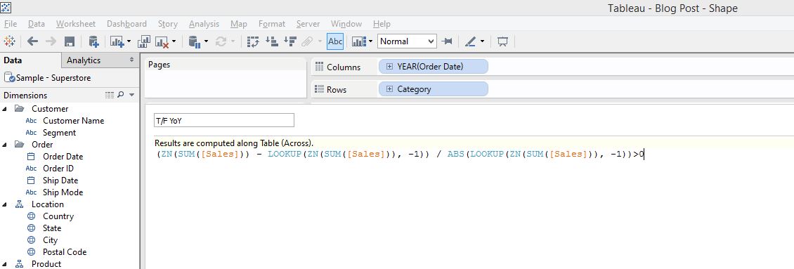
Step 2: Create a “true/false” calculated field based on your chosen baseline or reference point.
I’ve configured the arrows to change when the value is above or below 0.
In this particular view, I dragged and dropped the calculation into the measures pane to save it as a calculation, hence the the craziness in the code. But it is the easiest way to preserve the table calculation I had built. Simply add a “>0” at the end of the statement to turn it into a “true/false” calculated field.
Step 3: Change mark type to shape
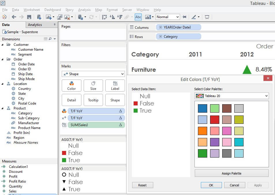
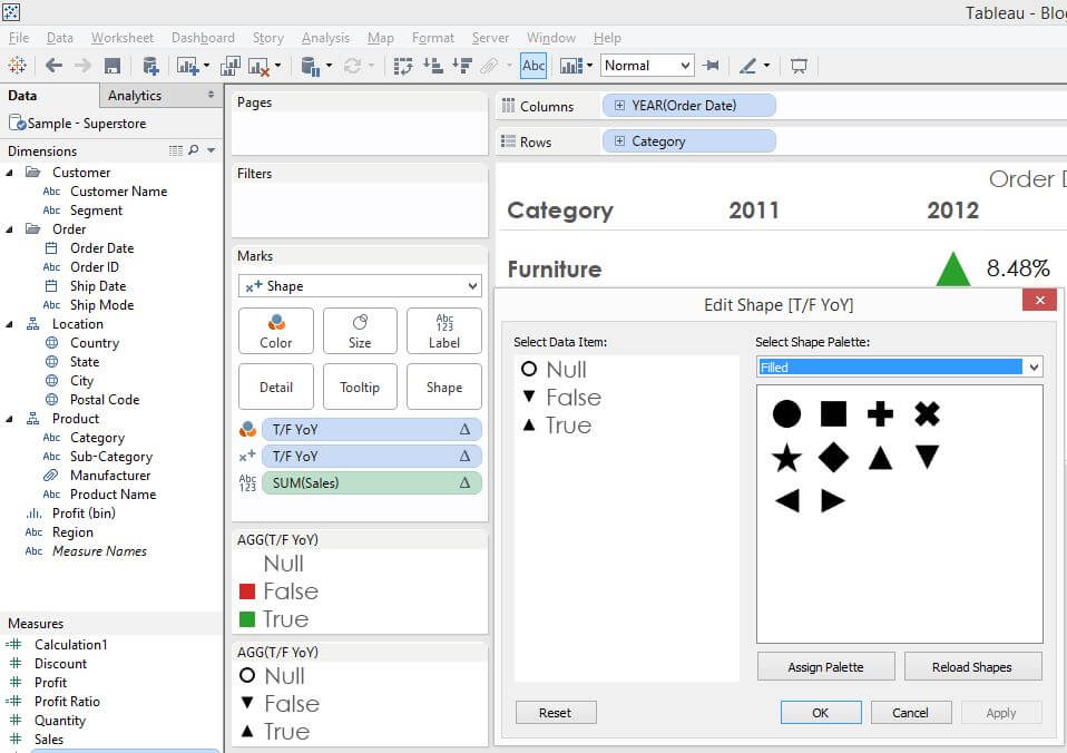
Within the marks card, you’ll have to configure 2 parts– color and shape. Putting the true/false calculation we’ve just created on color allows us to choose “red” and “green” attributes for the arrows while putting the true/false calculation on shape specifies the arrows’s direction. Putting these pieces together gives us:
Green + up arrow = good news
Red + down arrow = challenges
Here’s the configuration on color and shape
You’ll also notice there’s a value for “Null”, referencing the values in the first columns. This makes sense as the table calculation is built on a previous, table across value. Since there’s no previous value in the first column, there’s no value. I’ve changed the color value for “Null” into white so it blends into the background as this is a correct result but not relevant for our purposes.
I find this is a popular feature in KPI dashboards so I hope the explanation is clear and helpful. Expanding on this concept, we can also add a parameter on the threshold value… but that’s for another post 😀
Happy vizzing!

