Statistics used properly can be a powerful tool to analyse data with so I thought I would do a few blog posts, or a series if you will, on various statistical techniques.
First up is Cluster Analysis; primarily explaining in this post how to using Alteryx, but also in part two about how to do it in Tableau.
Cluster Analysis
Cluster analysis, or more specifically k-means or k-median clustering, aims to separate a number of observations into a series of groups with similar attributes. This is useful for firstly splitting up data to help analysis, but also for classifying new ‘members’/ additions to a data set. Most common is k–means clustering, which takes the mean of the cluster as the centroid, but the median can also be used (k–median clustering)
Within each of these clusters, each observation belongs to the cluster with the nearest mean to itself. Usually the algorithm used in k-means clustering finds groups of comparable spatial extent, as it employs a nearest-neighbour classification.
Cluster Analysis in Alteryx
Cluster Analysis uses three main tools in Alteryx, and they belong on the R Predictive Grouping shelf. They use the programming language of R within each user-friendly tool. They can be downloaded from here. These tools are:
- K-Centroids Diagnostics tool to help determine how many clusters the model should group the data into, given the data and the predictive grouping algorithm used
- K-Centroid Cluster Analysis tool which performs the statistical analysis
- Append Cluster tool which then labels each row of data with the cluster it belongs to

Three main tools used in Alteryx to perform Cluster Analysis
Generally all three of these are used in a workflow, to determine the number of clusters, their members and then a way of outputting the data together.
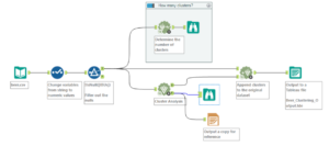
Workflow involving data prep, the three cluster analysis tools, and some reports and .tde files outputted
For this example descriptive data about different beers from different breweries was used to cluster beers into groups. The fields we’ll use are the ABV, the IBU and the size in oz. The analysis results would then be used to determine which beers should eventually be selected to ensure a wide enough range for all customers to enjoy.
Step One: Prep and Diagnostics
The first step is to prep the data. For statistical analysis the data needs to be in a numerical format, so changing the format here from a string (6.5% ABV) to a double (6.5) solves this problem. The sample tool was used and this automatically gets rid of any alphabetical characters when changed to a ‘double’ format.
The data also needs to not contain any nulls as these won’t be read and errors will pop up. For simplicity here these have been filtered out. However, when using an organisation’s data, or in the real world, it’s better to ‘pad’ the data. This can be done by using averages for either that category or a certain time. In general, within stats, the higher the sample number (number of rows), the more robust the analysis and the more confidence one can have with the results.
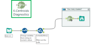
Step One: prep the data (blue tools) and diagnose the clusters (K-Centroids Diagnostic tools)
The first of the clustering analysis tools is used after the data is prepped: the K-Centroids Diagnostics tool. This tool performs some descriptive statistics around distribution of the data to give us an idea of the impact of various cluster numbers. In the configuration window (left in the image below), the variables used in the clustering analysis are chosen.
These can be standardised within the tool, and usually this is a good idea as it reduces the impact of bias/ weighting that a few variables might have. In this example, the size of the beer has only two or three values so it’s tricky to compare that against ABV, for example, as that has a more continuous distribution. Standardising them using the z-score allows us to compare them better. At the bottom of the configuration window, the minimum and maximum clusters to be tested are chosen and this is often between two and six. A large number of clusters is harder to analyse, but if the test suggest more could be impactful then the test can always be re-run to determine if more is helpful.
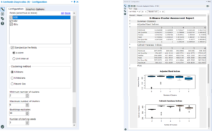
Left: the configuration window Right: the output within the browse tool
In the output of this tool, we are looking for the number of clusters that results in the highest mean and the tightest distribution in the box plot. Here, the choice is between three, four and five. Three has the highest median, but quite a few outliers. Four is better than five as it has a tighter distribution, so therefore four is the number of clusters chosen.
The K-Centroids Diagnostics tool and it’s browse tool can now be put in a tool container (select both and right click > add to tool container) as this saves time when running the workflow later on.
Step Two: Cluster Analysis
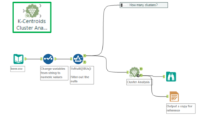
Step Two: Cluster analysis with the K-Centroids Cluster Analysis tool
Now that the number of clusters to apply has been determined, cluster analysis can be performed using the K-Centroids Cluster Analysis tool. The configuration window is similar to the K-Centroids diagnostics: select the variables to use within the clustering, standardise them, and input the numbers of clusters.
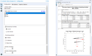
Left: Cluster Analysis configuration Right: Output
Within the output browse tool, it displays a table of results, as well as a chart which indicates results of principal component analysis (PCA). PCA and cluster analysis are often used together, though in this case it wasn’t used. Here we are only really interested in the numbers in the top table. Ideally the average distances and maximum differences to be low but, the separation values to be very high. This is because we want the values between each member (row) within the clusters to be similar, but the differences between each cluster to be high.
Therefore if the avg or max distance are slightly too high and separation values too low, this could indicate that this is not the right number of clusters. To fix this another cluster analysis could be performed which a different number of clusters specifies in configuration to compare before the final cluster groups are determined.
Step Three: Append the clusters
The third cluster analysis tool is used to append the cluster that each member belongs to to each row in an additional field. The tool needs to connect to both the K-Centroids Cluster Analysis tool’s output and the original data set.
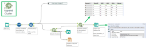
Step Three: appending the clusters as an additional field and outputting to a Tableau extract file
The output of the Append Clusters tool can then be outputted to a Tableau extract and visualised in Tableau. However, one thing to note is that Tableau automatically classifies the Cluster field as a measure. Before using it (either on colour, detail or a row/ column shelf) click and drag it up onto the Dimensions pane.
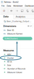
Click and drag the Cluster field into the Dimensions pane
It is then a way of splitting the data, e.g. in the scatter plot below. As this particular clustering field is generated from three measures, the clusters will overlap in a scatter plot with two of the measures on the axis.
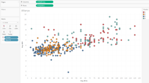
Alteryx clusters visualised in Tableau
The beers with stronger IBUs and ABVs are in cluster 4, with cluster 1 having beers at the opposite end of the scale.
Clusters can also be created in Tableau – see my post about how to do that here.
Also see Emily Chen’s post on Clustering with a small data set for further explanation.
