In this post, I’ll take you through how to create a Gantt chart. This is a useful chart that shows the duration of events, e.g. delivery times or hospital wait times. The date field is usually on the column, and then the various dimensions are on the rows. I’ll be using the Superstore data as an example to show how average delivery times vary within Sub-Category by Ship Mode for the Furniture Category.
One of the fun things about the Data School is that you learn how to create the ‘Show Me’ charts in Tableau…without using the ‘Show Me’ panel. This is either purposefully done in some chart cases, but for other charts it might be a coincidence of the training. I don’t think I’ve used ‘Show Me’ since joining the Data School!
When applying to the Data School I decided it would be cool, though highly unnecessary, to create my CV on Tableau Public! This involved creating a Gantt chart of my past academic and work tenures: the centrepiece to my viz. My original CV viz is here but it’s definitely not great – I plan to update it when I’ve (hopefully) passed the Tableau QA and Alteryx Core exam!
Gantt Charts
Step One: Add the date onto the view
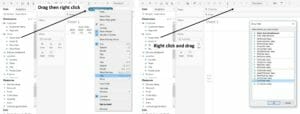
To start, drag the first date field (Order Date) onto the column shelf – but in it’s continuous form. Tableau automatically aggregates this up to the Year level, so either right click on the pill and click on the continuous days, or right click and hold the pill when dragging it onto the shelf and a menu pops up straight away. Either way – the date needs to be in a continuous (green) format.
Step Two: Add the dimensions to the view
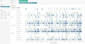
This will cut the dates up into more understandable analysis. I’ve filtered the view on the Furniture Category, and put the Sub-Categories and Ship Mode on the Row shelf.
Step Three: Filter the dates down a little
As the date is currently displaying the last few years of data, there are too many marks in the view. To make this a useful, dynamic analysis, use a relative date filter. This will filter and update the date to display this month’s data. Hold the ‘Ctrl’ key and drag the date pill onto the filter – this will duplicate the pill. Select relative date, and then this month. The last 3 or 6 months can also be viewed.

Step Four: Calculate the time between the two dates
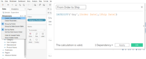
To understand the duration of time between the date an item is ordered and then shipped, a new field needs to be calculated. Click on the arrow in the data pane and select ‘Create Calculated Field’. Use the formula:
DATEDIFF(‘day’,[Order Date],[Ship Date])
Step Five: Event duration onto the view
Drag the newly created field onto the size shelf on the marks card. Tableau will automatically sum this to aggregate it, but an average makes more sense. So after dragging it onto the view, right click and change to average.
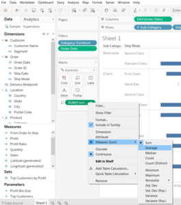
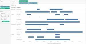
A Gantt Chart has now been created! This allows us to see that in December, the busiest orders for the US Superstore were shipped standard class – though first class was a popular option in the first half of the month, and second class in the later half.
[optional] Step Six: Colour
Whilst we now have a view that shows the time between ordering and shipping for different ship methods, it could be good to add a colour to highlight different aspects, for example:
- When an order has had an excessive delay in being shipped, either by specifying the number of delays or using a parameter for the user to explore the data
- The type of shipping mode, although this is double encoding which is sometimes frowned upon
- The profit per order, to see if there’s an impact on delay to shipping to the order’s profit
