Today’s challenge was to use a visualisation software that wasn’t Tableau to create a dashboard based on the complaints data from the FCC. I chose to have a go with Power BI today, which I actually found quite an enjoyable experience.
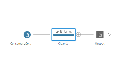
After I downloaded the data from the FCC website I out it into Tableau Prep to do a little bit of tidying on a few fields. The data contained locational properties but currently the longitude, latitude and zip code were all in the same column. To separate them out I used the automatic split option which separated the three fields. I then simply renamed the fields and deselected the original column. I kept all of the other fields in as I wasn’t sure what I would need for a dashboard at this point. This was my workflow:

The data was then ready to be put into Power BI using the ‘Get Data’ option. On first looking at the Power BI interface, it looks quite ‘frumpy’ compared to the Tableau interface, pretty much everything you need is on the right hand side, there are no ‘rows’ and ‘columns’ and there is no such thing as ‘sheets’ and ‘dashboards’ just pages. I am going to run through the pros and cons of Power BI that I discovered day:
Pros:
- charts are created for you at a click of a button
- interactivity is built in
- BANs are already a chart type
- floated/tiled isn’t really a thing, you can drag the charts and dashed lines appear to help you line them up
- all charts are on the dashboard from the get go, you don’t need to jump back to each sheet when you want to change something
- you can set a theme for your dashboard which will colour all the charts the same
- you can zoom into a specific period of a line chart and Power BI will create a waterfall chart for you to analyse the changes in that period
Cons:
- the formatting isn’t that easy to find and navigate, and finding the sequential colour option
- the maps are a bit basic and it’s hard to fix them otherwise they just jump around
- when you drag a field onto the view, Power BI tries to aggregate so you have to change it to ‘Don’t Summarise’
- no such thing as calculated fields
- can only create the charts that from the menu
I actually really enjoyed my day with Power BI, it’s definitely got more of a business reporting feel to it rather than building beautiful dashboards, so I can see how it’s a popular software with companies. The majority of DS16 have referred to today as ‘Tableau Appreciation Day’ but I would be happy to use Power BI again.
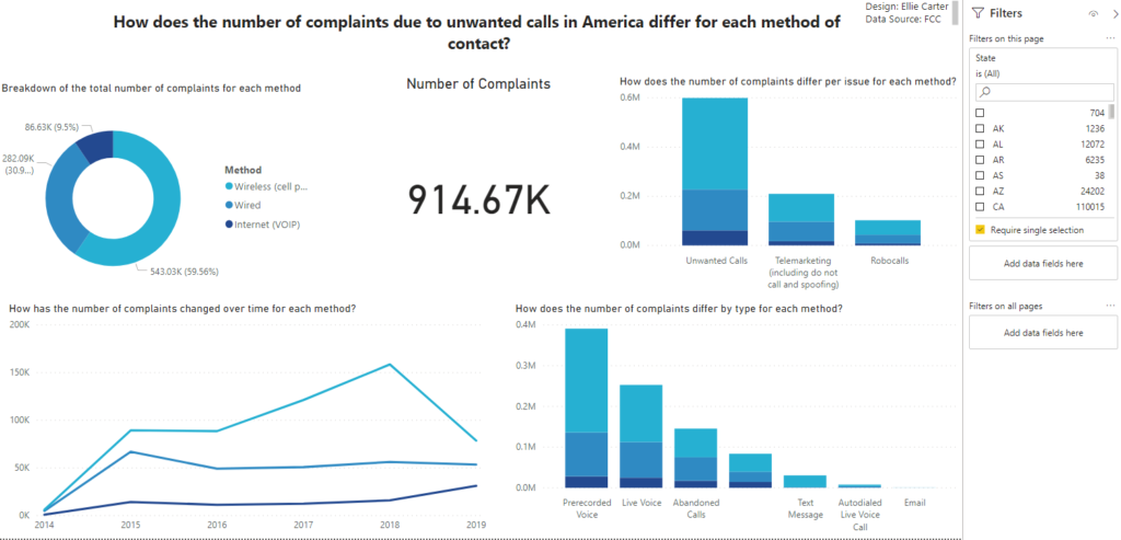
For my dashboard, I chose to look into how the number of complaints have different for each method of contact, internet, wired or wireless. Here is my final dashboard:

