Today we used data concerning the availability of bikes and docking stations from COORD. However, as we were back in 2018.3, the benefits of nice software was balanced out with a bit of a nightmare with trying to get the data (involving an API and an analytic app, see below). Others have explained the complexity of our collaborative workflow, so I’m going to talk about Mapbox (as shown to me by Louisa).

Our data today yielded points of bike docks and locations within a given location, which was Chicago in my case. Accordingly, a map was the obvious choice, and several of us decided to look for some designs that were a bit more jazzy than the three Tableau offers.
Enter Mapbox.
- Firstly, create an account, and navigate to ‘Studio’ where you” find some map options.
2. Select ‘Pick a template or upload a style’.
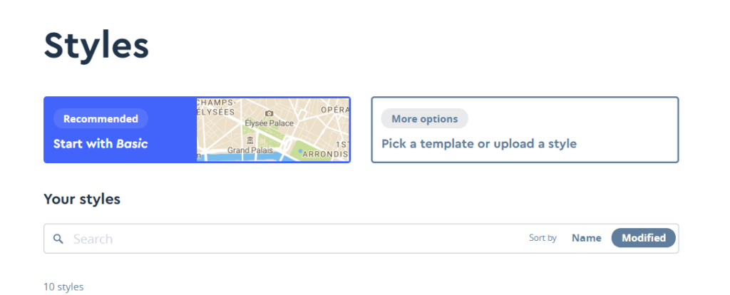
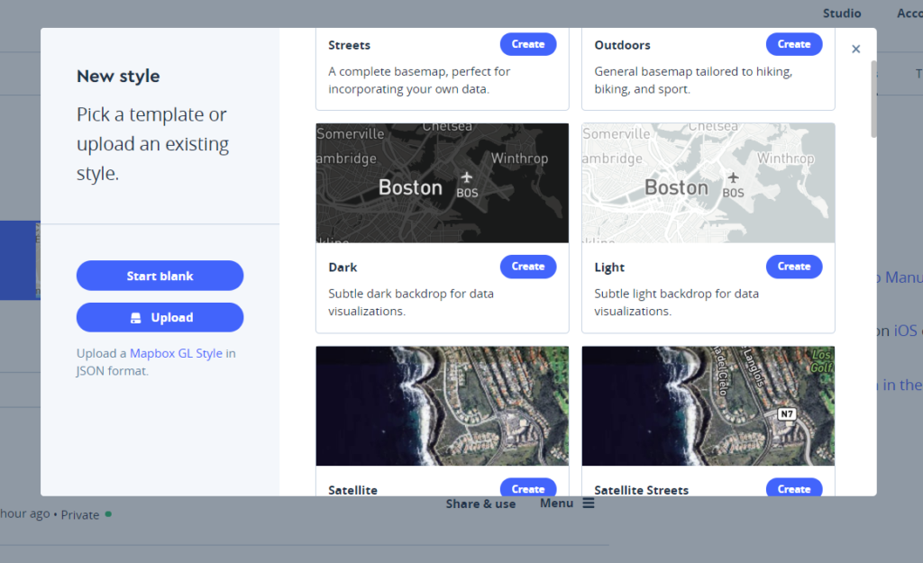
3. Peruse the various styles at your leisure, and select one.
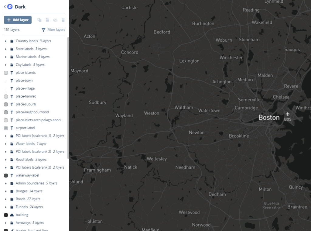
4. Within this pane, you can alter the various colours of the map layers, or any further adjustments you see fit.
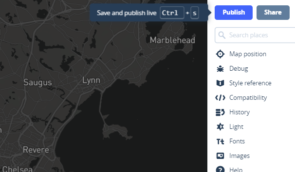
5. If you don’t make any modifications, you won’t be given the option to publish. You can skip to step 9 by clicking on the ‘Share’ option However, if you’ve made some changes you’ll have to select ‘Publish’ to maintain them
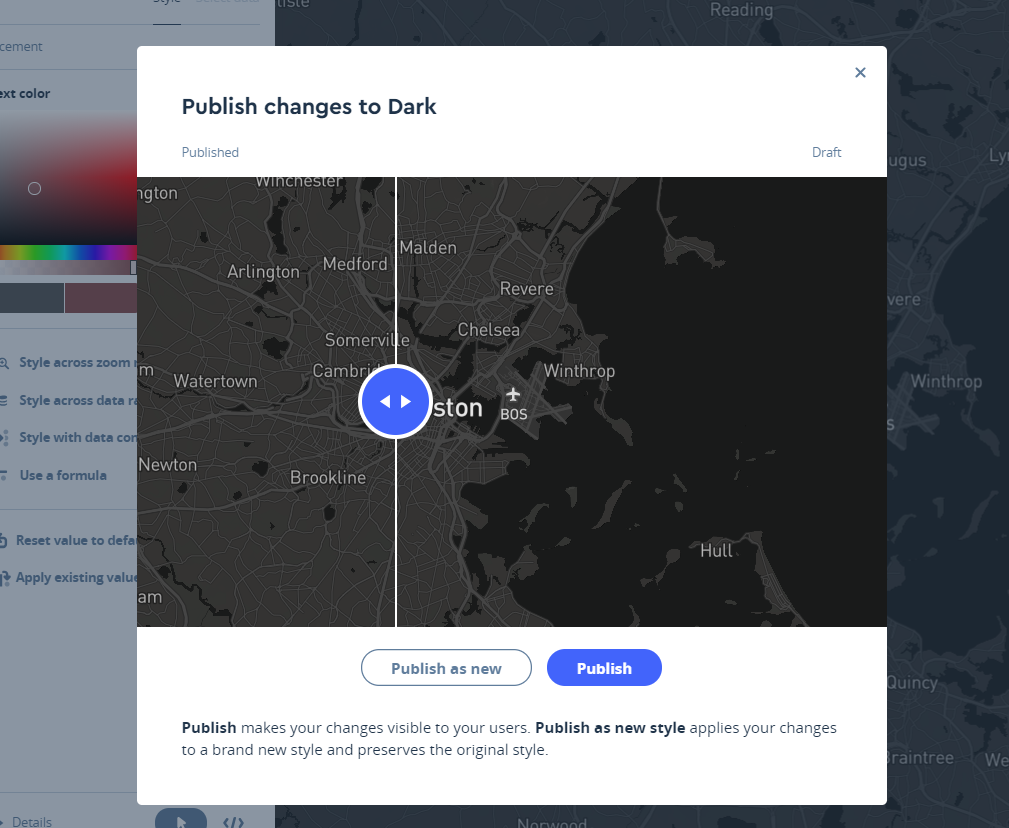
6. If you customised your map, you’ll see this view. Review your changes and select ‘Publish as new’.
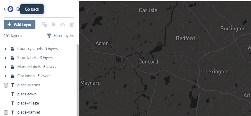
7. Navigate back to the earlier previous page after publishing – found in the top left corner.
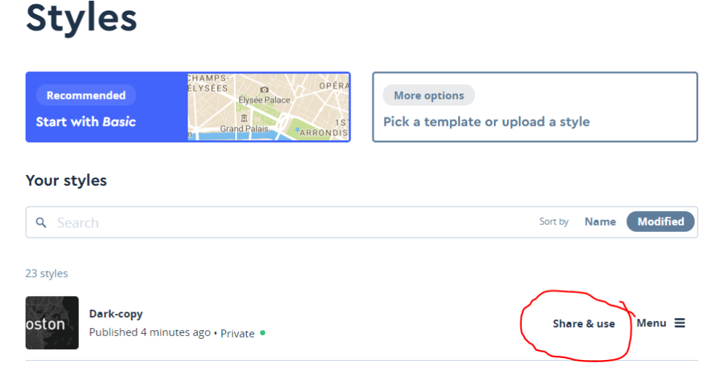
8. Select ‘Share and Use’.
9. Choose ‘Private’ followed by ‘Third Party’, then ‘Tableau’, and copy the URL provided to you.
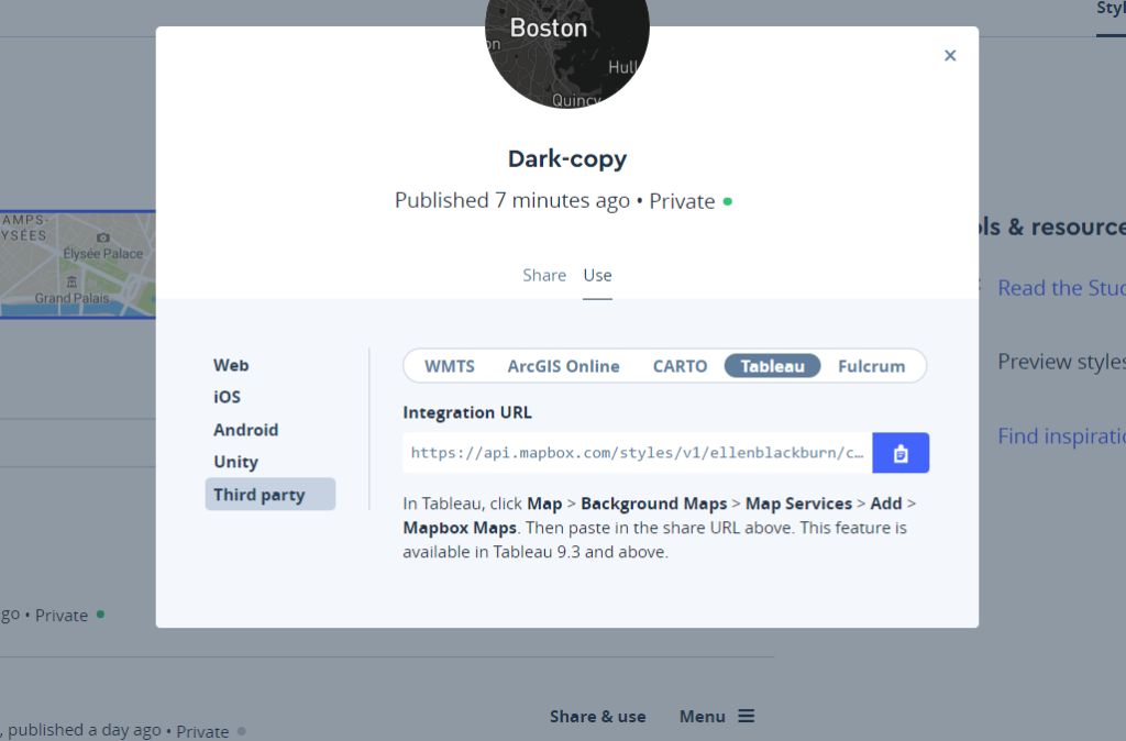
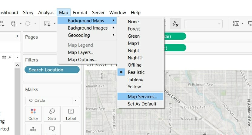
Go into Tableau, choose ‘Map’, ‘Background Maps’ and then ‘Map Services’.
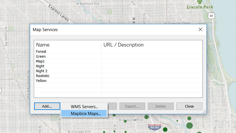
Within this pane, select ‘Add’ followed by ‘Mapbox Maps’
Name the map, paste the URL into the box provided, and the rest of the fields will be self populated.
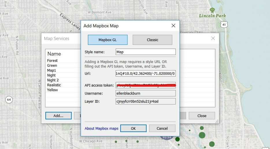
Press okay, and viola, you have a new map in your ‘Map’ drop down under ‘Background Maps’.
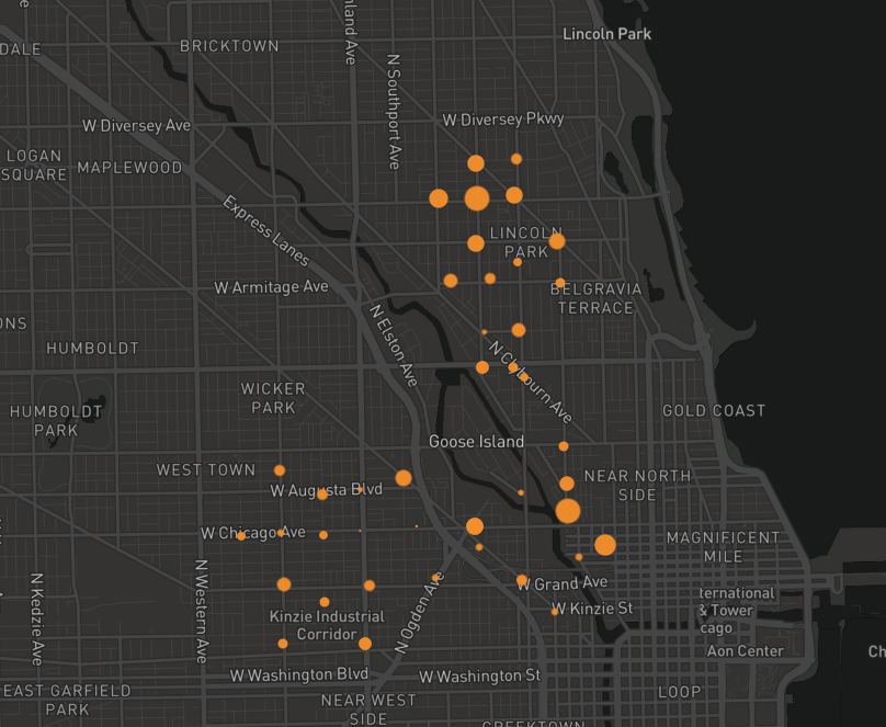
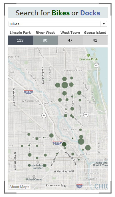
Given we didn’t get the data until nearly 6, this is what created; a dashboard optimised for a mobile device that shows available docks and bikes within four different areas within Chicago.
