During one of the last client projects we had at the Data School, I played around with the sunburst chart type and found it quite easy to build, so I wrote a blog post about it.
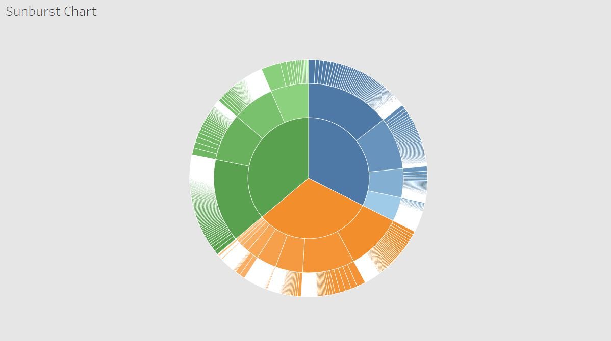
What are sunburst charts and what are they used for? Also called ring charts or multi-level pie charts, sunburst charts are used to depict hierarchy with the help of concentric rings, with each ring representing higher hierarchy levels from the inside out.
So let’s build together a sunburst chart using the Superstore data sample. As we all know, the dataset has a hierarchical data structure using Category, Sub-Category, and Product Name. So we will use these three dimensions to build our sunburst.
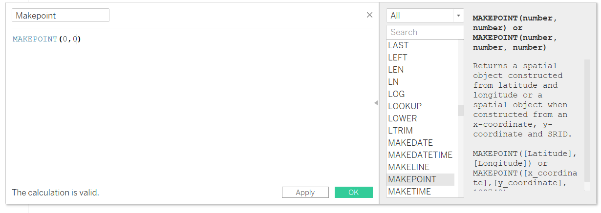
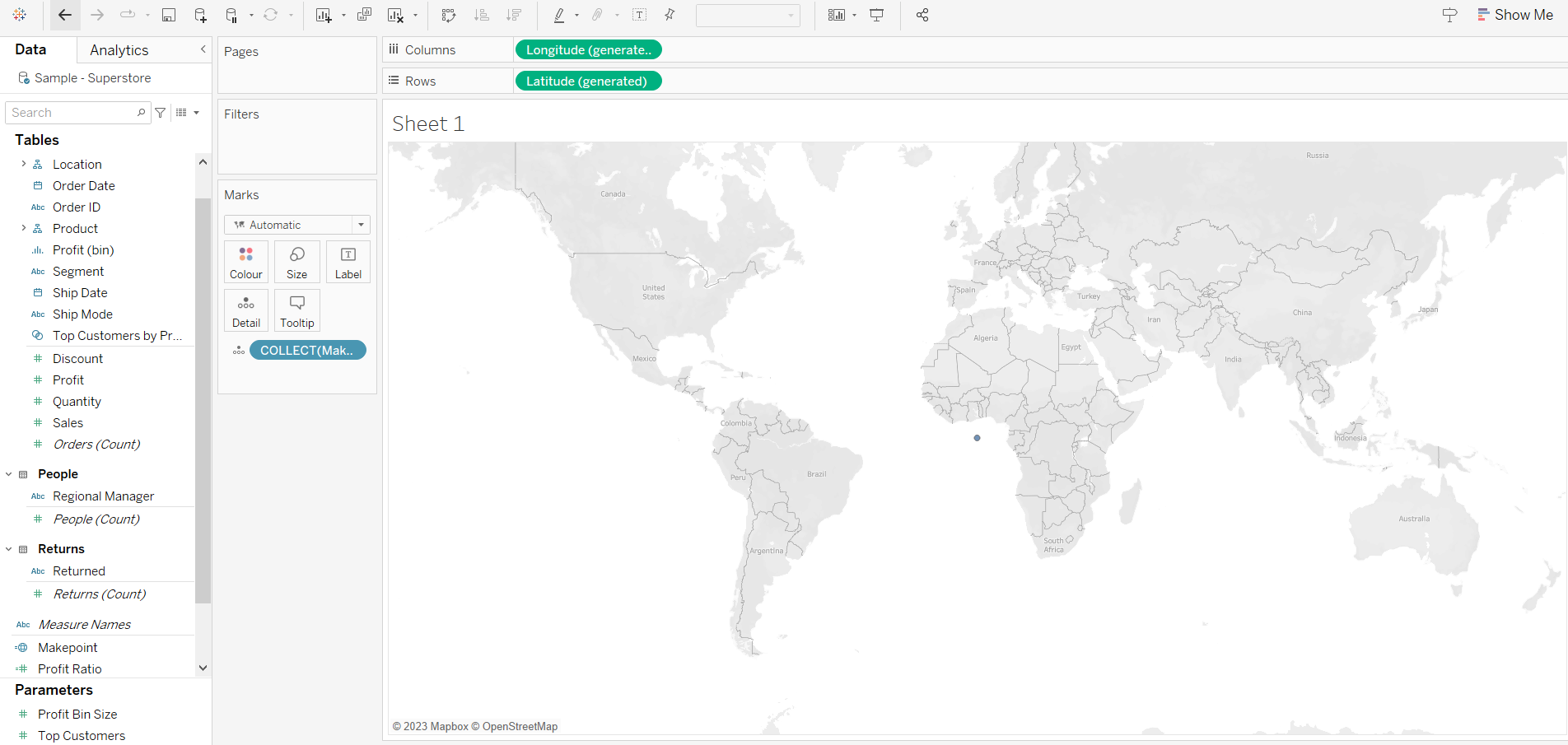
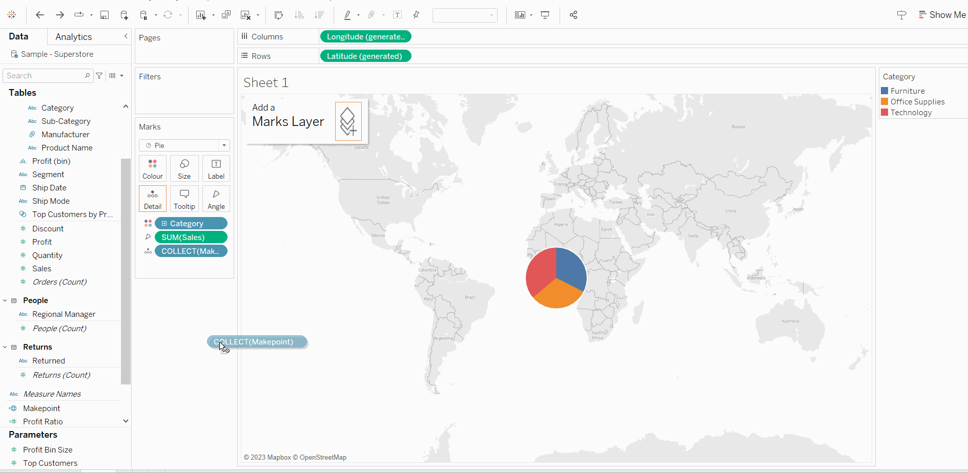
To begin, our initial step will be to utilize the Makepoint function to create a point. This point will be assigned longitude and latitude values, specifically 0 and 0 in this scenario. Following that, we will proceed to double-click on the recently created calculated field, thereby revealing the point's location at the center of our sheet.
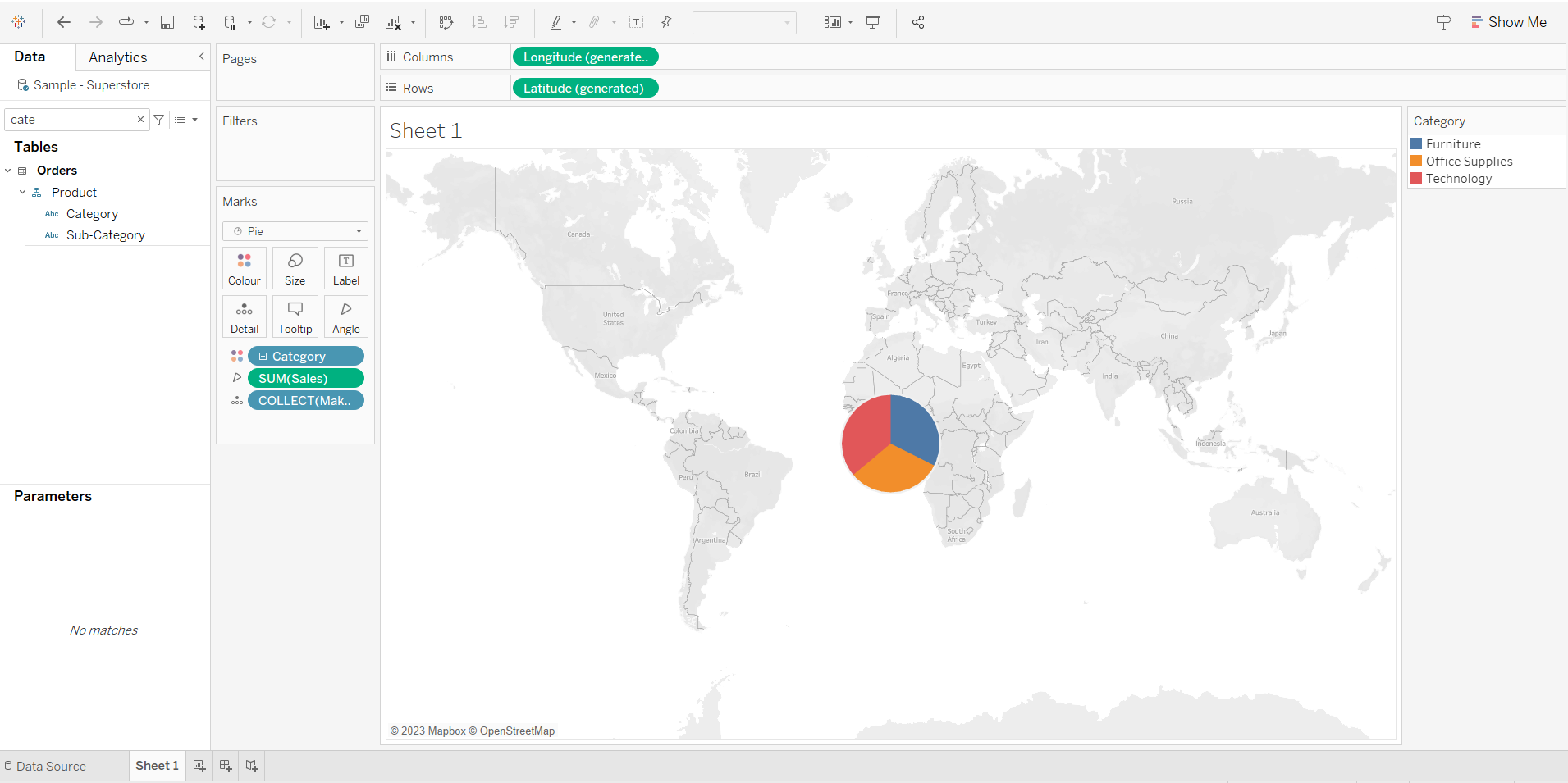
Change the marks from maps to pie, bring Sales to angle marks, and drag the Category into the Color marks. After completing the previous step, the pie chart will be generated, albeit at a diminutive size. We may use the keyboard shortcut Shift + Control and B to enlarge it. We can continue pressing this shortcut multiple times if we desire a bigger pie chart.
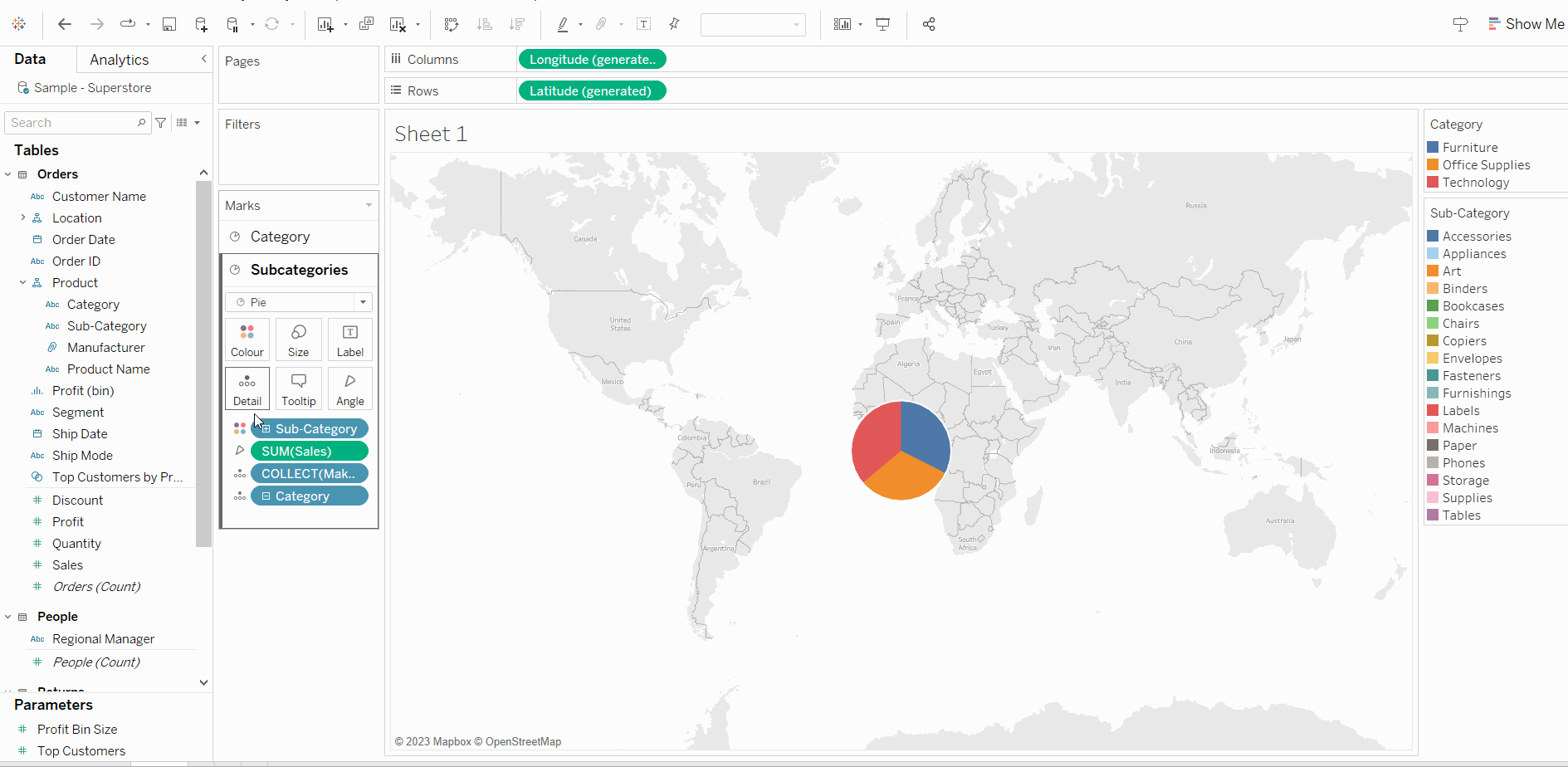
To produce an additional layer, I will move the Makepoint by selecting and dragging it, then integrating it into the marks layer. This process will result in the formation of a new mark layer positioned above the pre-existing one. Change the mark type to pie, add Subcategory in the color mark, and Sales to the angle mark.
Let’s rename this to Subcategories and change the order by dragging it down to have the subcategories on the outer circle. Let’s also name our first mark card to Category so we can differentiate it from the other cards.
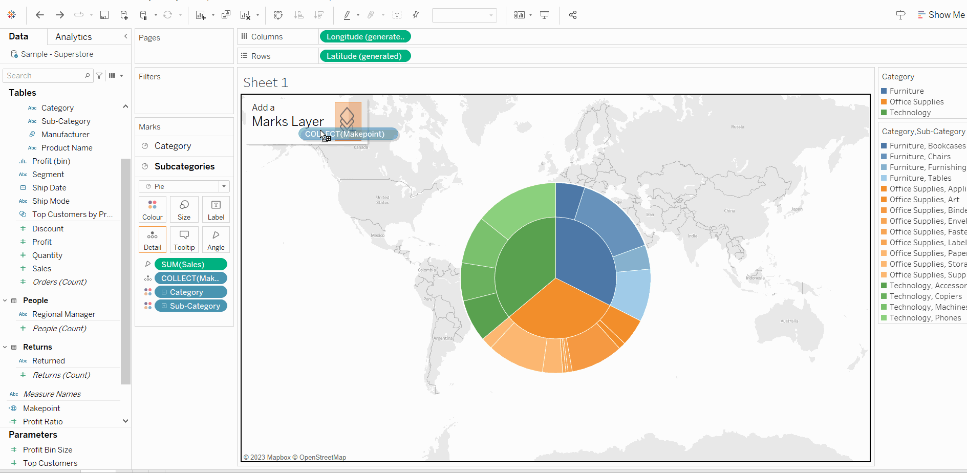
To ensure that the color coding for both categories and subcategories remains consistent, let's add the Category to the detail shelf. Click on the three dots next to the Category and change the mark type to Color. Drag subcategories just below the categories and increase the size of the pies to make them as large as you desire them. In the color shelf add white borders to the Category and Subcategories marks.
Let’s add another layer to our sunburst, using the same method as before by dragging the Makepoint field to the marks layer. We again see another mark layer created at the top. Let’s rename it to Products, change the chart type to pie, and drag the mark down to have the products in the outer circle. Bring Sales to angle, Category into color, Subcategory, and Product Name into detail. Click on the three dots and change them to color for both fields and drag the category so that they are all in order. Expand the size, and add borders to each of these products.
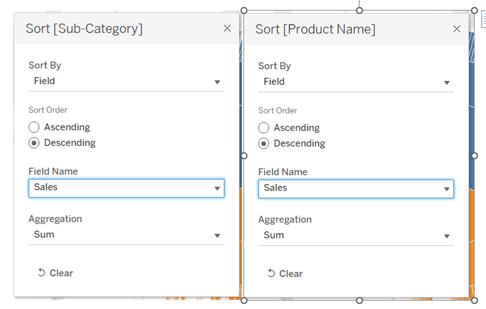
Now let’s do some sorting and formatting. First, start with the subcategories. Right-click on subcategories from the color and select Sort. Do the same with products.
We don't want the map visible in the background. To remove it, navigate to the "Background Maps" option in the map menu, and select "None". Let's also remove our gridlines, axis headers, and change the background to grey so that the chart looks much better.
And voilà, this is our sunburst chart. There are, of course, other ways to build this type of chart but I found this method quite easy to follow and understand.