


Tonight, I will be demonstrating how to build some dual-axis charts to my part-time students at Fullstack Academy. One of the charts I’ve included in my workshop is the bar-in-bar chart.
My first bar-in-bar chart was actually during the mock client project week. I glanced at Tristan Kelly’s dashboard, saw it for the first time, and wanted to recreate it immediately.

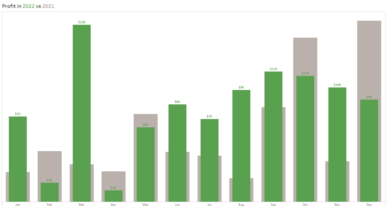
There are many ways of using a bar-in-bar chart. For example, you can compare two values, perhaps across some categorical fields. In the chart below, I am comparing sales and profits across years.

As I did in the mock client project, I like to use bar-in-bar charts to compare values of this year to values of last year.
I will walk you through two ways of creating this chart, one without a parameter and the other with a parameter.
WITHOUT A PARAMETER
1. Create a calculated field to determine values of the current year.
IF YEAR([Date]) = YEAR(TODAY()) THEN [Sales] END
2. Create a calculated field to determine values of the previous year.
IF YEAR([Date]) = YEAR(DATEADD('year',-1,TODAY())) THEN [Sales] END
3. Add these two calculated fields into the Rows shelf and Date (month as a date part) into the Columns shelf.

4. Right-click on the second calculated field and select Dual Axis.

The rows shelf will look different as a result.

5. Fiddle with the Color and Size in the Marks card to differentiate the two bars and create the bar-in-bar look.
WITH A PARAMETER
1. Create a parameter for the chosen year.

If you'd like, you can add more years to the list.
2. Create a calculated field to determine values of the chosen year.
IF YEAR([Order Date])=[Chosen Year] THEN [Profit] END
3. Create a calculated field to determine values of the previous year.
IF YEAR([Order Date])=([Chosen Year]-1) THEN [Profit] END
4. Add these two calculated fields into the Rows shelf and Date (month as a date part) into the Columns shelf.

5. Right-click on the second calculated field and select Dual Axis.
The rows shelf will look different as a result.

6. Fiddle with the Color and Size in the Marks card to differentiate the two bars and create the bar-in-bar look.
7. Lastly, let’s revisit the parameter. Right click the parameter in the Data pane and select Show Parameter.

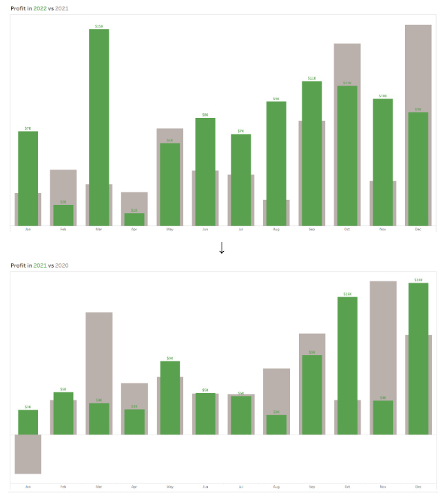
The parameter will appear to the right of the chart. The user can select a year from the dropdown.

FINAL NOTES
If you plan to use color in your visualization, be sure to incorporate a color legend. I like to do this in the title or subtitle above the visualization.
Similarly, if you plan to use a parameter, add context; include dynamic text of the chosen year and the previous year. For example, when I select 2021 as the Chosen Year, the title above the visualization reflects this change.
The title is dynamic because I included the parameter and a calculated field called Previous Field, which is simply [Chosen Year]-1. This is what the title looks like:

Although this is my favorite use case of bar-in-bar charts, what are some ways you like to use these charts?