


I have been taking a lot of certification exams recently. Sometimes, I need a break from studying and when I do, I like to complete Alteryx challenges or Back 2 Viz Basics (B2VB) prompts.
I learned about B2VB from my colleague, Annie Casey, during the first week of training. It is a community project that helps Tableau users - of all ability levels - practice some of the basics to form or rebuild the foundation for data visualization.
Although I knew of this Tableau community project, I didn’t participate in it until more recently, for the B2VB x Data Pride challenge for Pride Month, as seen below:

This week, I completed a few more B2VB prompts and I have really enjoyed the process. Each challenge focuses on a different topic, such as a specific chart or visualization feature. This gives me the chance to just build a chart with minimal bells and whistles and for that reason, I find it quite relaxing!
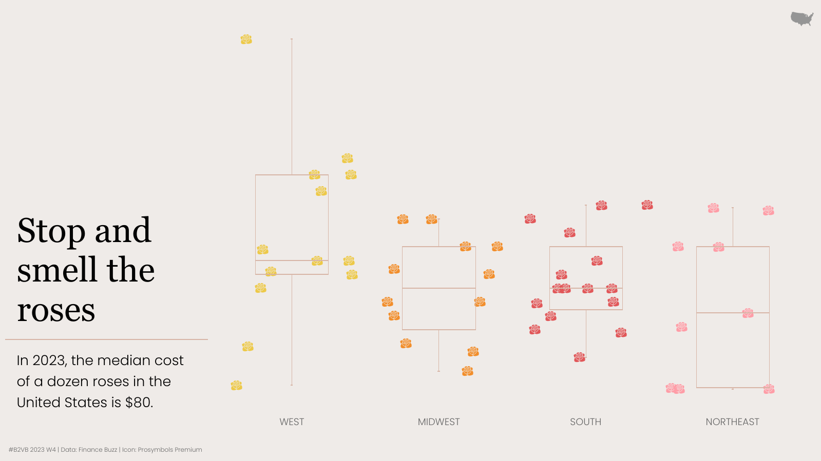
Stop and Smell the Roses
I was drawn to the prompt, Build a Box and Whisker Plot. I like boxplots for displaying the distribution of data and it’s rare I get to create them in my everyday life. Further, due to the topic of the dataset (the price of one dozen red roses in each US State in 2023), I could employ a custom shape of a rose here!
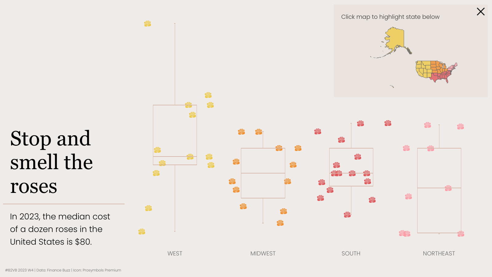
After building my jitterplots, I decided to add some functionality with a map that can be tucked away using a show/hide button. By clicking a state in the map, the corresponding data point in the jitterplots will be emphasized in size.
African American Museums
I have already built a map through B2VB, but I could not resist developing another - this time the prompt was Build a Symbol Map of African American museums in the United States. I built some big numbers and a symbol map; still, I wanted to do more.
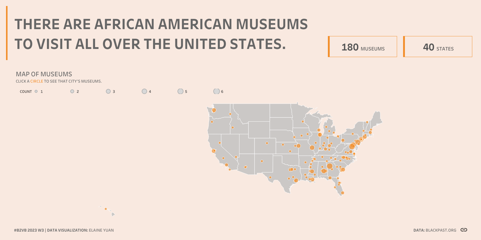
For example, I wanted to include a list of museum names and incorporate URL actions for users to visit the websites of these museums. In fulfilling these desires, I also employed set actions and dynamic zone visibility!

Female Nobel Prize Laureates
When I saw the prompt of Visualize Data in a Timeline, I thought of a circle timeline. As my cohort-mates know, I’m fond of circle timelines. They remind me of abacuses; therefore in this challenge, I decided to lean into that visual. I built the abacus part of this visualization in a few containers and included a viz in the tooltip to list the female laureates.
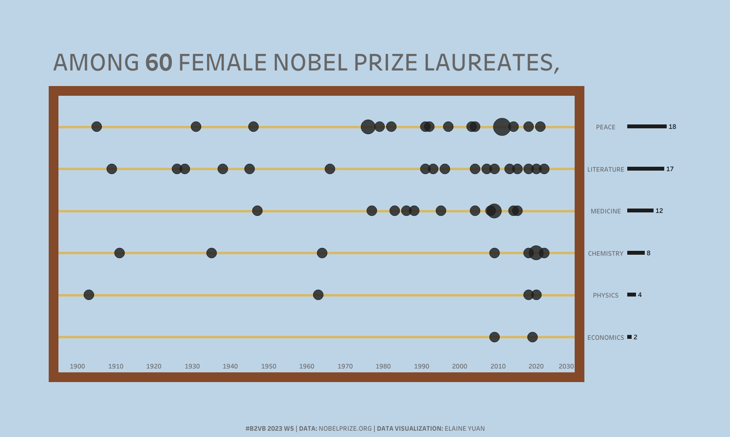
My intention was to create an abacus from a circle timeline and I did it!
Although I am drawn to the serene, easygoing nature of B2VB, I know I need to keep challenging myself with Makeover Mondays and Workout Wednesday. If I ever need a re-viz-it of a chart type (or a little distraction), I’ll be sure to return to B2VB!