


I love the snacks in the Data School New York office. There is a wide selection to choose from, from healthy and sweet fig bars to crunchy and salty potato chips. (If you plan to apply to DSNY, know that you will be well-fed here with our well-stocked snack pantry.)
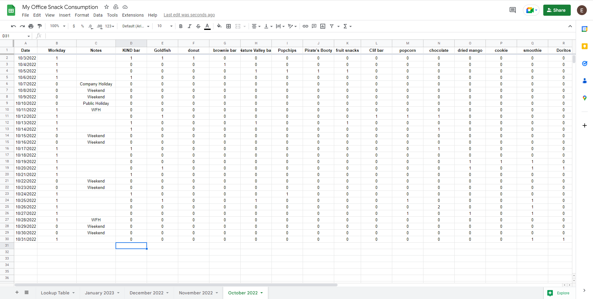
Knowing about the buffet of snacks in the office, I decided to track how many snacks I ate during training in Google Sheets. At the time, I decided to organize my data in a wide table:
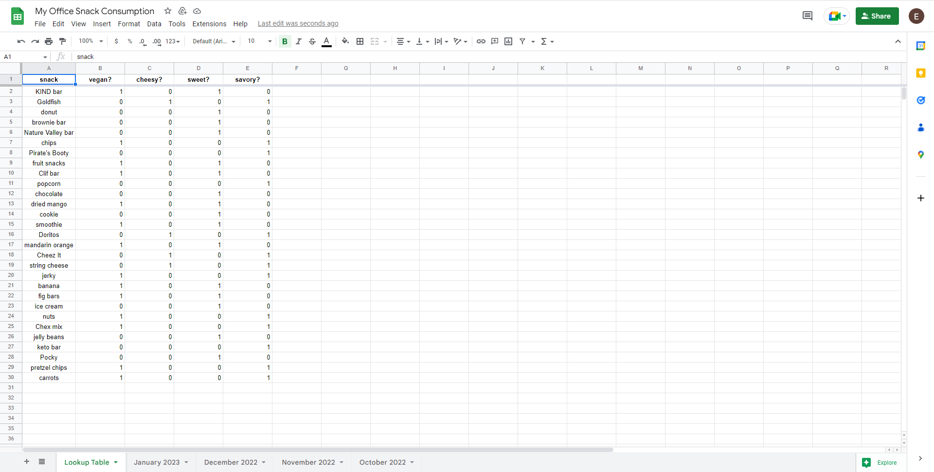
Recently, I added a lookup table to supplement my data. This table would flag the snacks for different characteristics, such as whether they are sweet or savory.
I brought the data into trusty Alteryx to transpose my data into a tall table and clean it up for Tableau. This is the resulting workflow:

I ultimately created two output files:
- In “OFFICE SNACK CONSUMPTION,” each row or record of data was an eaten snack.
- In “TOTAL SNACK CONSUMPTION,” each record was a day and its count of snacks eaten.
My data was now ready to be brought into Tableau to visualize. I wanted to see what kinds of snacks I gravitate towards and if I stress ate during certain times of training. I also wanted to create a calendar in Tableau - I have never built one and this was my chance!!
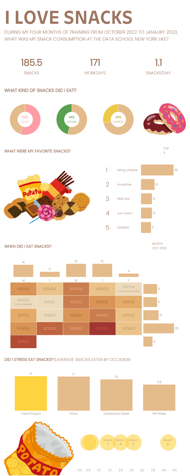
In my first design on the dashboard, I built a tall infographic dashboard. I like to build from top to bottom in this manner to structure the narrative of my dashboard.
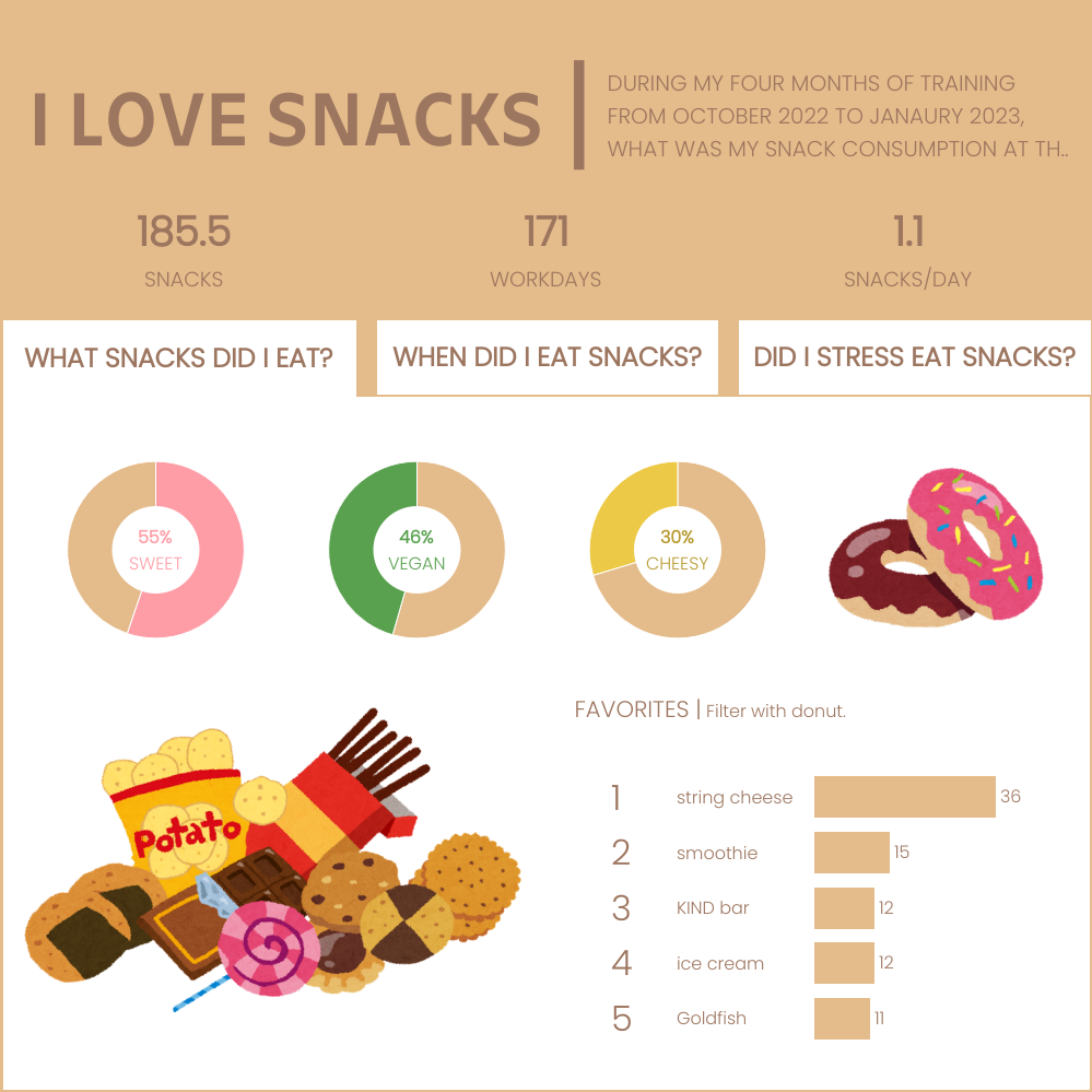
This is a tried and true method of visualizing data for me. Thus, I wanted to redo this dashboard. I recently practiced dynamic zone visibility in a TIL+ project and therefore, wanted to implement it here as well!
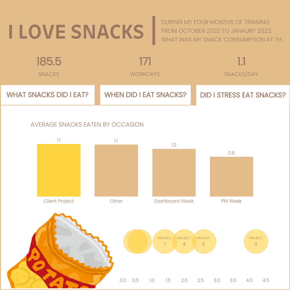
I created a dashboard with three question tabs:
- What snacks did I eat?
- When did I eat snacks?
- Did I stress eat snacks?
As seen below, the default view is the tab, what snacks did I eat?
The user can click on another question tab and new visualizations with answers will appear. For example, the view changes when the user selects the tab, when did I eat snacks?

The view changes once more when the user selects the tab, did I stress eat snacks?
(Note that the three tabs are not Tableau navigation buttons to three separate dashboards. This is a single dashboard with dynamic zone visibility, parameter actions, and filter actions to give that impression of smooth navigation. Read more about dynamic zone visibility in my colleague’s blog post here.)
Although I was particularly excited to build my calendar, my favorite visualization of this dashboard is my potato chip strip plot. Although this may not be the best way to visualize the average snacks eaten in client projects, I like how kitschy my potato chips are next to the potato chip bag.
I was surprised to see that more than half of my eaten snacks are sweet, rather than salty, and that my most frequently eaten snack is string cheese. I was more surprised to see that on average, I consumed more snacks during client project days and consumed less snacks during my PM days. Furthermore, on client project 3, when our team was given data in the form of PDF files and PowerPoint slides, I ate an average of 4 snacks a day!
I was very much looking forward to this post-training personal project and I’m very pleased with the result.