


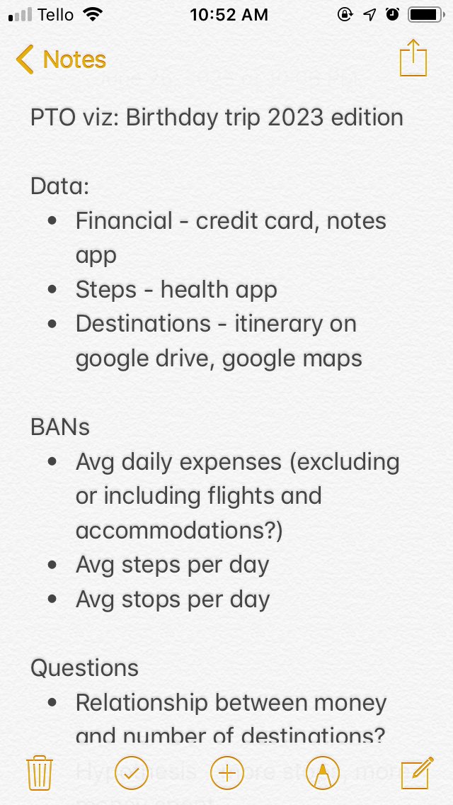
Ever since my training at the Data School, I have been empowered to visualize data in my everyday life. On my week-long birthday trip last month, I thought about how I would represent my vacation and in my downtime, like at the airport or on a flight, I brainstormed ideas on my phone:
After I returned to the office, I started organizing my data into the following spreadsheets:
- Step Count
- Expenses
- Airport Itinerary - in case I wanted to make a network/spider map
- Calendar - in case I wanted to create a calendar
- General Itinerary - a summary of each day’s activities
- Specific Itinerary
I had the addresses of most of the places I visited, but no latitude and longitude coordinates. I needed a Geocoder to input addresses and output coordinates. In my research about geocoding in Alteryx, I came across this blog post: https://www.theinformationlab.co.uk/2017/01/23/geocode-addresses-alteryx-google-api/
I followed the steps given and ended up with resulting workflow:
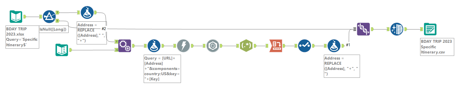
There were some inaccurate coordinates because of lacking addresses. There were only 65 places in my dataset and hence, I could manually correct the coordinates. (I would NOT recommend this if there were a greater number of records.)
After retrieving the coordinates from the Google Maps API and cleaning up that data, I opened Tableau to design my charts. Once I had a sense of what visualizations I’d like to include in my dashboard, I mocked it up:
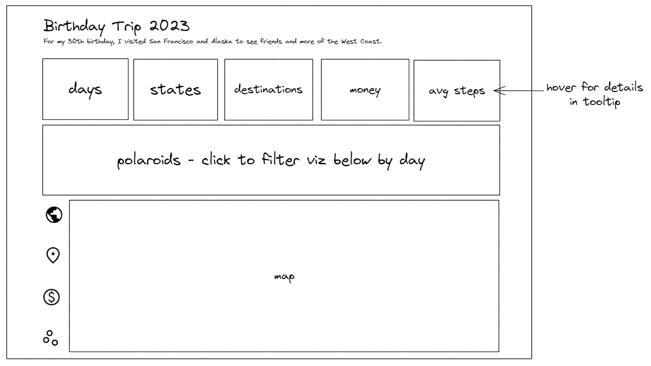
Satisfied with my mockup, I returned to Tableau and built a new dashboard. In the dashboard, I:
- Added tooltips for all the big numbers
- Established a filter action from the polaroid pictures to the visualizations below
- Employed dynamic zone visibility to navigate between the “dashboards”
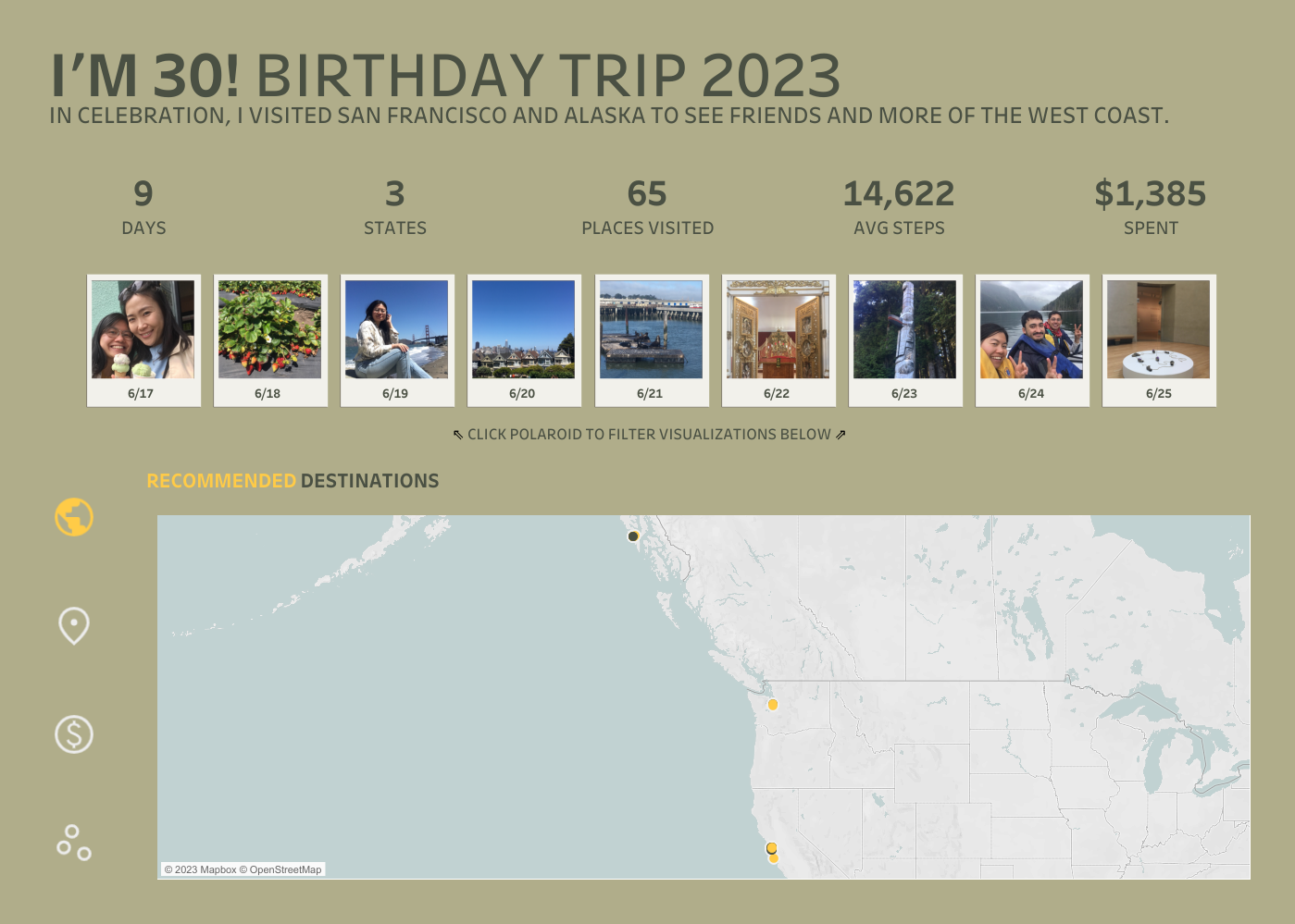
Interact with the dashboard here: https://public.tableau.com/app/profile/yuan.elaine/viz/Im30BirthdayTrip2023/Dashboard
I love working on personal Tableau projects, like this one, that document my life. As I complete these projects, I will be sure to share them on this blog, on my LinkedIn (yuanelaine), and/or on my Twitter (@datadrawnYuan).