


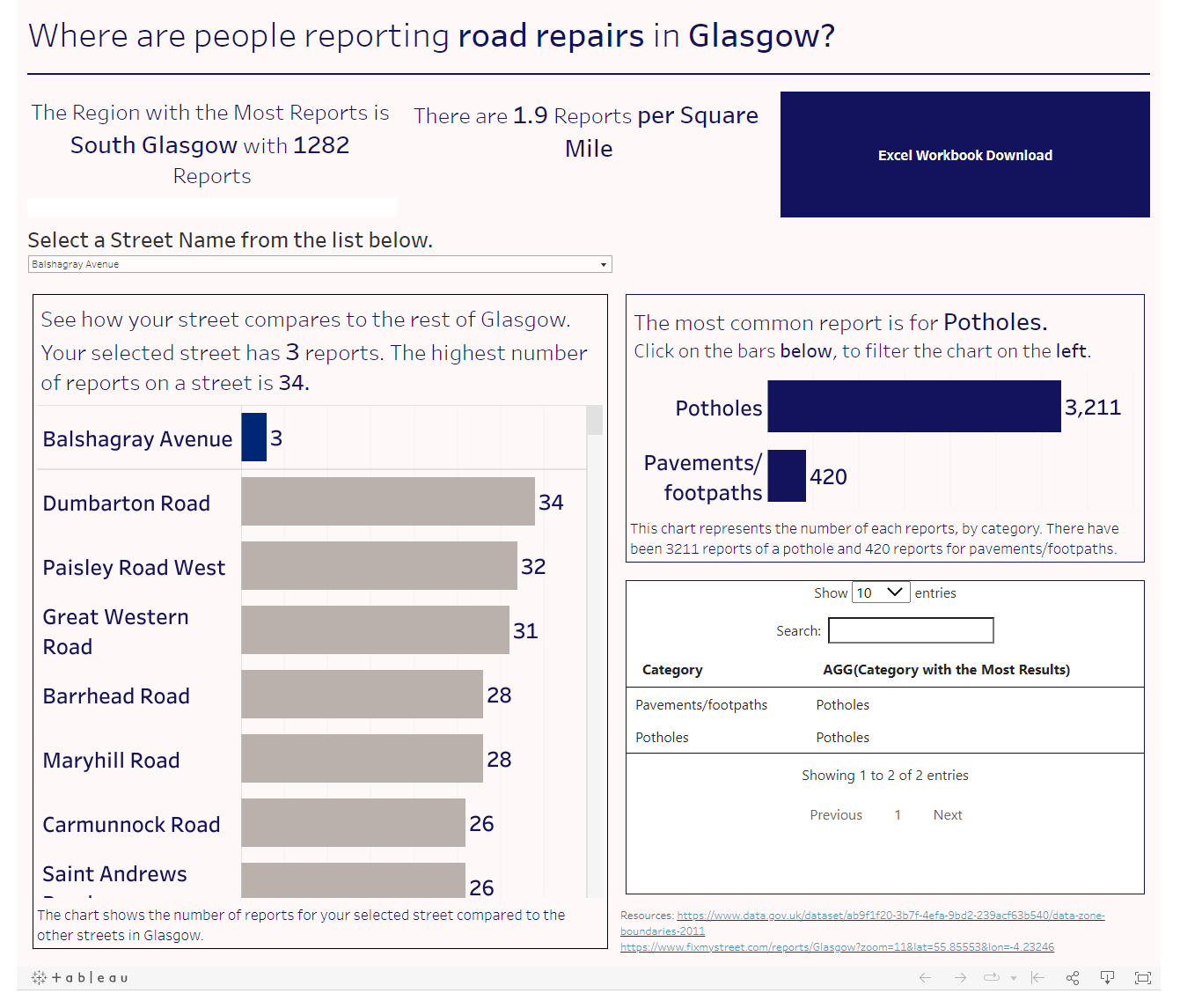
The first dashboard for dashboard week was based on street repair data in Glasgow, the aim of the dashboard was to help people who may have difficulties navigation existing interfaces.
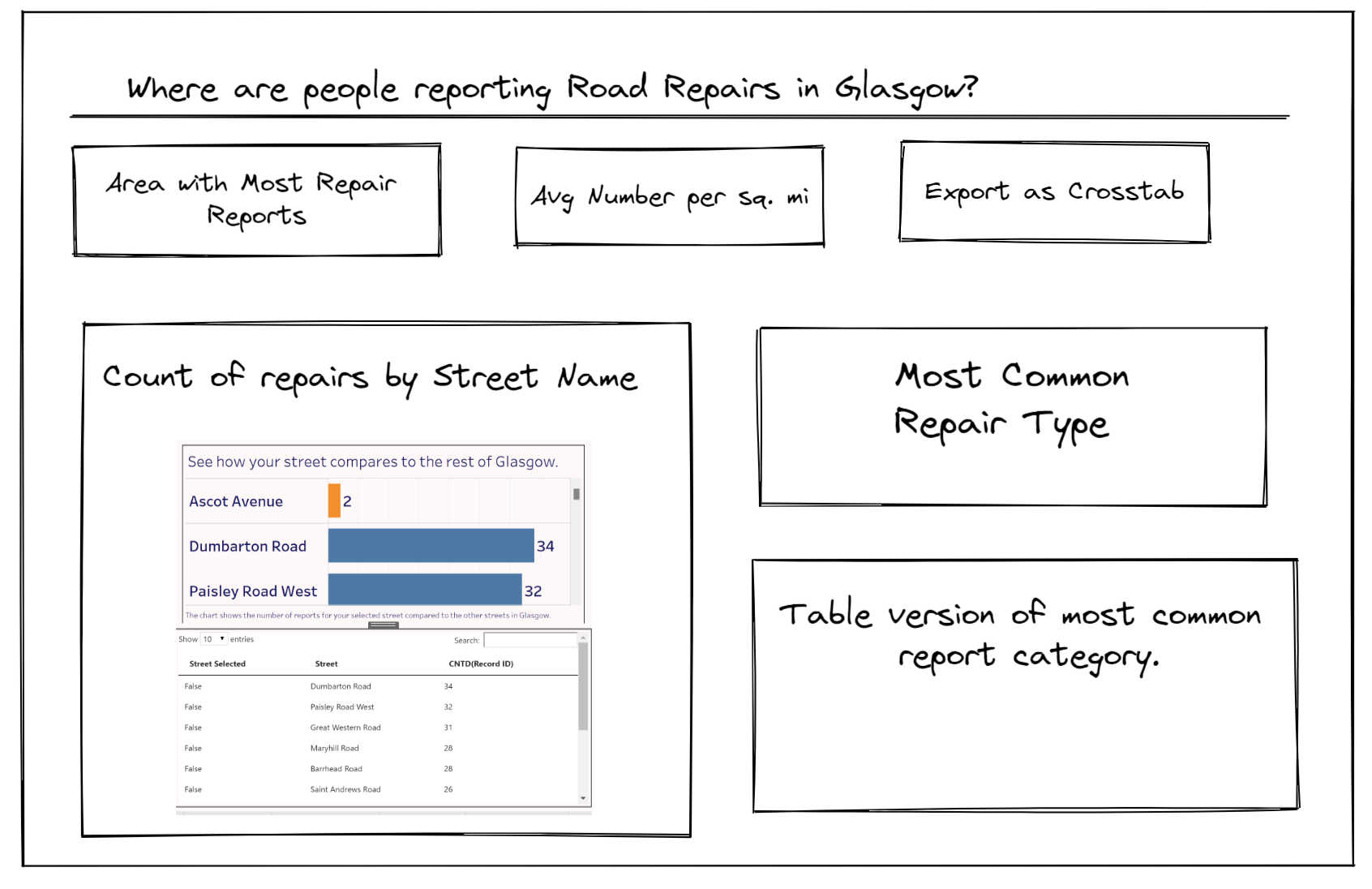
I started with a brief sketch on what I wanted the dashboard to look like and outlined the intention to import a new data source with some more geographical data based on the individual zones (Like boroughs), which make up Glasgow.
Advantages of my design:
The colours of my text and the backgrounds are well contrasting, as checked using Coolors.co
The sizing of all the text is a suitable size for those who may be visually impaired.
The extra data set added some context to the density/frequency of the reports.
The captions and titles of the charts give meaningful context to those who may be using a screen reader.
Limitations of my design:
The map functionality did not work as intended, meaning the dashboard was very generalised.
Some of the dynamic titles did not update properly when they were filtered.
https://public.tableau.com/app/profile/edhughes/viz/GlasgowStreetDatawaccessibility/MainDashboard