


I thought I would write a final training blog collating my Dashboard Week efforts into a final dashboard - giving them a rating, things I liked about them and things to improve.
Collating Dashboard Week Activities:
Day 1: Make an Alteryx App that updates a Tableau Public KPI Dashboard:
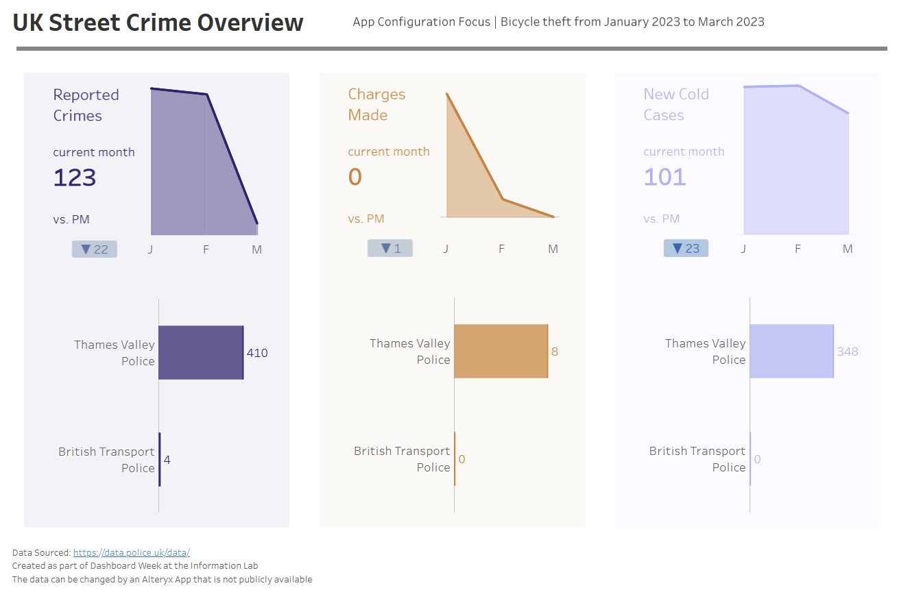
Overall Grade: 6
Positives:
I think I was happy originally with this on Monday, I managed to complete the core challenge of the day and my locally stored app still updates the app as intended. I also like the core KPI metrics.
Improvements:
I am more bearish on the KPI formatting and feedback rightly pointed out that adding the change values does not mesh well with an App in which a user can specify a single month. The same applies to the sparklines with this logic. I also now think that the bar charts were not achieving what I wanted: I think a simple density map across the bottom would better communicate the area that the app is currently set on. I could then have changed the measure with a parameter and colored accordingly.
Day 2: Recreate a Coaches Tableau Dashboard in PowerBI
Overall Grade: 9
Positives:
I would say this was my Dashboard Week Homerun, the topic area is one I was very curious about and I think I would be interested in returning to this and switching it to an extract refresh to keep the data up to date. I loved recreating the look and feel of the original using a different tool.
Improvements:
The gantt was a real disappointment, perhaps if I intend to set the report to refresh weekly I will also spend some time re-imagining that chart to be more powerBI friendly - primarily I need to communicate the certifications someone has and how long till they expire. It could also be improved by creating a lookup table for the badges that assigns them a consistent order to improve readibility.]#
Day 3: Choice of NASA API and Dashboard
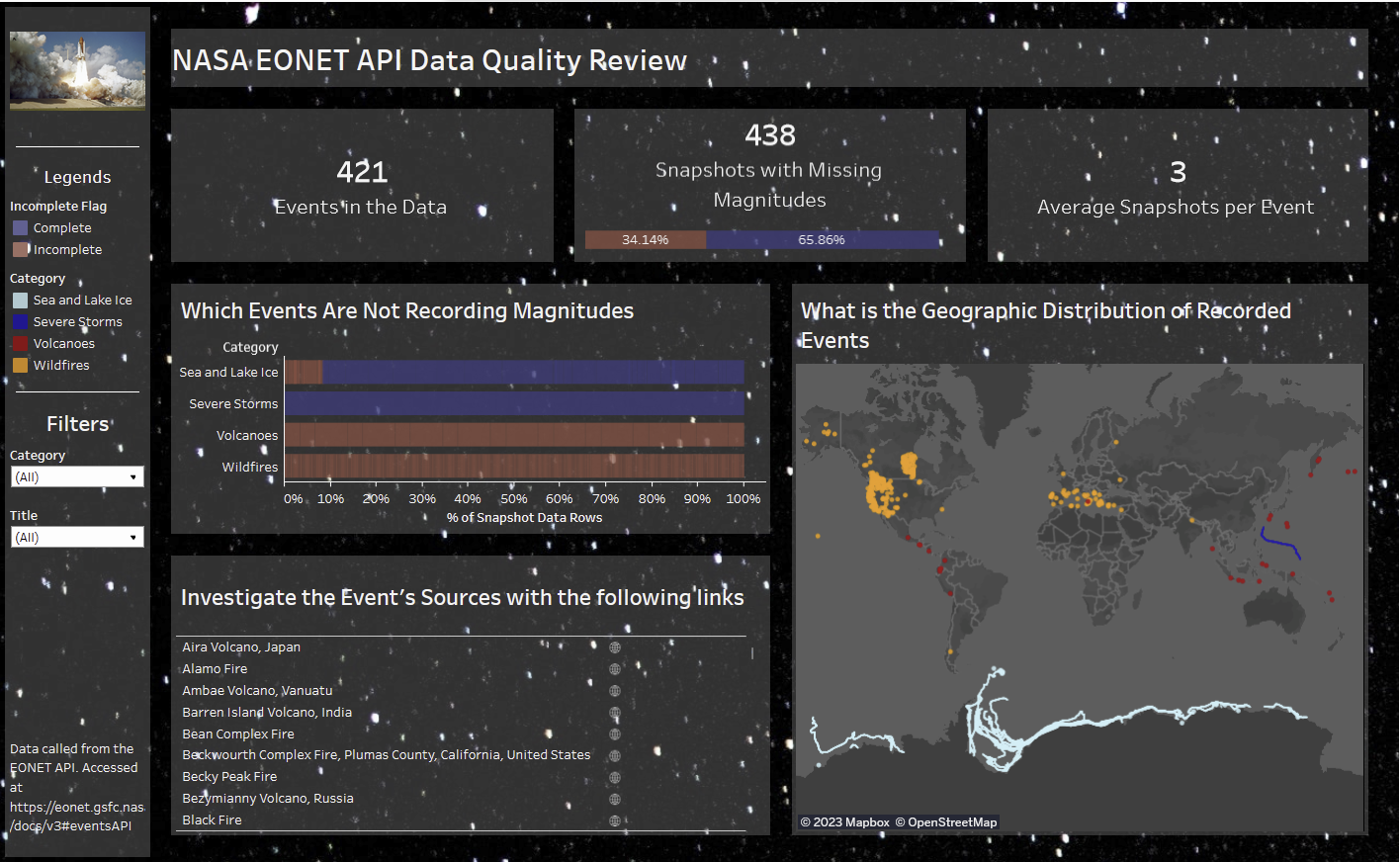
Overall Grade: 7
Positives:
This one has grown on me a bit - I enjoyed playing with using an image as a backround and the subject matter was interesting particularly the spatial information. The strong use case and user story for the dashboard appeals to me as well. i think my intial skepticism at what I produced was fuelled by the fact it was meant to be exciting data and it seemed a bit boring to turn it into a data quality review but I have been swayed by the content in it - although not great it is absolutely servicable and in a day I think that is a good result.
Improvements:
On reflection, I need to go back to my API call and troubleshoot to pull through all the data. I am missing events marked as closed so it should be simple to fix - and it might need an iterative macro to deal with pagination (a man can hope).
Day 4: Boybands Dashboard
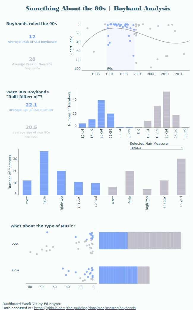
Overall Grade: 7
Positives:
For the grand finale, lots of my colleagues went for producing a fun and quirky dashboard. I like that I returned to our roots in making an application style viz. It is not perfect but there are some insights in there and again a use case that I think is communicated well, with a comparison theme motivating it. I think that to produce this in 3 hours was a pretty robust effort.
Improvements:
Adding the option for the user to select the comparison group with a set action is a simple addition that would make the dashboard more dynamic. Likewise movign away from vertically orientated axis ticks would be a simple formatting improvement. I think the opportunity to return to my original correlation idea with a matrix and scatter plot would perhaps help facilitate comparison rather than sticking to the simple histograms and bar charts in the middle.
Dashboard Week Overall
I think overall I achieved a few key objectives in the Dashboard Week that I wanted to achieve. Scope well and not get caught out with little to show at the end of the day. Strongly consider use-case and user-story in everything that is delivered. Enjoy the pressure and opportunity to produce something in a small window of working time.