


In this blog I want to provide the fundamental knowledge for why Tableau acts the way it does. The purpose is so that new users can have a clearer vision of achieving the visualizations they want quickly. When we load up Tableau, connect to our data source, and open a sheet to begin analyzing; we are confronted with a blank screen. This blank screen has promoted lots of the creativity we see on Tableau Public where people with familiarity of the tool and a vision of what they want to create can get to work.
For new users the story is more challenging. The blank screen does not give a clear start point. One of two options is to play around and experiment - effectively trial and error, fun for someone who is passionate about visualization but a burden for someone who just wants to get a report together. Thus a blog that can explain the basics will be useful to get these new users “thinking like Tableau”.
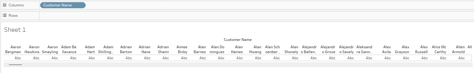
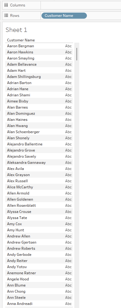
At the fundamental level we have both the columns and rows sections that serve to organize information on the sheet. They are organized with the logic of a table so columns organize data horizontally whilst rows organize data vertically.
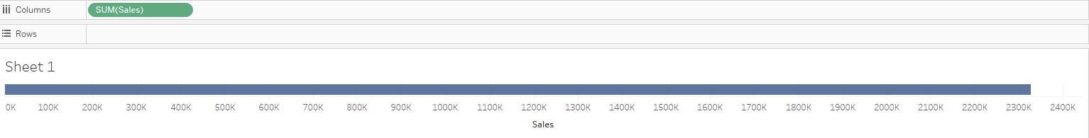
This is less intuitive for when we want to make axis as we would associate row with an x axis but if we break it down an axis is measuring something and therefore when you think of reading something off an x-axis you read down (or up) to the axis - like you would read up to the top of the table to get a field name. Thus an x-axis would be generated by putting a measure (I'll breakdown this term later) in the columns section.
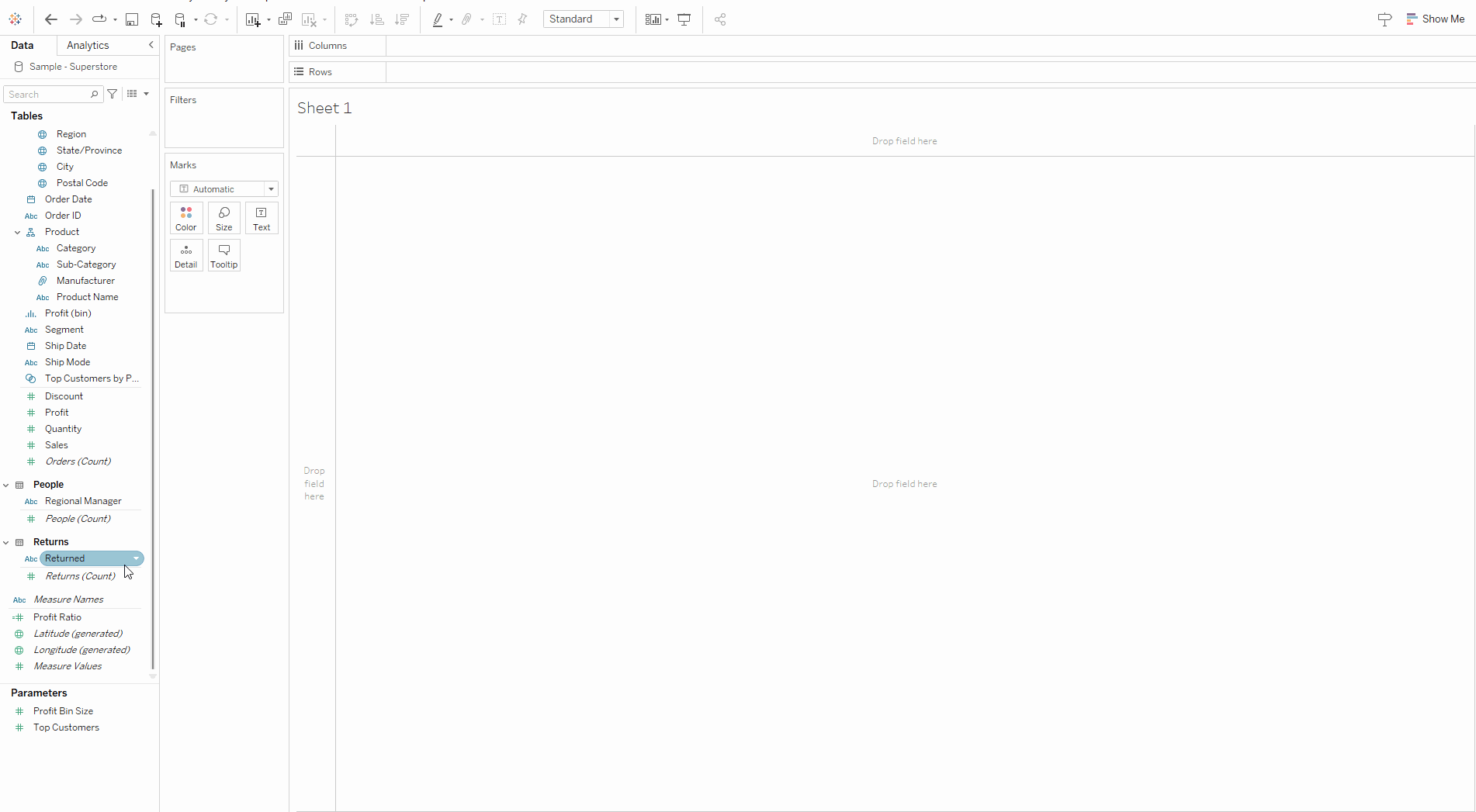
Turning to the data shelf:
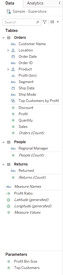
What we observe is a list of the categories and measures in our dataset with icons detailing the data type of a given measure/category. The data type is going to impact the way Tableau automatically attempts to visualize. Dragging a geographic field into the sheet is likely to generate a map assuming geographic data can be matched up with Tableau’s internal geographic information.
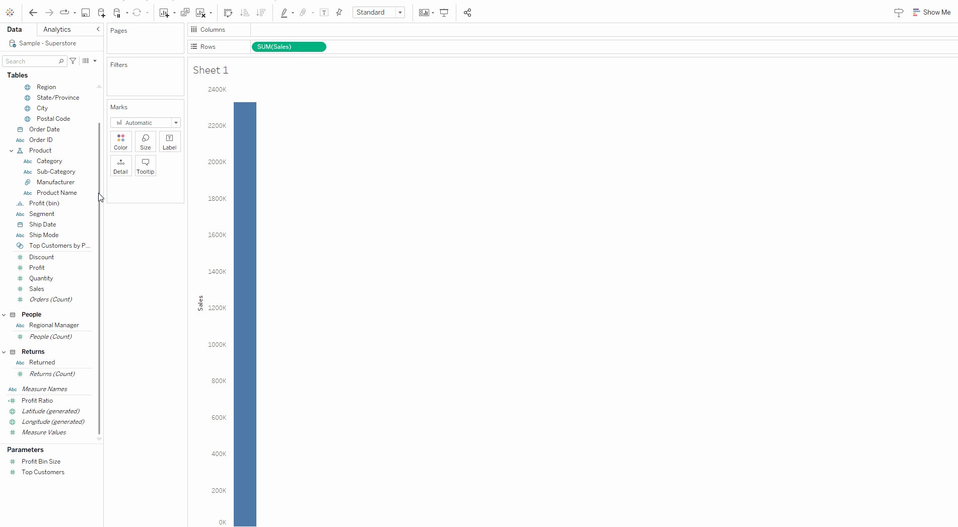
Now addressing the colors of pills: the colors are a powerful because understanding them goes a long way to anticipating their impact on a sheet. Green pills are continuous fields and therefore when placed in either the rows or columns sections generate an axis for that measure. For sum(sales) an axis upon which number of sales can be measured against (the measuring axis of a bar chart for example.
For a continuous date (green date): an axis that spans the duration of the period (think the time axis of a line graph). Following you will notice that the date in this dataset is discrete by default - with a right click drag I can instruct Tableau to treat it as continuous and set up my axis.
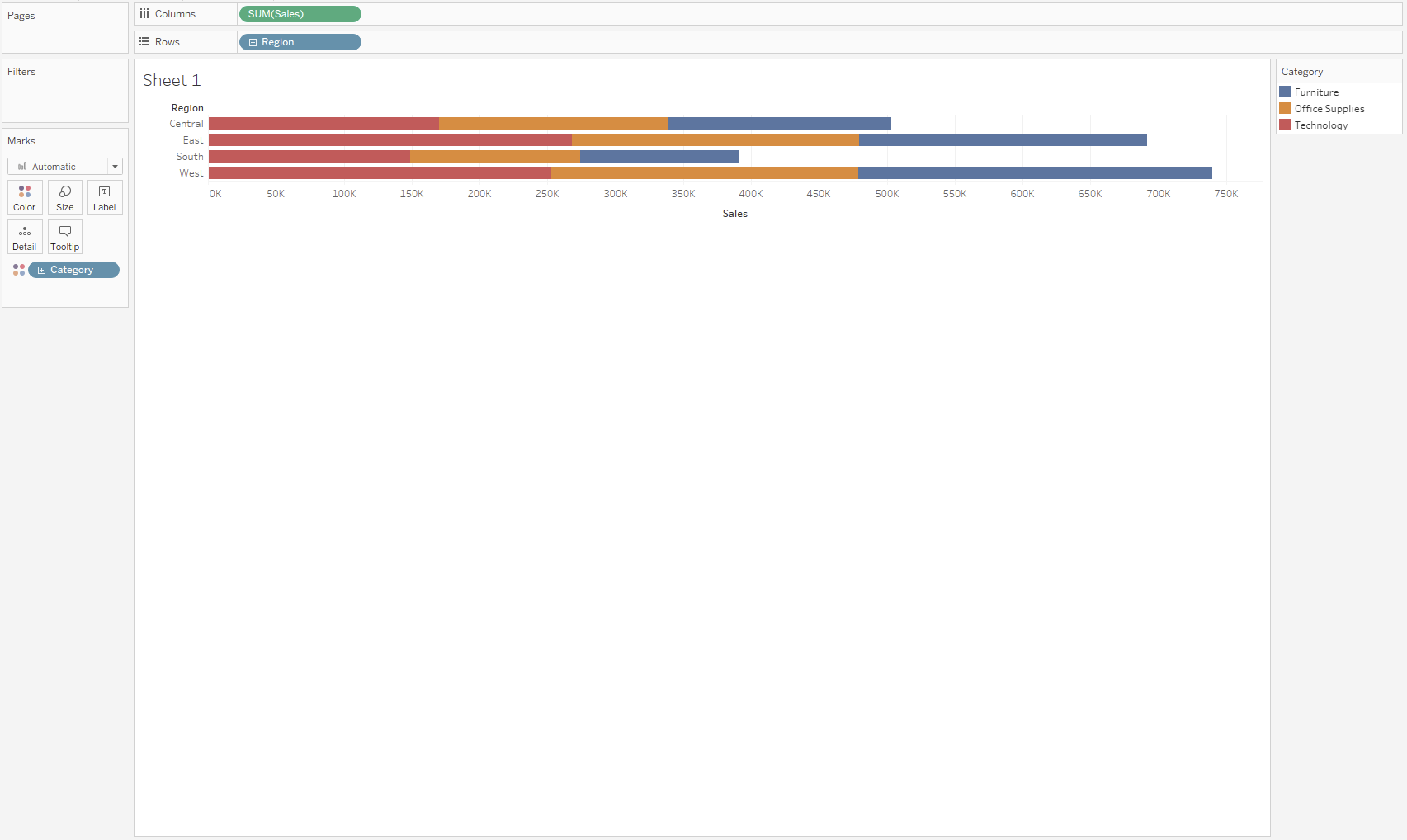
The blue pills are discrete and therefore breakdown data further. So dragging a blue field like category into a row or column whilst the other has an axis is going to breakdown the measure by the category. Adding another blue pill will break it down again (for each unique combination of category).
It also makes sense to address how Tableau thinks of measures. Tableau naturally wants to aggregate - notice when you drag sales into columns it defaults to sum (you can right-click drag for more options). This then gives the user the ability to breakdown this aggregation in whatever way they like with blue pills. The marks menu is a means to supplement the existing framework of the view with additional information perhaps determining color based on a category. Here we have a mark for every unique combination of category and region.
Hopefully the above blog gives new users the basic knowledge of how Tableau functions and sets up a foundation for expanding knowledge to more advanced techniques.