


In this blog I hope to explore the relationship data model that is an option within Tableau. I will be using Alteryx workflows to try and unpack what happens when we attach two tables with "a noodle" in Tableau.
First, setting the context, we have two datasets, sales information at the daily level for 5 companies and monthly sales targets for the same 5 companies in a different table. First we should notice that the level of granularity in each table is different - in the sales table each row is a daily value whereas in the target table each row is a monthly value.
If we consider the following the view we want to produce in Tableau:
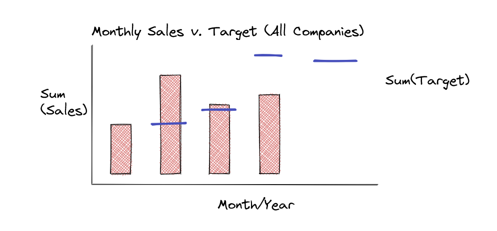
Notice that for the chart we have bars for the months where we lack targets and targets for months that do not have updated sales yet. This is a useful observation for the join logic later on. The other observation that needs to be made at the start is the granularity of the dimension on the x axis - in this instance Month/Year.
The key takeaway for unpacking the relationship data model is that aggregation occurs before the join and we can explore this in an Alteryx workflow. Effectively we will need to aggregate the sales data to the same granularity as target given that is what we have on the x-axis and then returning to the bar observation use a full outer join to bring in the rows with only one of the measures.
Expressing this logic in the form of an Alteryx workflow:
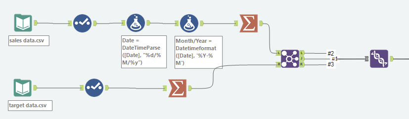
Now we can address the component parts of the workflow:
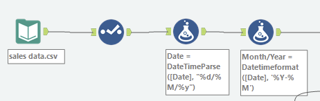
First we use a select tool to ensure we have the correct data-types for aggregation later and then get to work getting the string date into the correct form - with the first formula we get Alteryx to recognize it as a date and then in the second using Datetimeformat() we get it to output a string in the same form as the target data (yyyy-MM).
This is comparable to setting the relationship in the Tableau Data Pane with calculated fields:
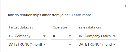
In this instance I went about it slightly differently - turning the target month year into a date field - it automatically assigned the first day to each month year combination and then used date truncate on both so that the relationship was at the level of month year.
Now on each row we have sales for each day but with the month year information, a summarize where we group by Month/Year and summing sales will put the data in the desired format:
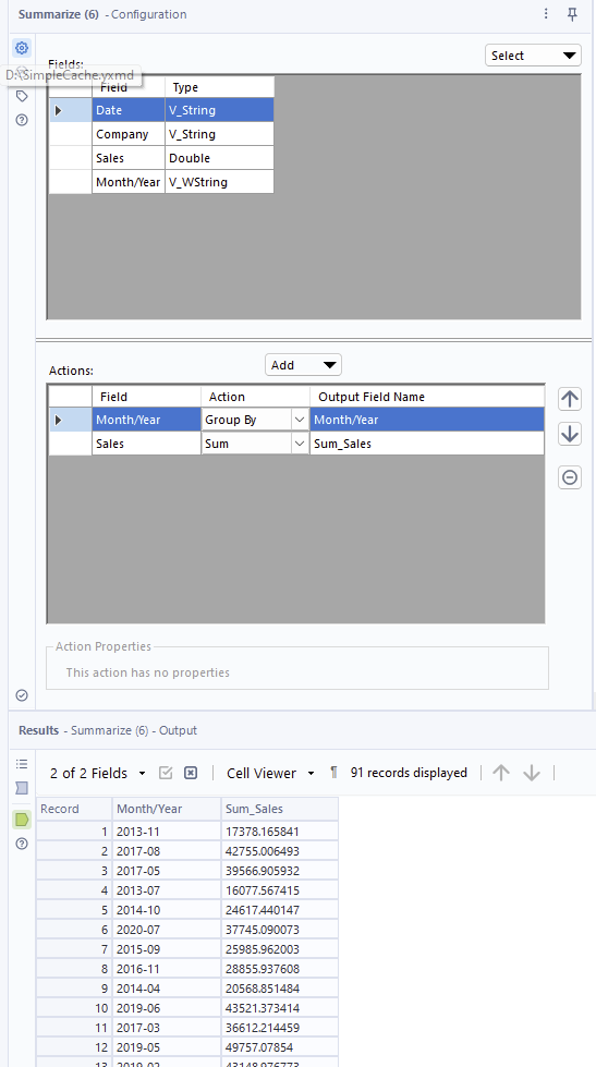
For each Month/Year combo return me the sum of sales and this aggregation is built into Tableau's relationship model so a potential drawback is that you have less control/confirmation of what has occured (Alteryx could be useful here in double checking the outcomes are the same).
All that remains on the Alteryx side is a full outer join:
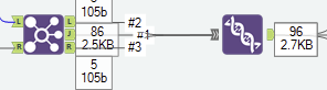
Achieved by using a union tool on the anchors for inner join (J anchor) and the unmatched rows from the left dataset and the right dataset(L and R anchors respectively).
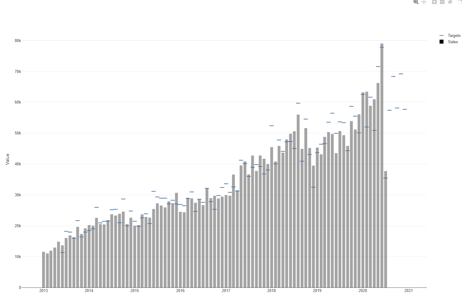
Using the interactive chart tool we can visualize the output of Alteryx:
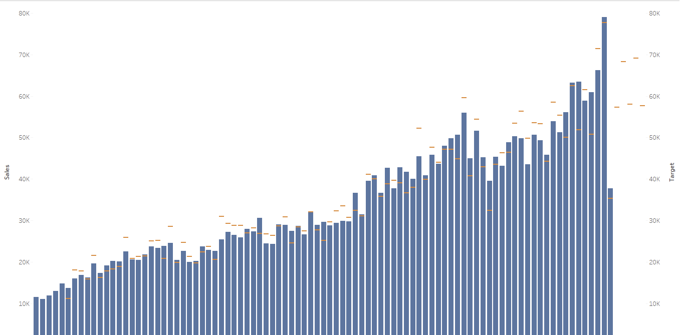
And compare it to what was produced in Tableau:
To recap; the aim of the blog was to try and unpack the noodles in the Tableau Data Pane when we refer to relationship data models. At the fundamental level it refers to aggregation before joins.