


For this blog I thought I would document my progress and try and give a fair reflection of time dedicated to the project.
Identifying a Project
I wanted a personal project to populate my Tableau Public and with the Master's Golf Tournament on the horizon at the time, golf was on my mind. Conveniently a #SportsVizSunday had recently used a golfing dataset and as a result a viz landed in my recommended on Tableau Public.
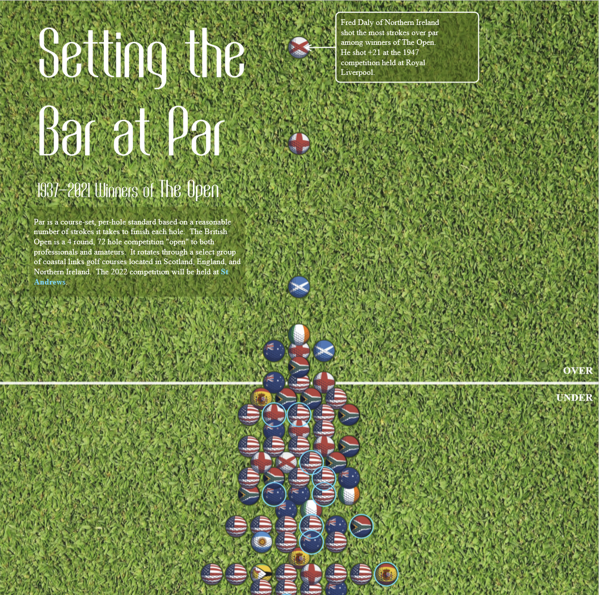
First what I liked about the original viz was that some information was particularly clear - the format working down to lower (and better) scores felt like a data journey. The use of national flags also allowed the original viz to add additional information to what is in effect 1 chart.
The reason I wanted to try my hand at visualizing the given data was I thought that venue might have played a role in the scores. The Open is played at different courses where difficulty varies - this was the central message I wanted to emphasize in a reviz whilst also giving the end user the ability to explore past winners performances still.
Planning the Reviz
I planned my reviz in Excalidraw: i had a cursory glance at the data to try and work out what was and was not possible. The plan produced was as follows:
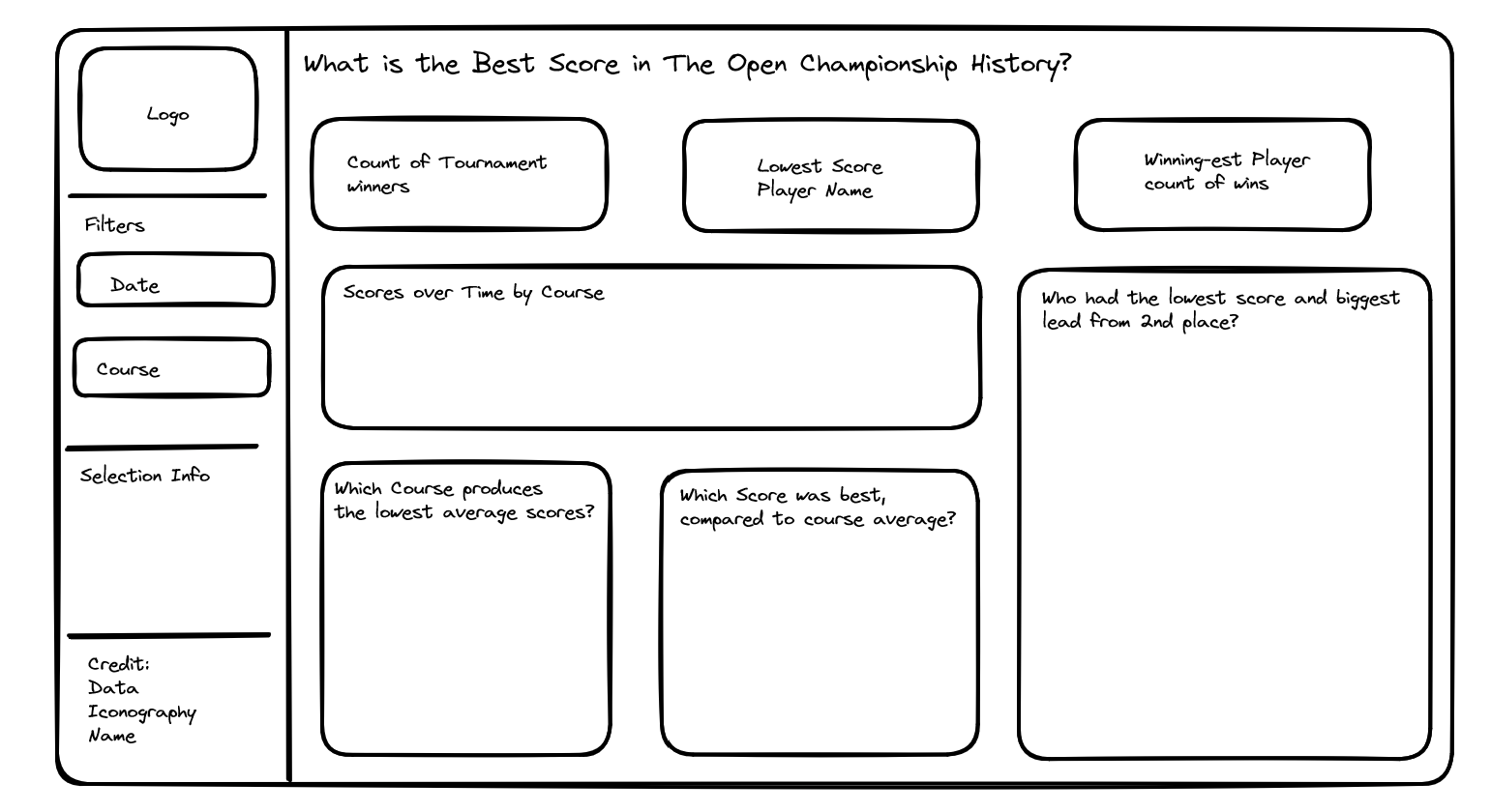
In terms of structure I wanted a formal dashboard and the criteria I set myself was that I wanted it to look like something the R&A (organisers of The Open Championship) might put out themselves. The logic of the filters was as mentioned previously to give the user the opportunity to explore aspects of the data.
The KPIs were thought of to set context but also adapt to the users exploration - the logic was that perhaps someone wanted to look at St. Andrews exclusively and see the lowest score there.
I thought the charts would help show the trends in the data that might have previosuly been missed due to the use of a single chart. I expected scores to get lower over time as players hit the ball further and skills improved with a line graph intended to show this. I wanted a chart that explored which course produced the lowest average scores as a proxy for difficulty. Along with charts exploring winning scores relative to this average.
Finally, I considered the fact that conditions at venues change depending on the year of the competition so I hoped to capture at least a bit of this variation with a chart that recognized winning score relative to second place. Ultimately I removed the chart from the final version as the dataset I had was missing this information for some of the earlier competitions and I did not want the dashboard to be too modern. Perhaps, a second viz focusing on the modern era could work that chart back in.
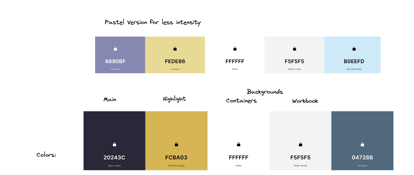
The colors above were what I planned to use in the Viz inspired primarily by the R&A website and branding for previous Open Championships.
In total I had a strong idea of where I wanted to take the viz so the planning stage was fairly swift - I would conservatively estimate that the planning took no more than 40 minutes.
Making the Viz
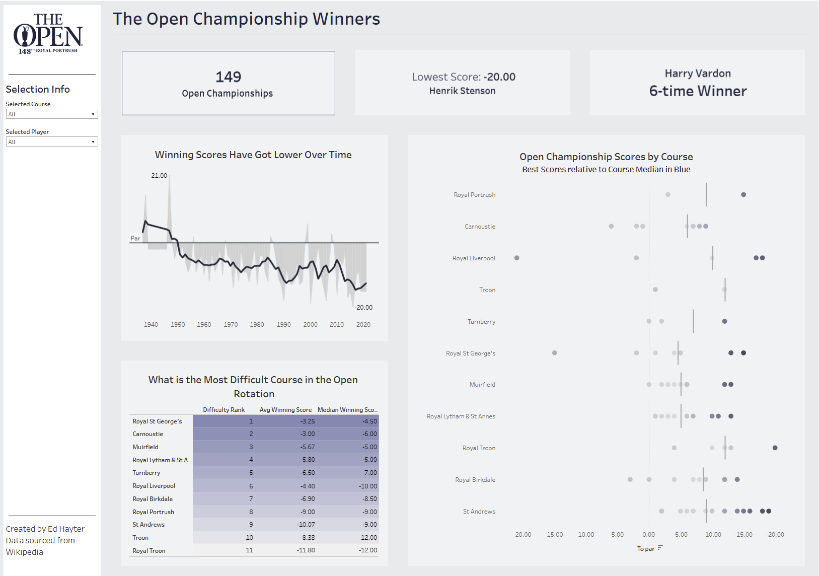
Refllecting on the final viz, I had issues with the KPIs that slowed the rollout of the finished dashboard. I was trying to get the KPIs to update with simple filters - ultimately I decided I would switch to a parameter approach that allows people to look at the data for a specific venue or a specific players winning round. The use of parameters allowed me to update them based on peoples selection.
I was happy with the change in approach I made to the line chart. The grey area chart in the backdrop is the variation in winning score over time, this fluctuated a bit likely due to playing conditions. Thus, I used a moving average (prior 3, current and next 3 tournaments) to illustrate a more general trend of tournament scores with a line.
In order to rate the difficulty of the courses I settled on a table in the current form with color illustrating difficulty. I ended up opting for a table as I thought it was good for illustrating rank - on reflection a bump chart over time might have been an alternative. However I did want to build in two averages both mean and media to explore the effect outlier tournaments might have had on difficulty. I combined the two and hid the calculated field, I ranked and sorted on this combined difficulty to produce a table that suggested the hardest course.
Finally the centrepiece chart was a dot-strip plot - again the varying median line is meant to bring to attention varying difficulty, but this time we get a dot for each winning score so that we can see the distribution behind the median. I used color to draw attention to scores that were further away from the median scores and therefore theoretically stronger scores relative to what might be expected to return a win at a given venue. Two points that my eyes were drawn to in the chart were the Colin Morikawa victory at Royal St. George's in 2021 and Tiger Woods' -19 performance at St. Andrews in 2000.
Reflections
Overall when we incorporate formatting into the equation and the difficulty getting the KPIs to behave as I wanted them to the Reviz project probably took 3-4 hours of dashboarding. When accounting for planning it was probably a 5 hour project.
On reflection I am quite happy with the finished article - I was hesitant to publish the viz because I wanted the formatting to be better but ultimately the insights are what is valuable from the dashboard and endless tinkering is probably not as valuable.
I do wish on reflection I had the full data for how much a person one by to really help unpack the effect conditions might have played on scoring but I made the decision that I wanted as much of the data as possible and that focusing on modern wins only where I had more data would dilute from the original goal of the dashboard.
That rounds up my blog reflecting on a personal reviz project.