


I wanted to begin my blogging career by recording the 7 approaches to telling stories featured in an article written by Martha Kang. I think it is important to start with something fundamental that is going to underpin the technical decisions of visualizing data. Data visualization is about facilitating understanding and helping craft a story is a means of achieving that objective.
I intend to highlight some use-cases of the data stories in order to facilitate an understanding of what the stories refer to exactly. It is worth noting that rarely do these kinds of stories work in isolation. It is far more likely that they mutually reinforce each other and answer the broader "So What?" question with regards to what the data means and why it is important.
Note all screenshots of Viz's should link to their Tableau Public Versions
Change Over Time
An example of exploring change over time might be tracking how birth rates have changed or how a political party's vote share has changed. Alternatively from a catgegorical perspective a use-case might be how has the diversity of university courses changed over time.
I think this is an effective data story in setting up the question of why these developments have taken place.
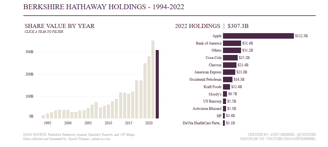
The above Viz on the left shows the amount of assets held by Berkshire Hathaway. The right uses dynamic filtering to help unpack the change over time by exploring the types of stocks held in a given year.
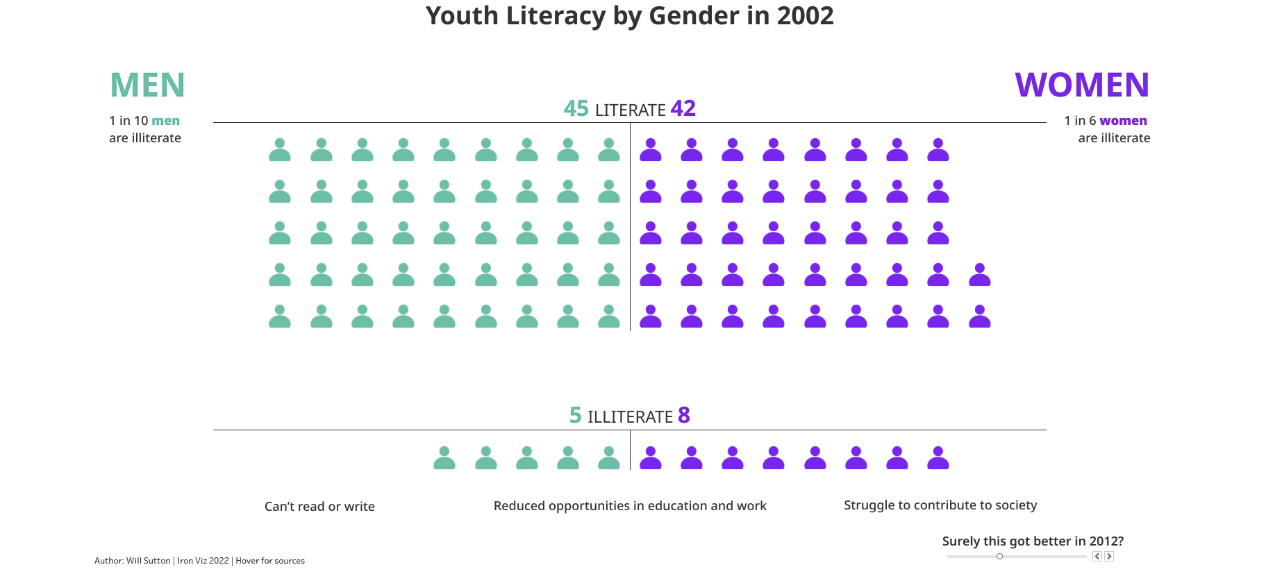
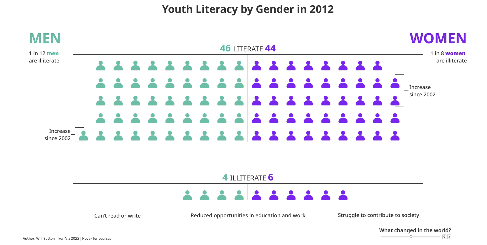
Will Sutton's 2022 Iron Viz tackles change over time using a dynamic approach to displaying the data. The scroll bar in the bottom left takes the viewer through the Viz. Importantly the viewer can note that the literacy rate has changed over time. On the male side from 1 in 10 to 1 in 12. Again this sets up a why question nicey as Will asks "What changed in the world?" to introduce his next section of the Viz.
Start Big Drill Down
Starting from a zoomed out macro-level before drilling down into specific cases can be used to help craft a data story of explaining why a distribution of data is the way it is.
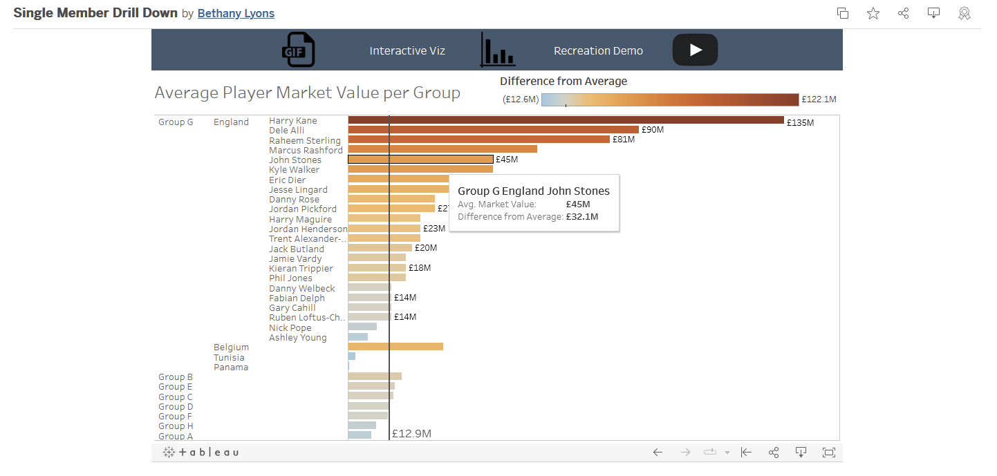
Bethany Lyons uses the concept of a drill down story to explore the average player value at the 2018 Russia World Cup.
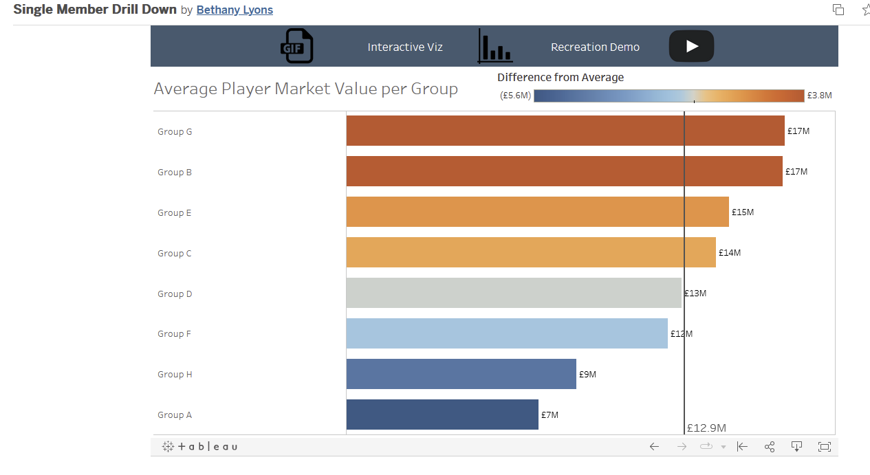
Drilling down to Group G interestingly shows the importance England and Belgium hold in increasing the average whilst drilling down further reveals the key players contributing to the increase in average (in the case of England Kane and Alli - one has aged better than the other).
Zooming Out
Zooming out is the inverse of drilling down and can be used to achieve some subtely different stories. Perhaps there is a specific case of interest and the zooming out story serves to contextualize the data in a wider population.
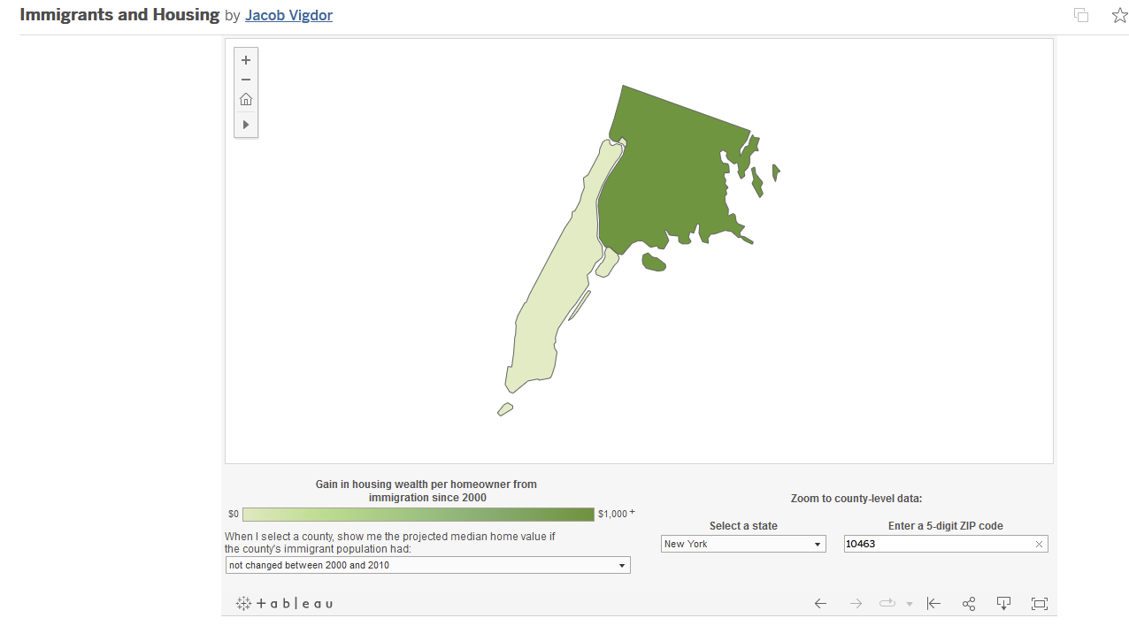
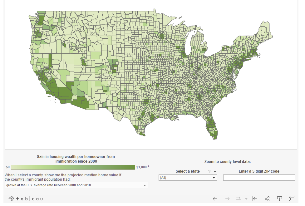
Jacob Vigdor explores regional variation in the gain in wealth per homeowner from immigration since 2000. In other words, the people of which area have benefitted or lost from recent immigration. Here I can use the zoom out story to start in an area I am familiar with and then zoom out and perhaps compare it to a neighboring areas and the country at large. It helps contextualize that the area I know fairly well (Spuyten Duyvil) has benefitted from recent immigration compared to neighboring Washington Heights and parts of rural America.
Highlight Contrast
Exploring differences in the dataset can be a powerful tool in drawing attention to parts of the data. Consider a topic where a gender difference is relevant, a vizualization strategy might revolve around highlighting the gap, as Ramon Martinez does below.
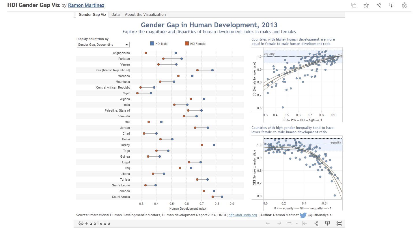
This forms the basis of an interesting data story when the viewer utilizes the sorting function to highlight countries with a large data gap and ones with a small gap - inviting the user to consider in what ways these countries might be similar or different.
Exploring a Point of Intersection
This story was the hardest for me to wrap my head around and in some ways strikes me as more niche than the others. It makes sense in a longitudinal setting where the data might show two lines, the intersection would be the point at which the lines cross and it introduces the question of why.
A simple example might be this case below:
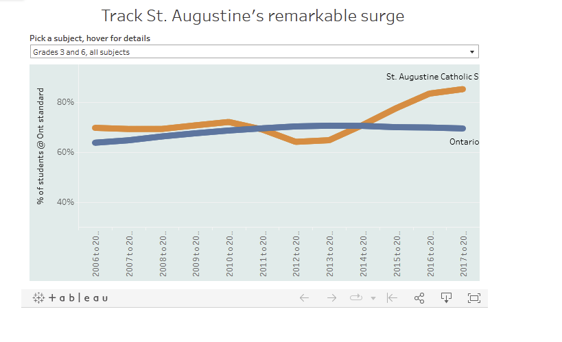
The above chart by Jeff Outhit explores the rise of St. Augustine Schools rise in proportion of students who meet the provincial standard compoared to Ontario in general. It sets up further investigation into what reasons might be behind what seems to be a failry significant increase in performance.
Tangentially, rather than focusing simply on intersections it seems to me that further investigation could be given to patterns that perhaps previously display parrallel trends and then begin to diverge.
Dissect the Factors
Dissecting the Factors can often form the next step in an overarching data story. Having vizualized the data, what subsequent vizualizations can unpack a measure or metric. A measure like a Democracy Index might be useful in this context, suppose a viewer wants to explore the component parts of an index score.
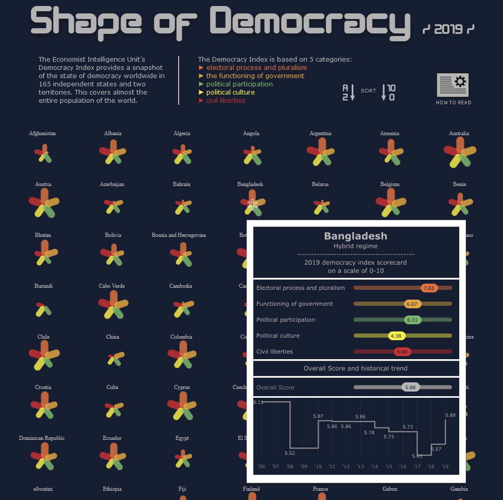
George Gorcyznski use of tool tips to unpack the Democracy Index into its component factors reveals that the overall score is a form of average of component scores in different areas.
Identifying and Profiling Outliers
Exploring outliers might be a supplementary or subsequent data story to explore after the data has been visualized in a way where outliers become apparent. In combination with a drill down story and dissection of factors that have contributed to why a case might be an outlier.
I really enjoyed looking at Flavio Matos' first round application Viz when it came to exploring outliers.
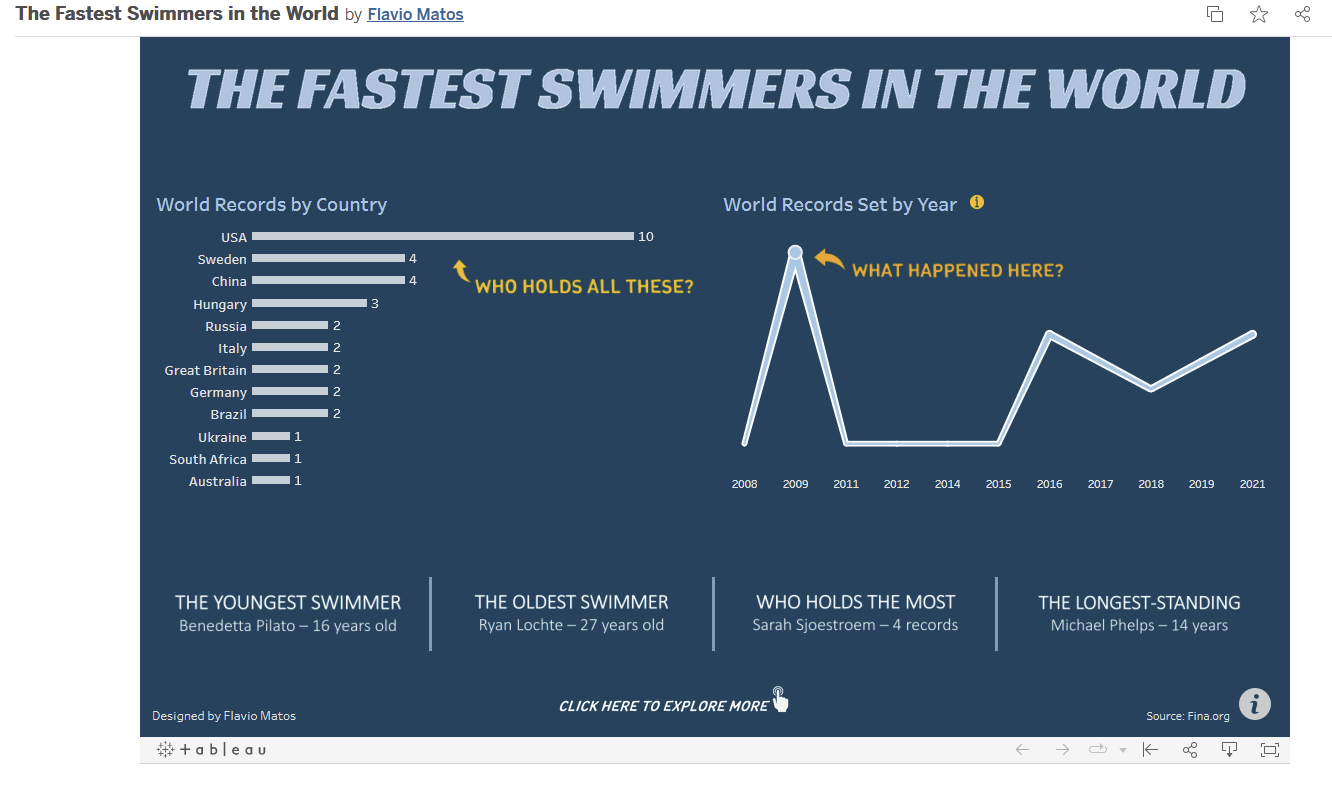
The world records set by year shows a clear outlier peak and then the tool tip offers a potential explanation as to why this peak might have occured - the introduction of a new swimsuit that reduced the drag swimmers faced in the water.
Thanks for bearing with my marathon of a first blog post - I am looking forward to putting out some briefer blogs too!