Parameters in Tableau have many useful applications. Here's a guide on how to make a dynamic calendar heatmap using parameters.
Step 1: Setup the parameter
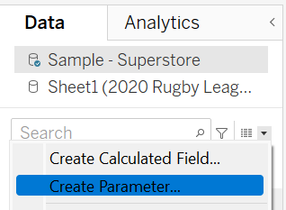
To create a parameter go to the data pane on the left; select the dropdown arrow at the top and select create a parameter.
Now name your parameter, change the data type to 'String' and choose the 'List' option in the allowable values. Create three new values: year, month and weekday. Save your new parameter, look for it in your data pane, right click and select show parameter.
Right now the parameter is just a button; now we need to link it to the data using calculated fields...
Step 2: Create calculated fields
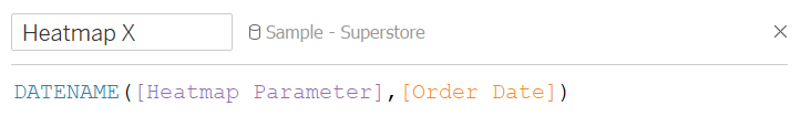
Our first calculated field will be used for our columns or x-axis. This will grab our selected parameter (year, month or weekday) and display it in columns as a discrete date.
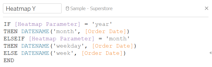
For our y-axis we want to create an IF statement that will return a different date measure depending on the measure chosen in our heatmap parameter. For example if 'year' is selected for the x-axis, the IF statement will return 'month' for the y-axis.
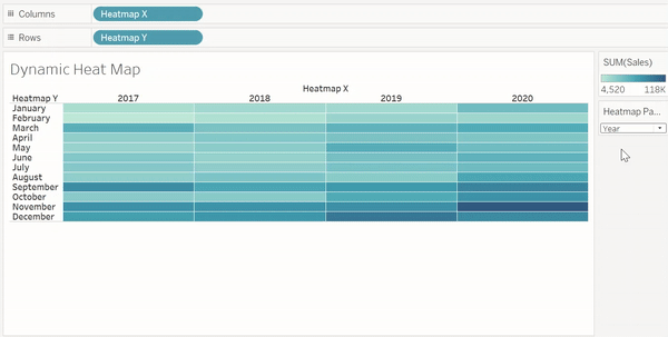
Step 3: Build the calendar heatmap
Drag your Heatmap X calculated field into columns and Heatmap Y into rows. Now place your desired measure onto the marks colour (in my case this is sales). You're now set, take a look at the finished visualisation below: