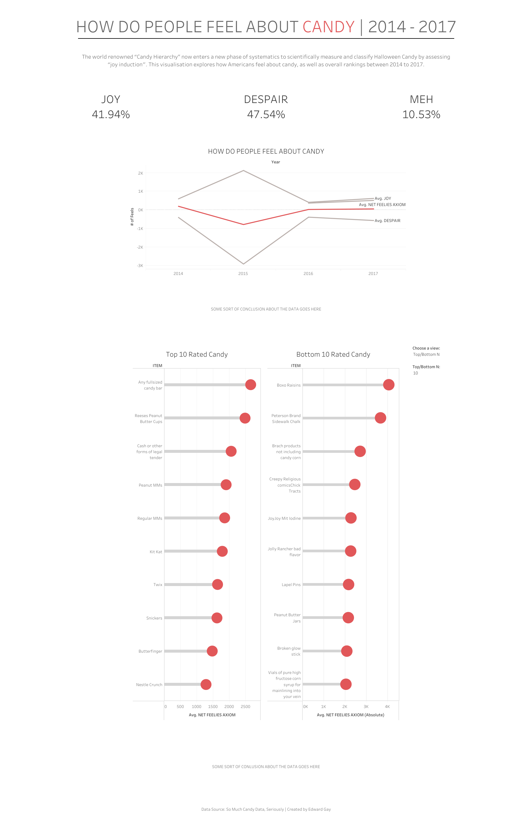
It's day 4 of dashboard week and today we were tasked with preparing data and building a dashboard all within Tableau Server. Today we were working on candy survey data. This consists of four years of data coming from The Science Quarterly Review. I really enjoyed this challenge as it forced me to use Tableau Prep over Alteryx which helped get me out of my data prep comfort zone, as well as giving me the opportunity to build my first dashboard via web authoring! Here's how my day went:
Using in browser Tableau Prep
After some data exploration I decided I wanted to make an overview dashboard summarising the 4 years of candy survey data. To do this I needed to clean up the data and ensure all 4 tables had matching columns so that I could union them in Tableau prep. This is what my initial workflow looked like:

This is where I encountered my first issue. There seems to be a bug in the browser version of Tableau prep that doesn't let you rename values without causing an error after running the workflow. To fix this I used some calculated fields, I ran the workflow and my data successfully uploaded to Tableau server ready for dashboard building.
Building the dashboard using web authoring
Next was the more difficult part, building the dashboard. Due to the way my data was prepped I ended up not having many measures or fields to work with so coming up with something meaningful proved to be quite difficult.
I ended up sinking more time than I would have liked to into something I couldn't seem to get working so I decided to cut my losses and try something different. I ended up spending the rest of my time trying to work on spacing and general appealing formatting as this is something I've noticed I need to improve on on my previous dashboards I've made this week.
While doing this I discovered an advantage that Tableau Servers web authoring has over Tableau Desktop, you can zoom out to see what your entire dashboard looks like! Despite web authoring lacking some formatting features, this feature definitely makes it worth using if you want to build particularly large dashboards like I did today.
At the time of writing this blog the dashboard is not completely finished but this is the output I had by the end of the day:

Even though I wasn't able to build the main visualisation I wanted and couldn't finish the formatting, I am still pleased with how it turned out and I plan doing a bit more work on it so it's presentable for Tableau public. Today was fun, I look forward for day 5 tomorrow!
