The purpose of this blog is to provide anyone building Tableau workbooks with an easy solution to allow viewers with color vision deficiency (CVD) to switch from the very common red-amber-green (RAG) colour palette to one that they can more easily visualise.
● The general problem is explained in-depth by Jeffrey Shaffer at this link.
[TL;DR: "[A]round 8% of men and 0.5% of women have CVD" and the colours red and green, when used together, can create problems for people with CVD. Exceptions apply and red and green are not the only potentially problematic pair of colours, but they are definitely the most common one.]
● More specific problem: often end users who are not affected by CVD get resistant to the idea of changing from the very popular and intuitive RAG palette to something else, especially when if a workbook has been already in use for some time. Therefore, applying new colours to a dashboard can become problematic.
● Solution: create a parameter that viewers can use to swap colours if they need to, so that both views are possible.
Problem visualised:
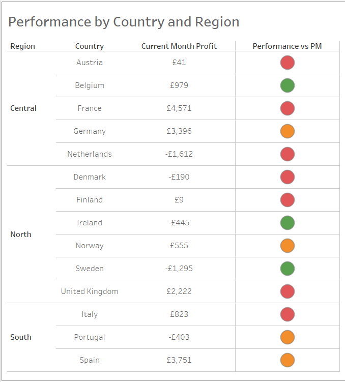
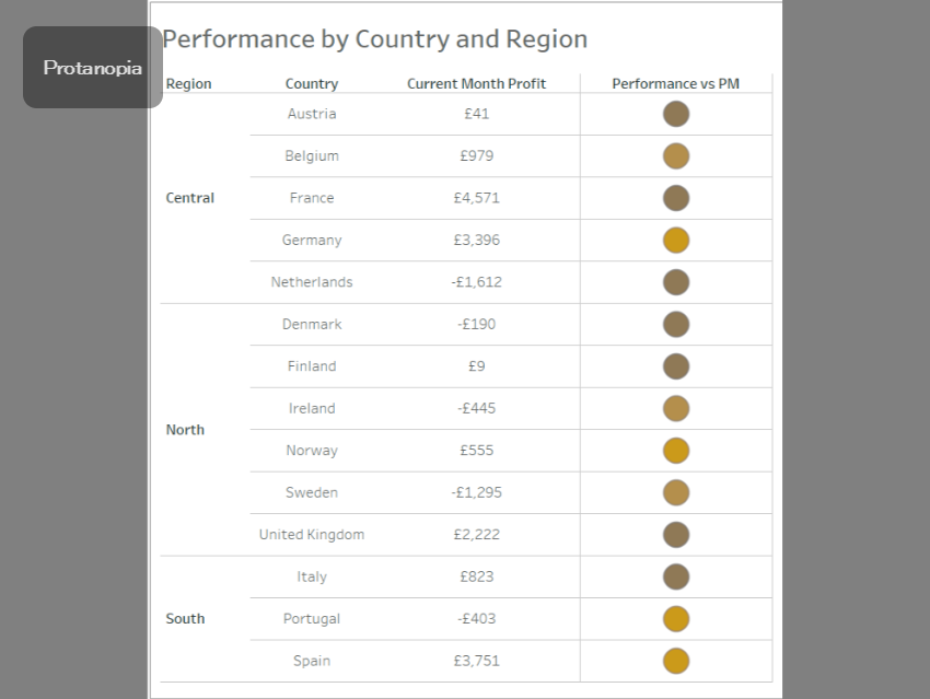
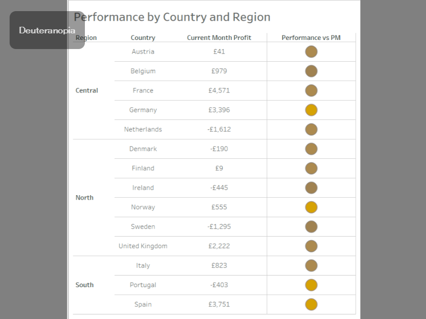
The images above show how similar the colours red and green can be for people with CVD.
Steps to build the parameter:
- Create your chart/view and add your RAG calculation onto Colour
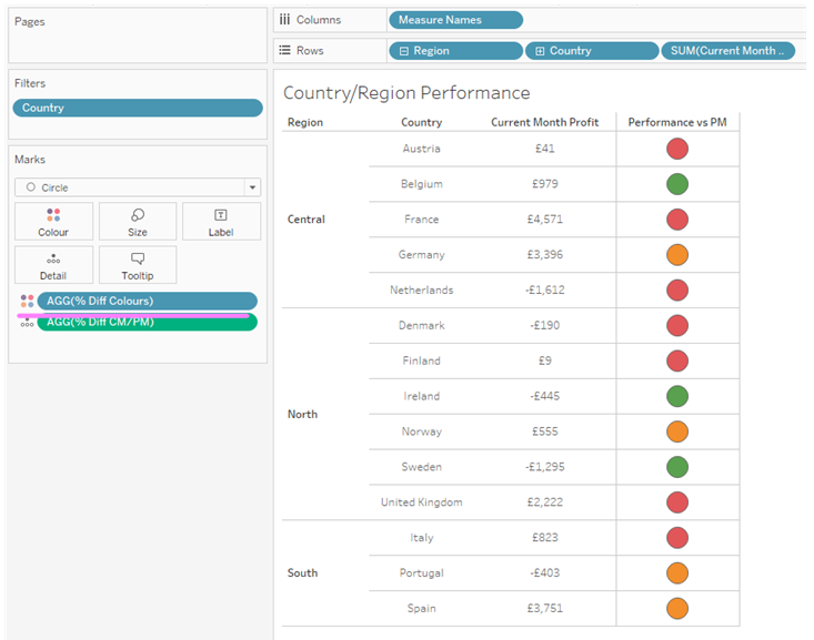
2. Create a parameter:
- choose String as your Data Type;
- choose List as your Allowable Value;
- create two options in the list ("RAG" and "Colour-blind")
- after clicking OK, right-click on the parameter and choose Show Parameter
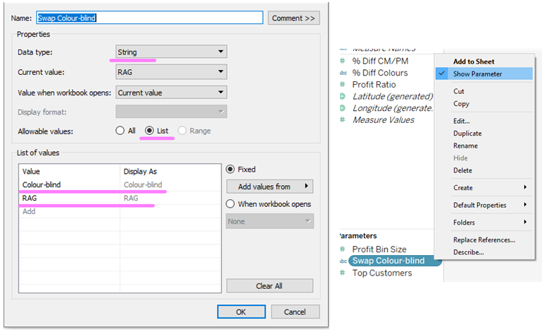
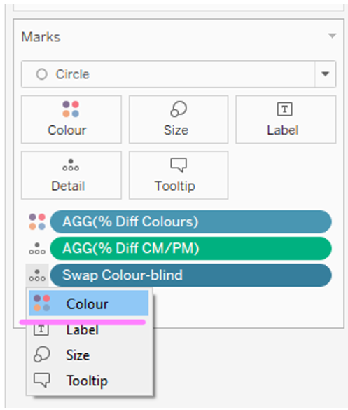
3. Drag and drop the parameter onto Detail in the marks card, then click on the Detail icon and choose Colour
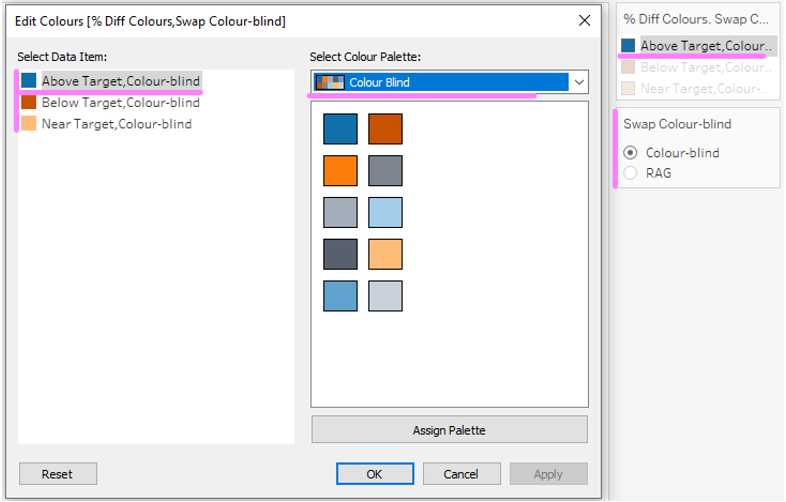
4. Configure your RAG colours as well as your colour-blind friendly ones and... done!
Result:
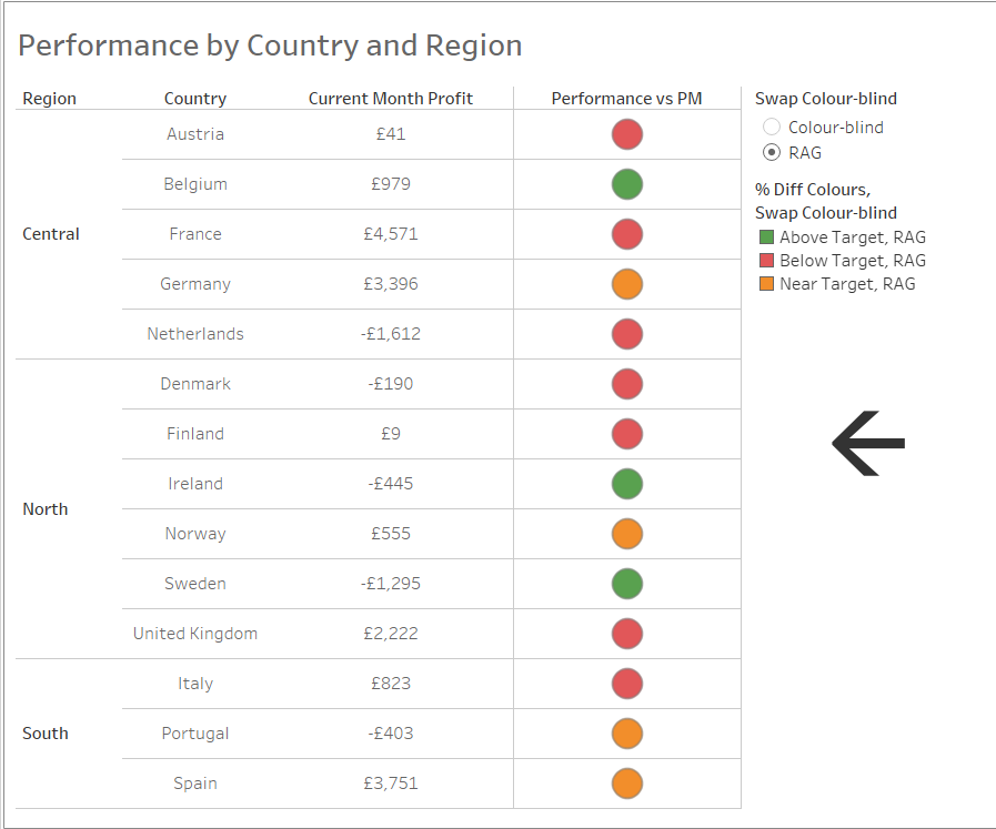
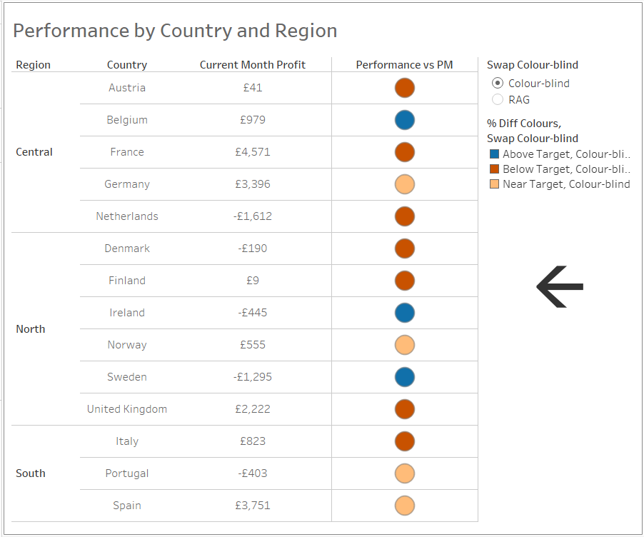
You can also see the published version of the workbook on Tableau Public here.
