On Monday DS46 was tasked with designing a dashboard based on the 2024 Week 4 Makeover Monday on the highest paid athletes of 2023.
The aim of this was to plan how we would put into practice what we had learned about some visual best practices, including mark types, sorting and general layout advice.
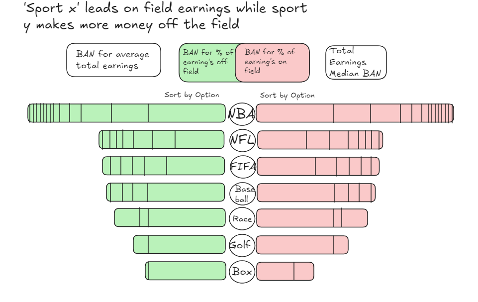
This data set detailed the 50 highest paid athletes of 2023, giving us their on and off field earnings. I wanted my design to show how much each sport was making and allow easy comparison across sports.
I decided on two stacked bar charts with one showing on field earnings and the other showing off field earnings. Some icons related to each sport splitting the charts could be a nice alternative to text. We also learnt about title best practice and how our chart titles should to tell the user what we want them to take away from my graph. I settled on “Sport X leads on field earnings while sport Y makes more off the field".
The two BANS above the bar charts provide some summaries, showing the average ratio between on and off field earnings as well as the average total earnings. I also like the idea of a tree map, giving a visual representation of the % of earnings across on and off field.

However, upon reflection I felt the having the ratio, percentage and total earnings all provided similar information. So instead I'd consider a swapping the ratio BAN for a median. My thought process behind this is that the mean average may be heavily skewed by a few higher earning athletes.
A recurring theme throughout my first week/s at the data school is the importance of planning and visualising that plan. Whether it's data prep, analysis or visualisation having a plan gives me something to refer back to throughout the process.