


With this weeks client project, I was creating a map that tracked train journeys from one city to another, the client wanted a map that could be interacted with to show only key cities and the most popular destinations and origins of train journeys for that city.
Initially with the data I could put it into tableau and because the city fields were recognized as Locations I could plot them on a map, with this I could achieve the map that was needed but all I could do is bring the start and end locations onto the map and use a sperate table to show the top 10.
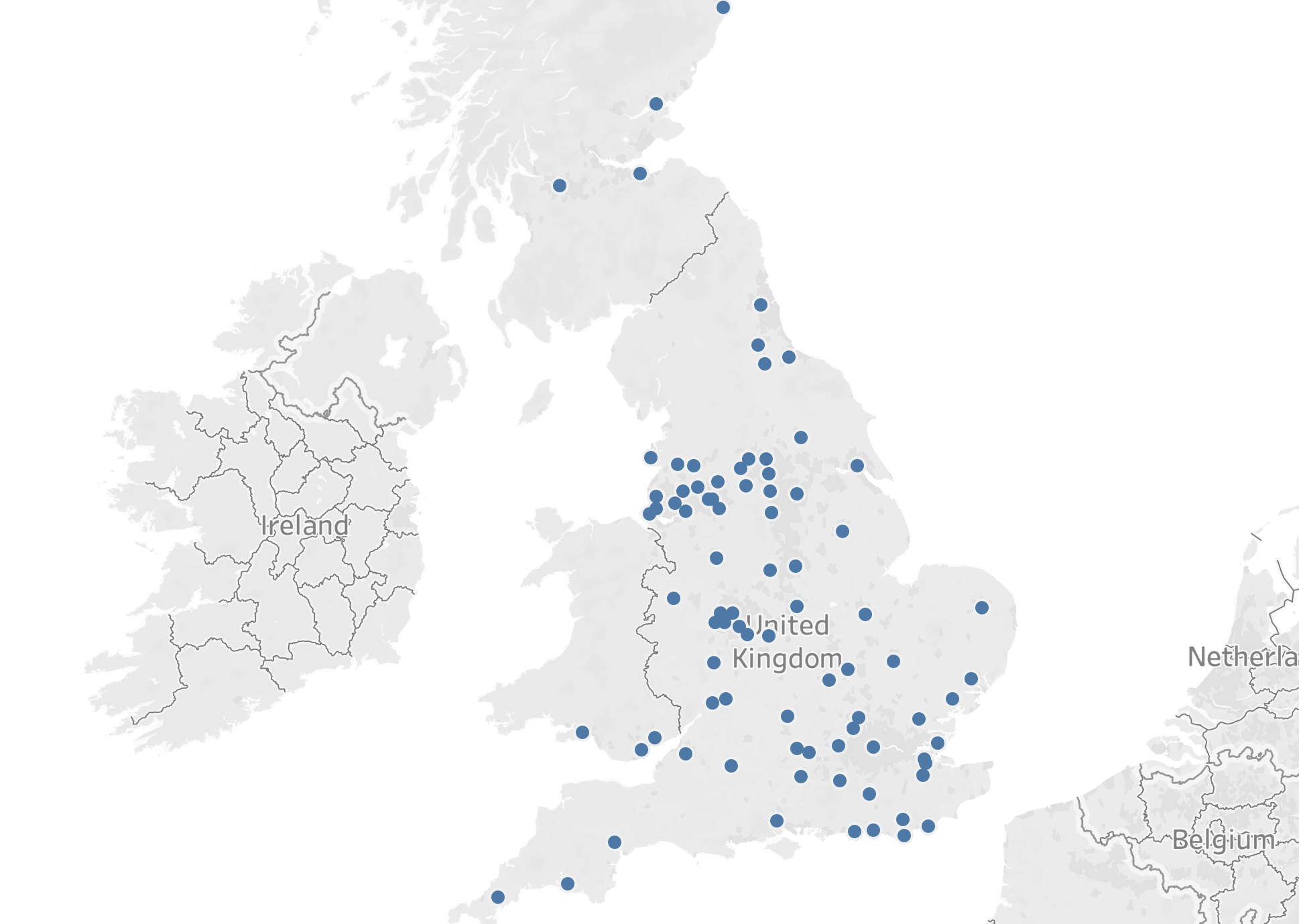
This worked however having seen some more advanced dashboards I knew that so much more was capable if I was to use the spatial functions MAKELINE which first requires MAKEPOINTS. In order to create MAKEPOINTS, you need to have both latitude and longitude co-ordinates for each of the points you want to use, In my case this was for 95 Cities across the UK, tableau know these co-ordinates when you tell it you have city data, unfortunately you cannot extract it or use them to create MAKEPOINTS. So if I wanted to create MAKEPOINTS, I needed to find the Latitude and Longitude details for each and every City I wanted to plot.
This process would be a lot but I knew the output would make it worth it. We found a dataset that had the data for most the major cities and their co-ordinates but this list did not fully align with ours, the second problem was that many of the cities had slightly different spellings or names which meant when we joined them they did not match. So we needed to change the city names where they did not match up and add the co-ordinates for the cities that didn't exist in the data. This took a while but was rewarding once we had finished the list.
Now that we had the Lat & Long for each city I could create MAKEPOINTS for start and end cities and then use MAKELINE for both of them. This meant that when put onto a map it created sperate lines coming out of each city for each of the possible journeys. It then needed a lot of formatting to create the desired map but the end product was worth it. I had several filters and parameters that interacted with the map and the client was really impressed.
I have included a picture to give an idea of the map that was created but as it is using client data I can not show of the full dash.
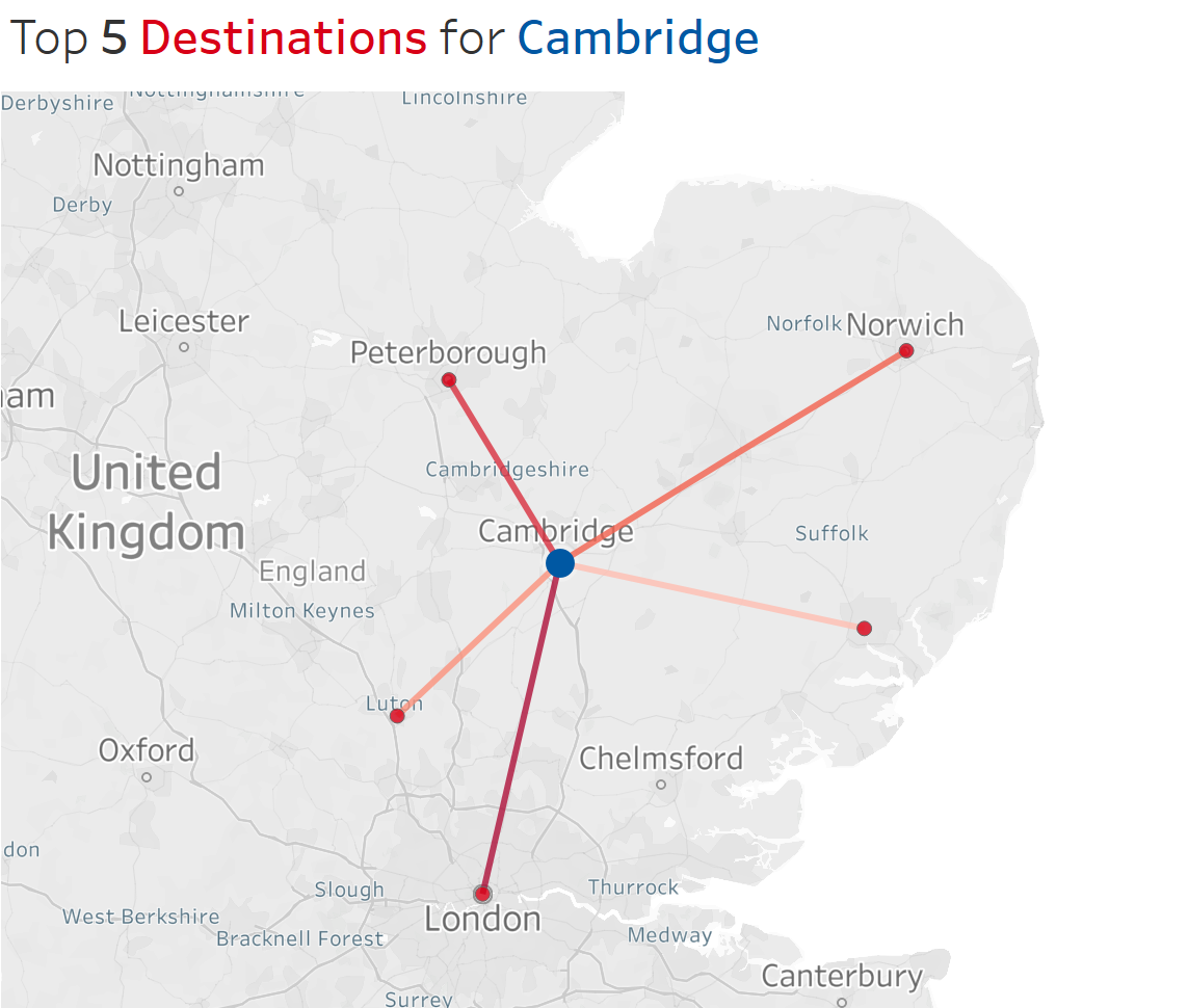
When you want to show routes or journeys on a map, using MAKELINES is always going to result in a better product but will require more time and more data, but I feel it is worth it.