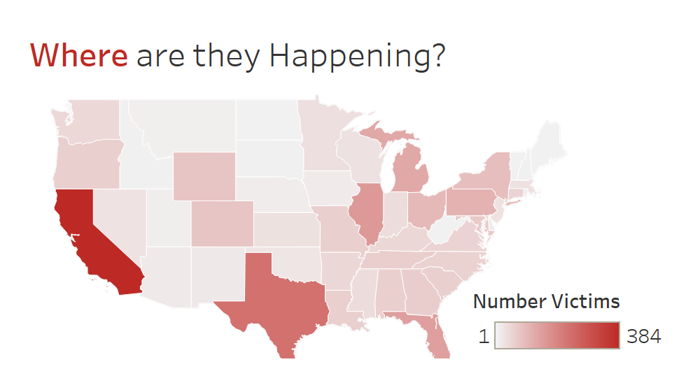
Maps are a very popular choice when it comes to visualizing geographic data because they are very appealing to look at and when done right can be very effective at displaying data. But if you are creating maps in Tableau and leaving them in their default formatting you are missing out on taking your maps the next level and making them much more visually appealing.
When you have your map in Tableau, right click on it and enter background layers.
Here you can play around with different Map styles and chose which map layers you keep.
But my favorite map formatting I have been taught is going with a clean setup.

To achieve this drag the washout % to 100 to completely remove the rest of the map, and then go into colours on the map sheet and set the border line to white. This creates the clean floating look and makes dashboard look very professional. This also removes the © OpenStreetMap in the corener which looks a lot better.
