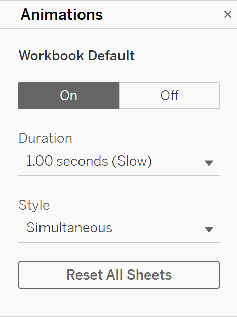
Animations
We all know how useful tableau actions and interactivity can be, you can transform a simple boring dashboard of charts into so much more by adding filters, tooltips, chart choosers and so much more. Something I had not given much thought to before I discovered this neat tip was the speed at which these animations happened when interacting with a dashboard, in my head you want to see these animations happen as quickly and efficiently as possible because speed is sleek and professional and makes technology feel modern. However, this is not simply the case and playing around with the animation speed on tableau allows you to have even more control over the user experience of your dashboard.
How to Change the Speed
To access this option click on the 'Format' dropdown at the top of your screen and select 'Animations'
The quicker way of getting here is pressing Ctrl + Alt + A

Once here you can edit the animation speed and style on one or all of your sheets.
Why
The default is set to 0.3s and you will be familiar with this speed, but what you will discover when you start playing around with that speed is that you can completely change the user feel to your work. By increasing the duration you will find the animations feel much more engaging and clear as you can see exactly how the data is changing, this can be very useful when working with a complicated line chart with lots of different lines as you can see how they are changing. But if you want you can select a custom speed and set it to 0.0s, this will make the animation instantaneous and give the dashboard a much more responsive feel to it which could be very useful in the right scenario.
You will be surprised how much a small change like this can add to the user experience, and it really allows you to customize how the audience of your dashboard will feel when interacting with the work. I know when I and my cohort discovered the feature when attempting a WorkoutWednesday we were blown away by how it made a particular graph feel so much more interactive.
