


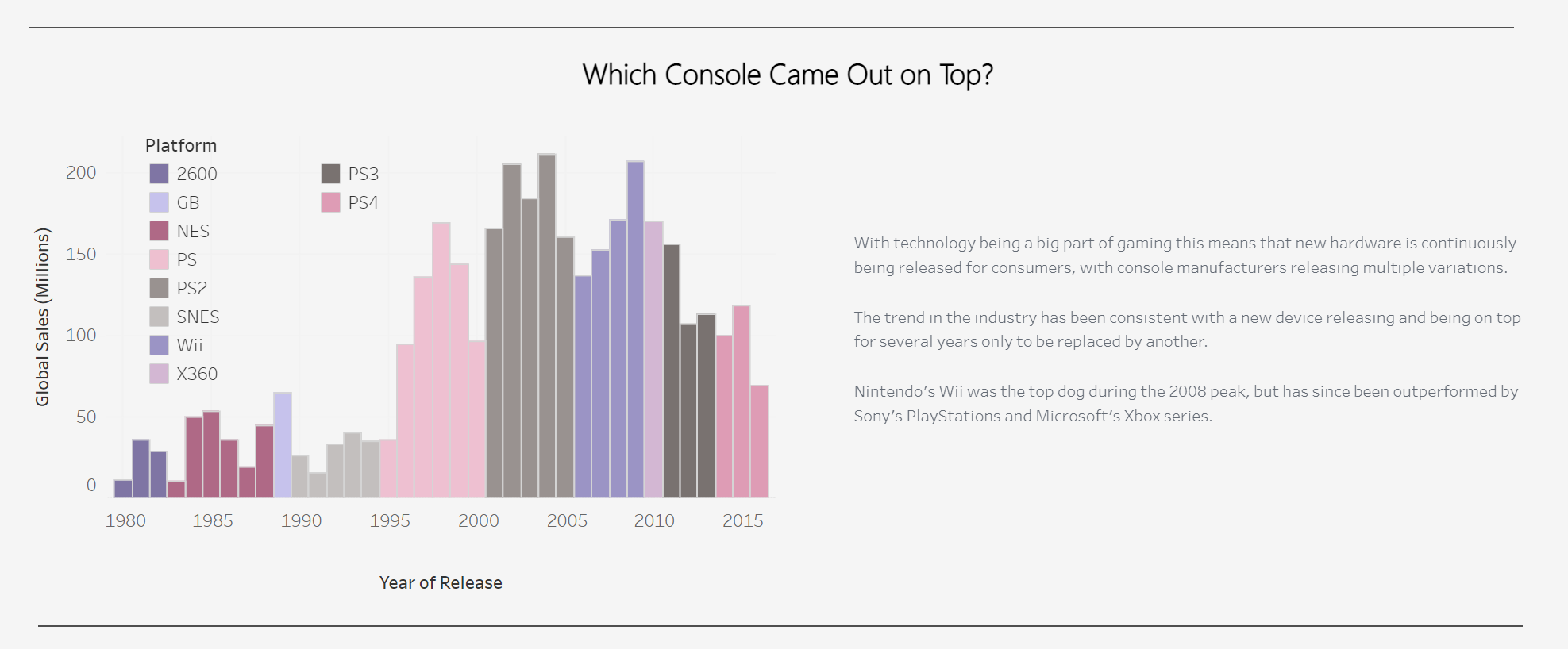
Using Sets: Looking back at my original Viz one of the glaring problems I see now is the colours, I used far too many for the whole viz and for this graph I chose to use very obscure colours for each individual console which lead to a confusing and unappealing chart. Having learnt about sets in tableau this week I wish I knew about them back then as I would have created constant sets for each console publisher so that only I only needed 4 different colours on the chart.
This would have allowed me to cut down on the number of different colours used on the viz and also create better cohesion as those colours would have been used across multiple charts.
Hiding Duplicate charts behind others: Another problem I ran into when making my original viz was adding just the totals for a stacked bar chart, when I tried to do so it would add totals for each category and not the total for the year. The way I got round it was having a line graph for the total that was not connected so that it created small dots at the top which could then be labeled with the totals.
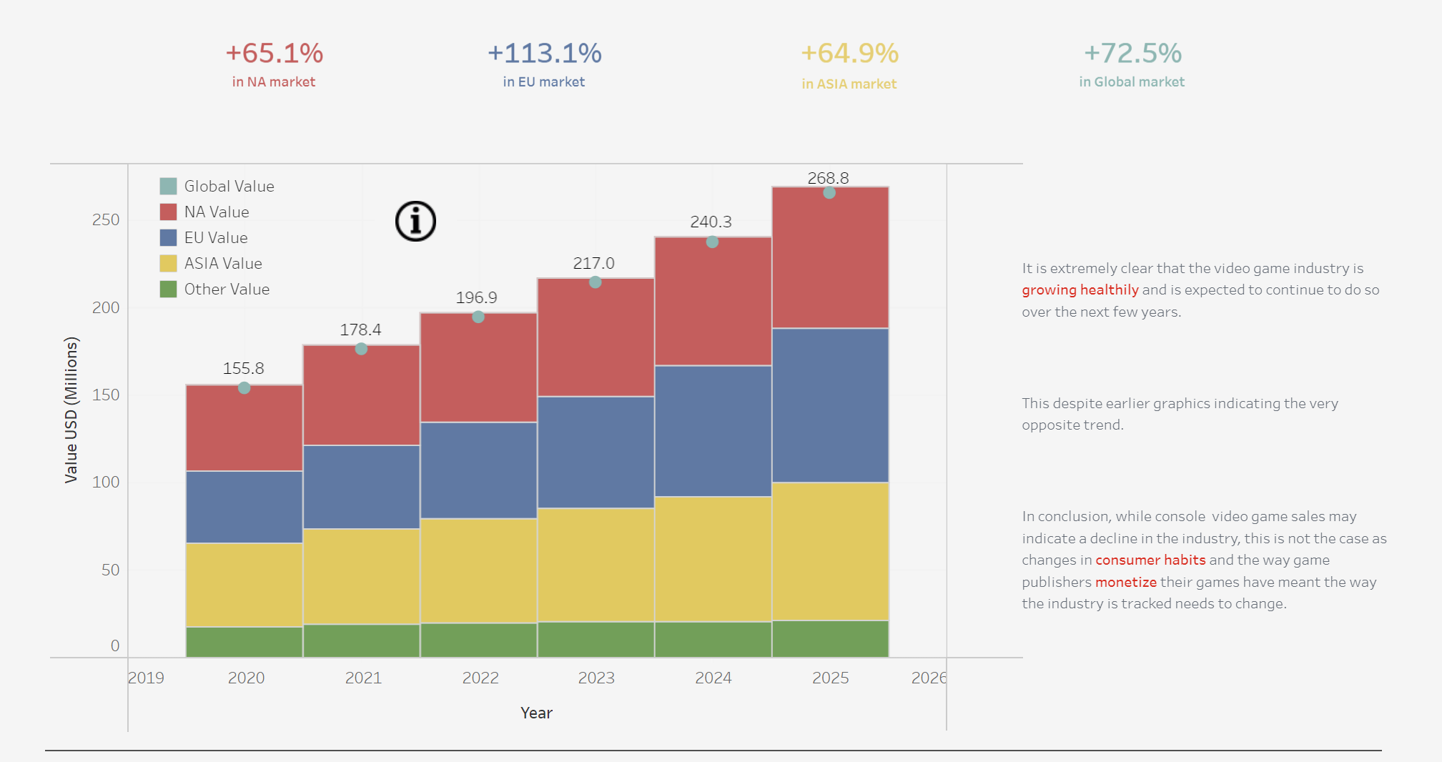
However I quickly learnt during training that you can actually add duplicate bars and by not splitting them by region, I could add the total labels and then move it behind the original bars to just view the label. This would have improved the look of the viz hugely as it would have removed the ugly blue dots at the end of each bar.