


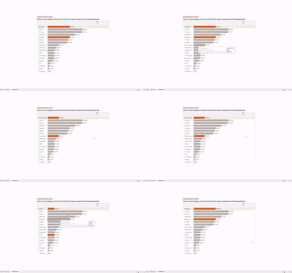
Recently I've been working with set and parameter actions in Tableau, and came across a Workout Wednesday that seems simple, but is much more intricate than I thought. In this view, you're able to click on a sub-category, then it highlights, brings the selected item to the top, but also keeps that bar in its original place. Creating a parameter action that highlights a selected sub-category and moves it to the top is much easier, but this small extra step needed lots of Tableau hacks to do it. I'm going to walkthrough my approach to this WoW and how to make this action possible.
Getting Started
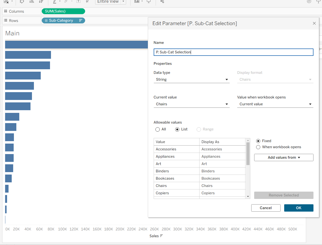
I won't go through every step to build this WoW, mainly just how to get the parameter action working. So, I first built out the base chart of Sub-Category by Sales and created a parameter that is populated with a list of sub-categories.
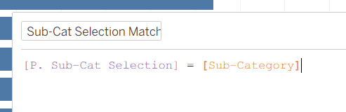
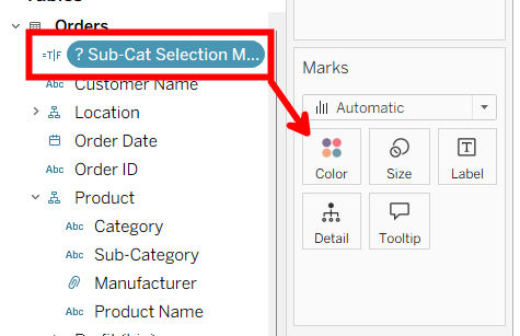
Then show the parameter so you can change the selected sub-category as needed, add a Boolean calculated field to change the selected sub-category's color, and drag that onto the color box in the marks card.
Adding the Parameter Action
Next, add the parameter action so the selected sub-category changes when you select a bar. Go to the worksheet tab, and click 'Actions'.
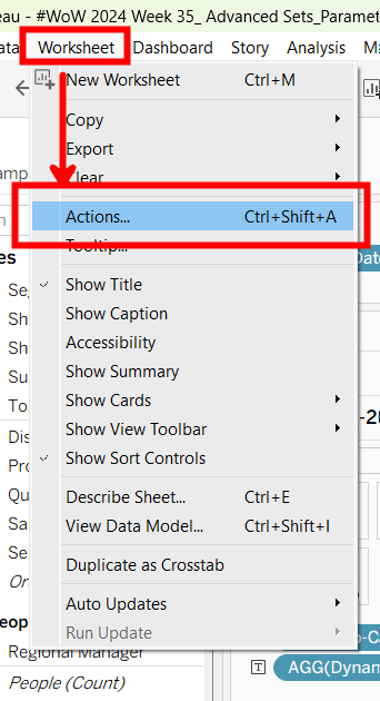
Then, click 'Add action', and choose 'Change Parameter'.
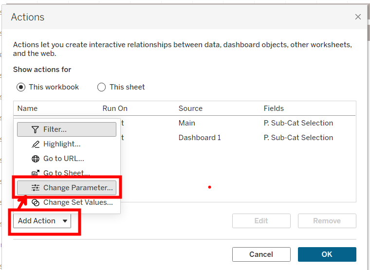
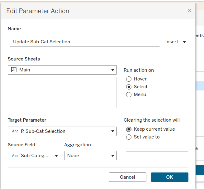
These are the settings for the action. Source sheet is the current sheet with your bar chart on it, 'Run action on' should be set to select, the target parameter is our Sub-Cat Selection parameter, then the source field is Sub-Category.
Now when you select a bar, the parameter will change and that bar will be highlighted as well.
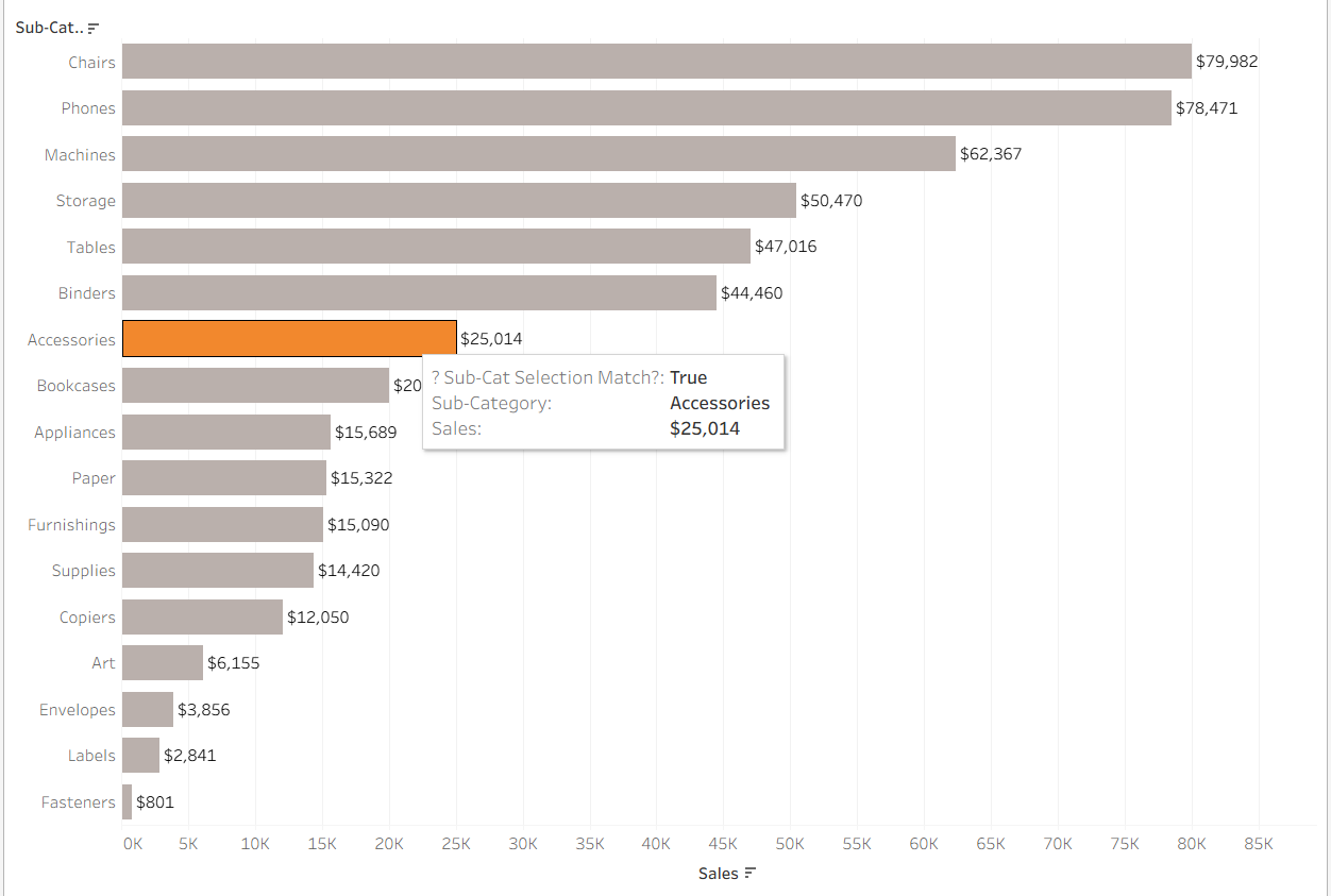
But, how do we get it to shift to the top and keep it in its original place? There's a few more steps we need to take to get there.
Adding a Grand Total Row
The key to getting this row to move to the top while keeping its original place is to add a grand total row! So go to the analytics pane, and drag in a 'Totals' pill into 'Column Grand Totals'.
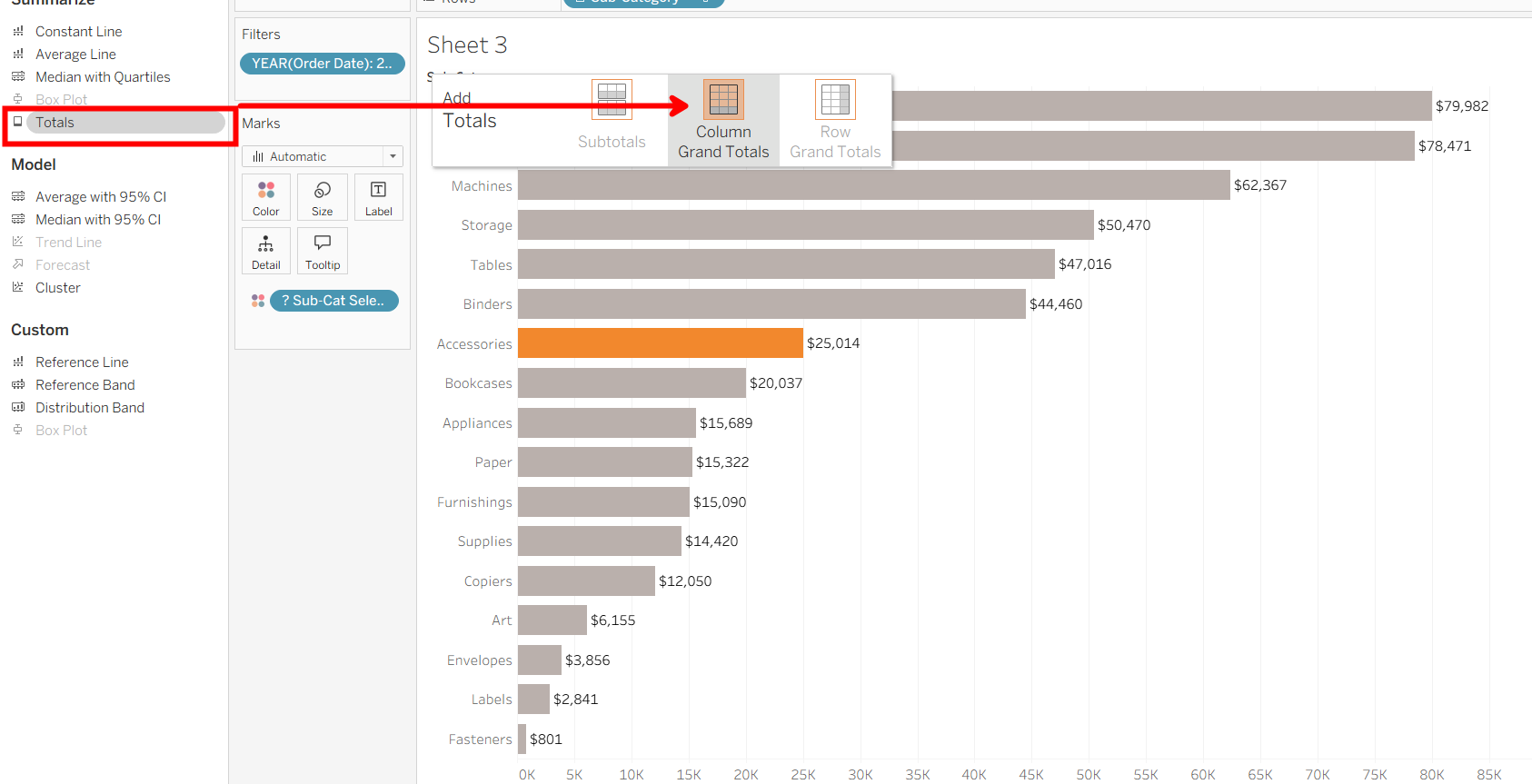
It will pop up at the bottom of the chart, so to move to the top, simply right-click on the 'Grand Total' and click 'Column Totals to Top'.
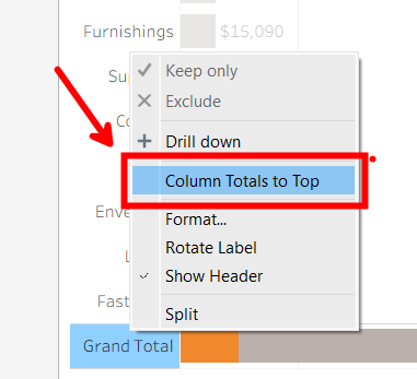
Now, the total is showing the grand total for all sub-categories, but we want it to just show the total for the selected sub-category. To do that, we need to make a calculated field for Sales that replaces our SUM(Sales) pill. This field says if the size (number of categories or rows in the pane) is one, which is true for our grand total pane, then return the sum of sales only for sub-categories that match our sub-category selection. Else, return the sum of sales for all other rows. Again, because our grand total is in a separate pane in our view, there's only one row. SIZE() = 1 provides a way to show the sales for the chosen sub-category in that grand total row.
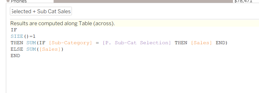
Drag that into columns to replace our original SUM(Sales) field.
Now, we have a grand total row that changes to the selected sub-category's value. But, how do we ensure the grand total header changes to the selected sub-category name? The key is to use data labels, NOT headers.
Creating "Headers"
First, let's remove our actual headers in the view.
To get the new "headers" in our view, we need to create the dots in the view that also highlight when a sub-category is selected. By creating these dots, we can add data labels to them, and those will be our new headers. To do this, we need to create a quick calculation in the columns shelf next to our Selected + Sub-Cat Sales field. AVG(-20000) will allow our dots to sit to the left of our bars. Double click directly on the shelf to add this field.

Then press enter, and move that pill to the left of the Selected + Sub-Cat Sales field. Next, we need to create a dual axis to get these on the same chart. Right-click on Selected + Sub-Cat Sales and click 'Dual Axis'.
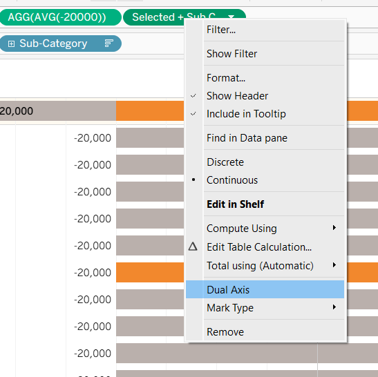
Now, make sure the Selected + Sub-Cat Sales marks are bars, and remove 'Measure Names' from color.
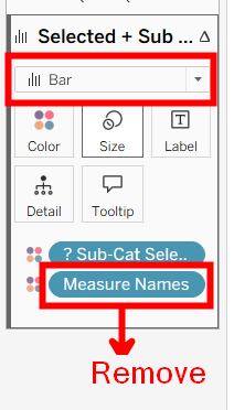
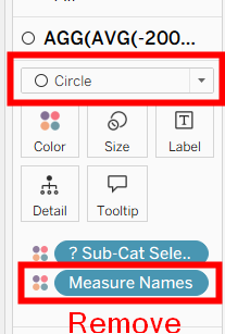
And remove 'Measure Names' from AVG(-20000) too, making sure the marks are circles.
Now, synchronize our axis so we get the dots and bars aligned. Right-click either axis, then click 'Synchronize axis'.
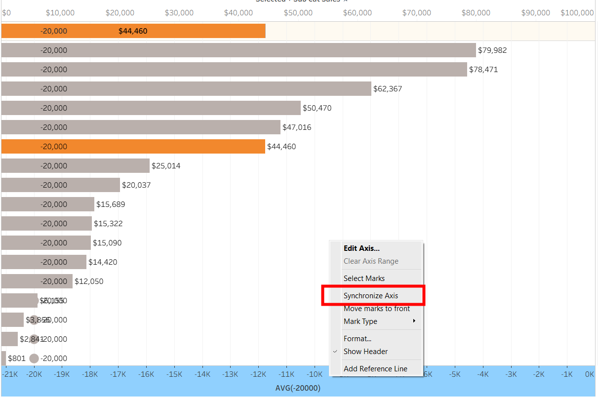
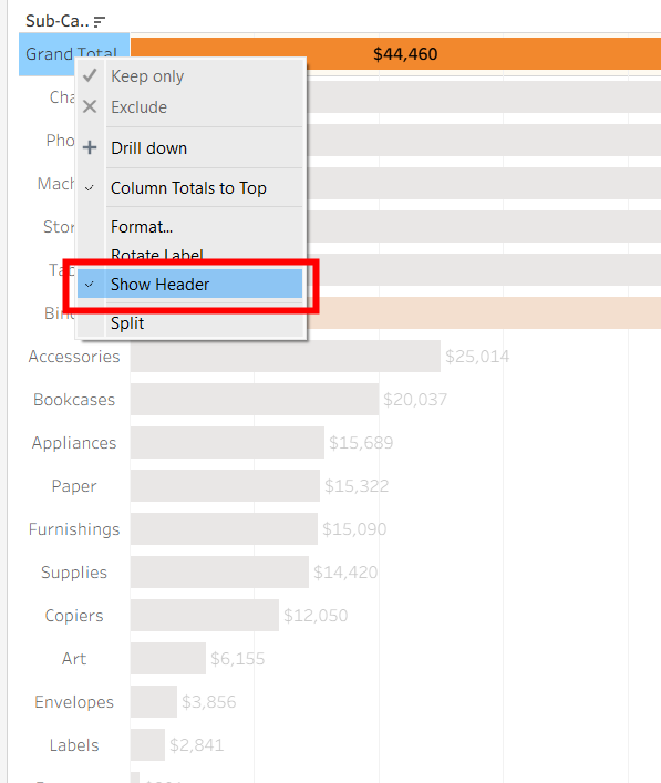
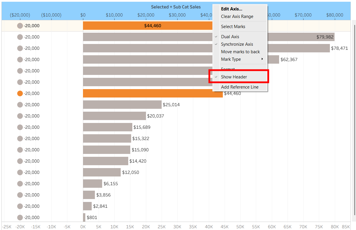
Then, we can get rid of both axes headers, so right-click on both and click 'Show Header'.
To get the headers to change, we need to make a new Label field that will act as our headers. Here is the calculation:
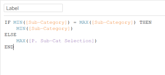
Why does this work? Well, the condition MIN([Sub-Category]) = MAX([Sub-Category]) is looking at each row of the chart, so because there is only one sub-category present in each standard row (e.g., the row for "Chairs"), the alphabetical minimum ("Chairs") is the same as the alphabetical maximum ("Chairs"). So if this is true, it returns the name of that sub-category. But, this statement is false for our grand total row. This is because the grand total row looks at the entire dataset at once an contains all the sub-categories rolled into one. So, the alphabetical minimum (e.g., "Accessories") does NOT equal the alphabetical maximum (e.g., "Tables"). Because it's false, the statement returns the else, which is the sub-category selection we made. This replaces the grand total text with whatever sub-category the user clicked on.
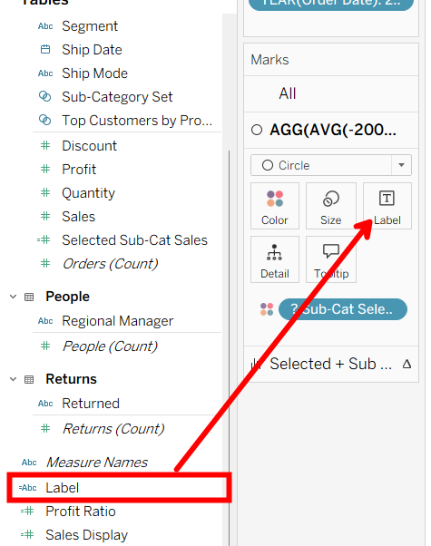
With this calculation up and running, now drag this into our circles marks card on 'Label' to show our makeshift headers.
And there it is! Now, when we click on a sub-category bar, that bar highlights, stays in its original place, and the top bar changes to reflect that chosen sub-category.
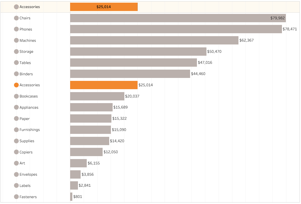
There's some formatting left to do for this WoW, but that's the overall functionality of this parameter action and all the Tableau hacks to get it done.