


Context:
Before explaining the task for the day, some context is needed.
During the early days of training, we collectively realised that we were a pretty sneezy cohort, and Harry came up with the idea of creating a sneeze tracker - a shared excel file where we would religiously track who sneezed, on what date (and time), and in what room. Alongside this, we would also track who the first person to say bless you was, as well as how many bless yous they received in total. The reason I’m explaining all of this is because visualising this sneeze-tracker was the task set for today.
Data Preparation:
The data itself was predominantly clean, some minor changes included filtering out non-cohort members from the sneezer list (there was only one), and standardising room names - for instance, merging 'Event space', ‘Event Space ‘ and 'Event Space' to ensure consistency.
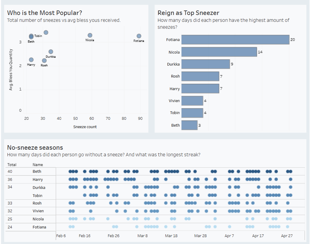
To account for quiet periods, I performed a date scaffold. Since the tracker only logged events (each row in the dataset was a recorded sneeze), 'sneeze-free' days were essentially invisible; scaffolding allowed me to identify that only two such days existed in the entire history of the sneeze-tracker (excluding weekends and bank holidays). While I initially hoped to find a long consecutive streak of silence to prove maybe we weren’t a sneezy cohort after all, the data suggested otherwise. I eventually shifted my focus to a person-by-person analysis; here streaks of silence did exist, and revealed much more interesting individual health trends.
Dashboard:
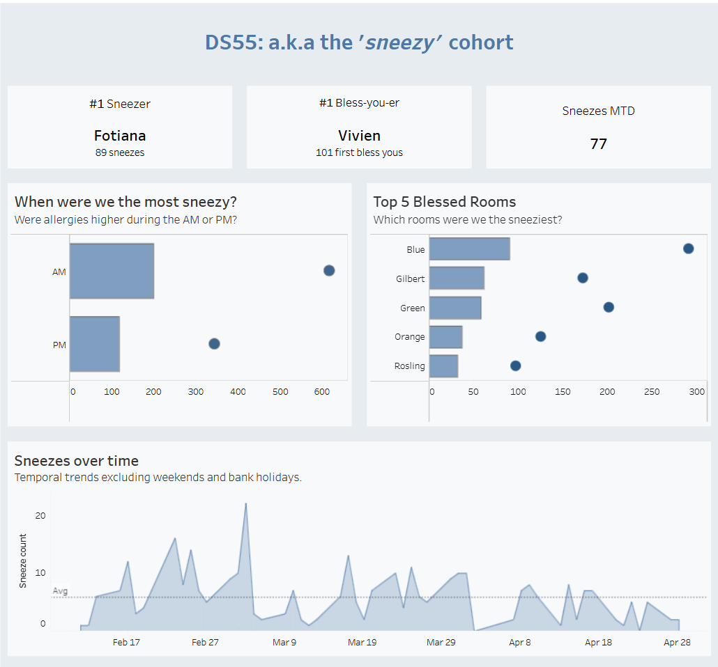
Although I left more time for formatting today than usual, some key elements were still missed out. Specifically, a legend to clarify that the bars represent sneeze counts while the dots signify 'bless you' quantities for the first two charts, and user instructions to explain how these charts could be used as filters for the rest of the view. I was also indecisive about what colours/colour scheme to use so stuck with a default blue, using varying opacities to create contrast. Going into the last task for dashboard week, refining my dashboard design is something I want to prioritise.