


Today marked the end of our training phase with day 1 of Dashboard Week.
But first, what is Dashboard Week anyway?
In this week we get a new data set every day that comes with different challenges and then we have to create a dashboard from it.
Today's data set came from the IMDB database and contained all films since 1900, with the corresponding ratings, actors, runtime and number of votes.
As a child and even now I still love Star Wars. So I chose the topic of comparing the careers of my three childhood heroes.
The challenge for me was not just to build a dashboard with the bare visualisations that I usually do, but also to incorporate an appealing graphic aspect. The problem is that I like to visualise data straight out and build my dashboards very clean and straightforward. So at first I had no idea how to go about it or what my options were with so much freedom, so I went to Tableau Public to get some inspiration.
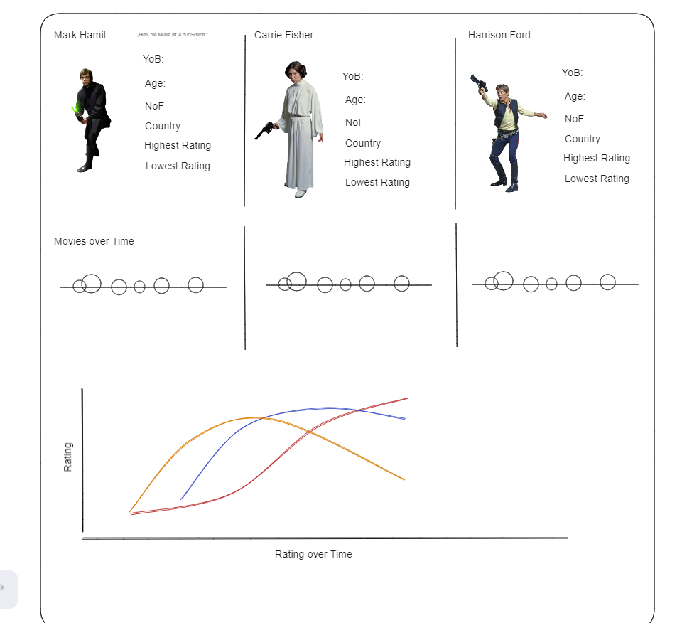
As always, I was absolutely impressed by what great dashboards you can build but as time was limited I wanted to start small and made a first sketch.
First of all, I needed pictures of the three main characters, that was very simple, a quick google and that was it. What required a little more research was to find a good site where you could remove the background of the image without losing much quality.
When I finally found what I was looking for, I was able to start the relaxed part of the work and create the necessary charts. As the data set for my topic was limited in variety, I simply wanted to use visualisations that made it easy to compare the careers of the three.
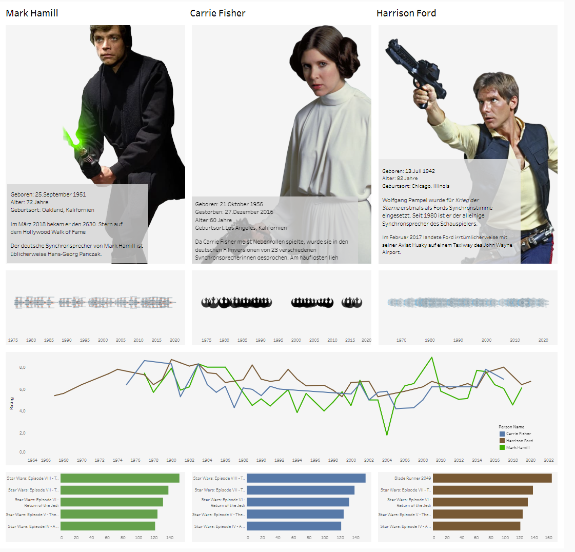
To my surprise and contrary to my expectations, building and adding the images was very easy. The images fitted well and even better when I disabled the option to move the images to the centre and resize them.
I definitely had fun and I want to build more creative dashboards to improve my skills.