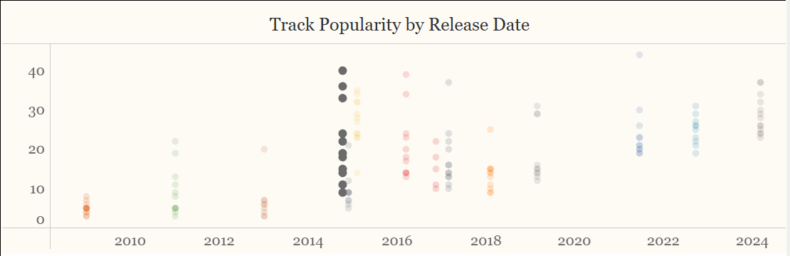
So here is an interesting one, let's say you have a scatter plot, with the marks coloured according to category:
In my case: songs plotted by release date and popularity, coloured by the album they were released in.
I would like to use a parameter to highlight and album's marks. What to do?
Step 1: Build a Parameter
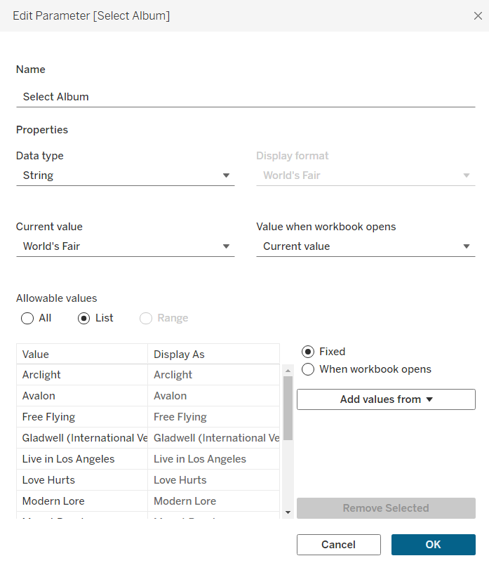
In my case: the list of selectable albums.
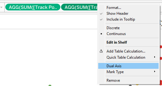
Step 2: Duel Axis the chart
Ctrl click on your Rows pill, drag to the right and drop it (also in rows).
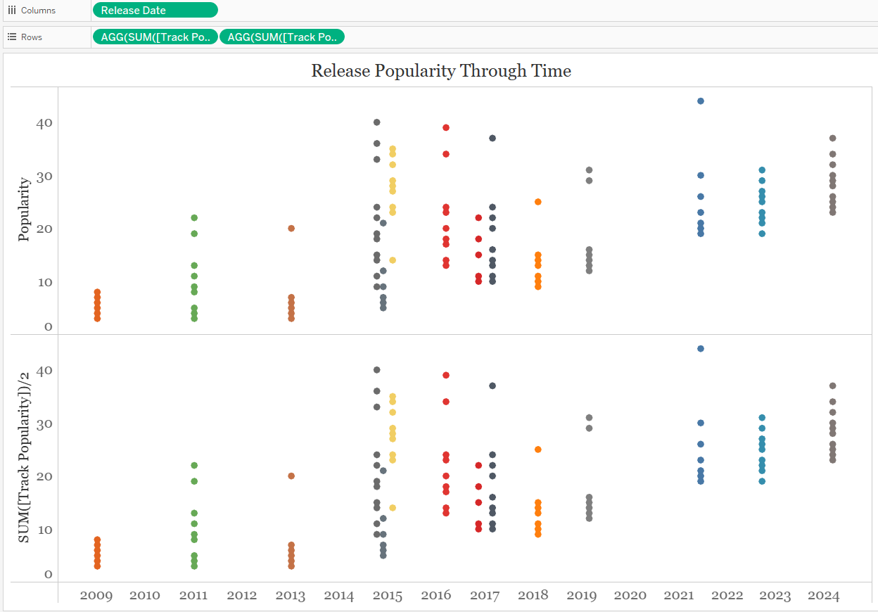
Right click on the new pill, and select duel axis on the drop down.
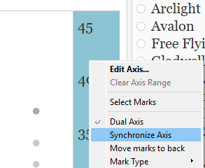
Right click on the new axis and click 'synchronise axis'
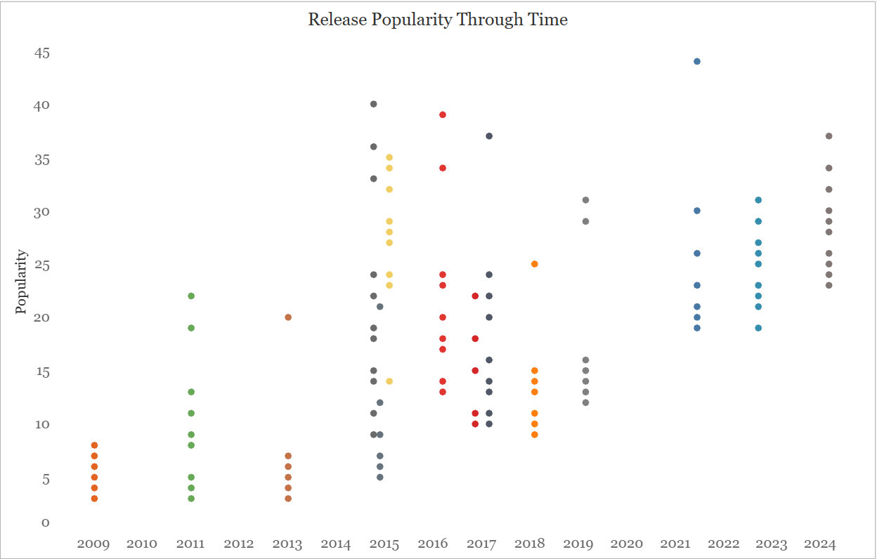
Step 4: Reduce the Opacity of one of the Marks Cards.
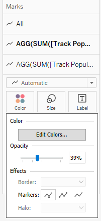
Just one! Make sure you are not on 'All'
Step 5: Now for the clever part
First a quick calculated field:
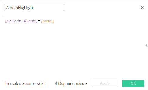
This will return true whenever an album is the same as the album selected by the user.
Now we want to double click on the pill associated with the marks card that is still 100% opaque. Add in the following IF statement:
SUM(IF [AlbumHighlight] THEN [Track Popularity] END)
In other words: if an album is not equal to the selected album it will return null... and therefore you will only be able to see the translucent mark below it! Success!