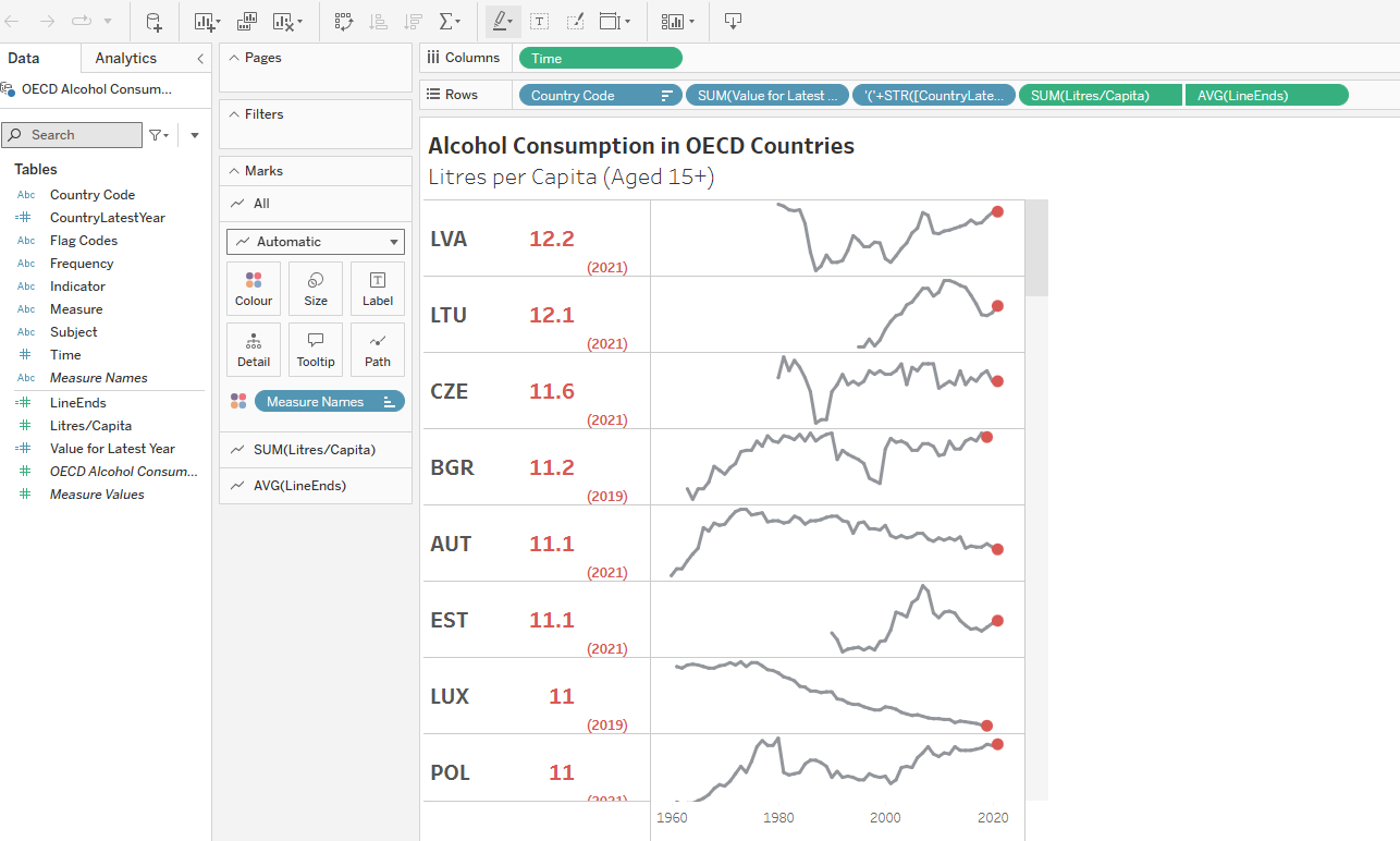
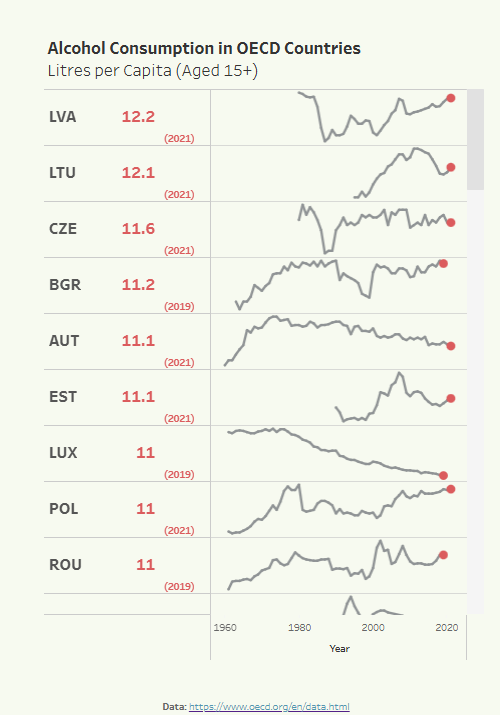
Sparklines are small line charts, commonly used as context for KPI figures, and drawn without axes to show trends of a measure over time. I find it can be useful (sometimes!) to display them in a table format:
Here is how I built the visualisation above!
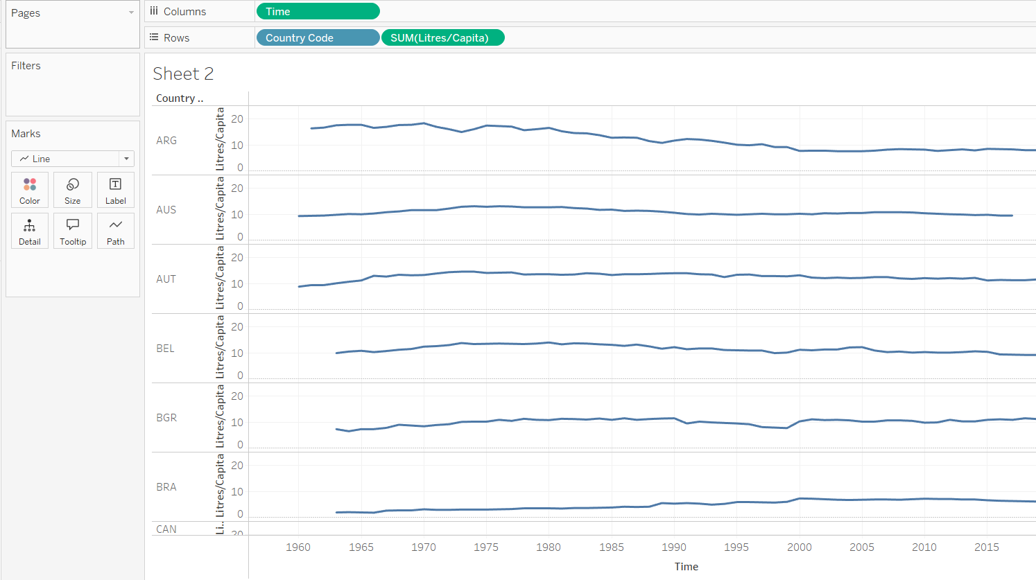
My fields included country code, year, and litres/capita (avg national annual alcohol consumption).
Step one was to drag country code and litres/capita to Rows, and Years to Columns. Set Mark Type to Line:
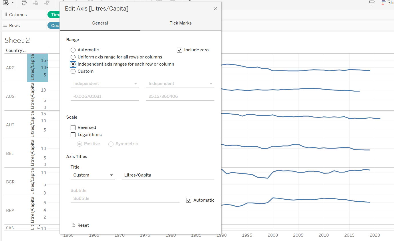
With Spark Lines, we commonly want them centered, and taking up as much space as possible. The Y axis therefore needs to be set to independent for each row or column. Right click on the Y-Axis and select Edit Axis:
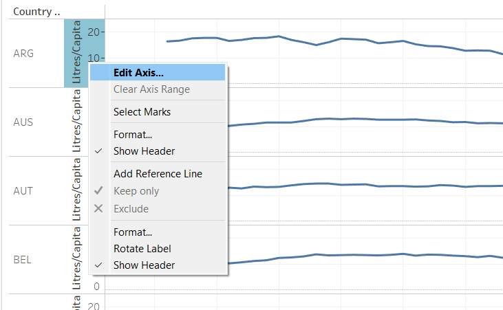
And then select Independent Axis ranges for each row or column:
Now it's time to create and insert the KPI figures for each country. In my case I wanted to show the value for the latest year - taking into account different countries may have a different year as their last record:
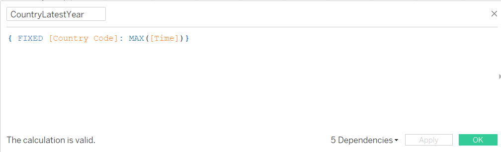
Step 1: Calculate the latest year for each country
This involves a basic LOD function. Create a calculated field, fix to Country Code, and find the max year (in my case name 'Time')
Step 2: Calculate the Value for the latest year for each country
This is a slightly funkier calc:
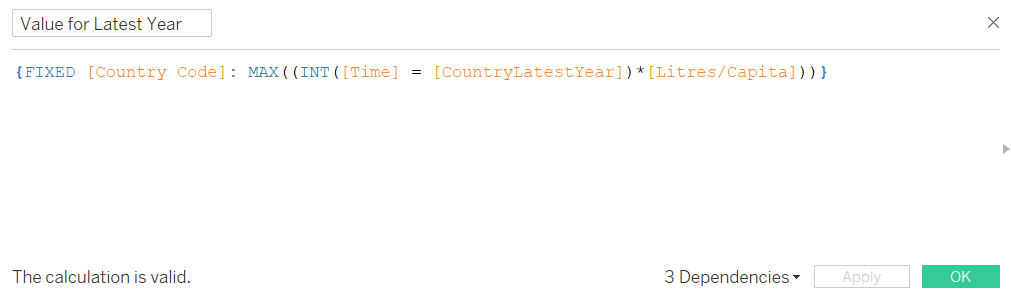
In essence, when year is equal to latest year, the function will return '1'. This is then multiplied by the measure value for that year, giving the latest year value. We ask for the max because all the other years will return 0.
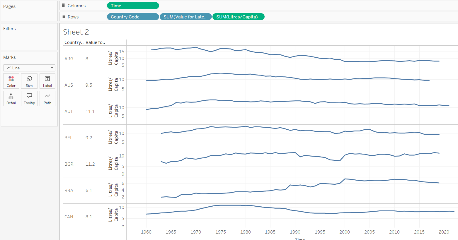
Step 3: Drag your KPI onto rows, between Country Code and your measure
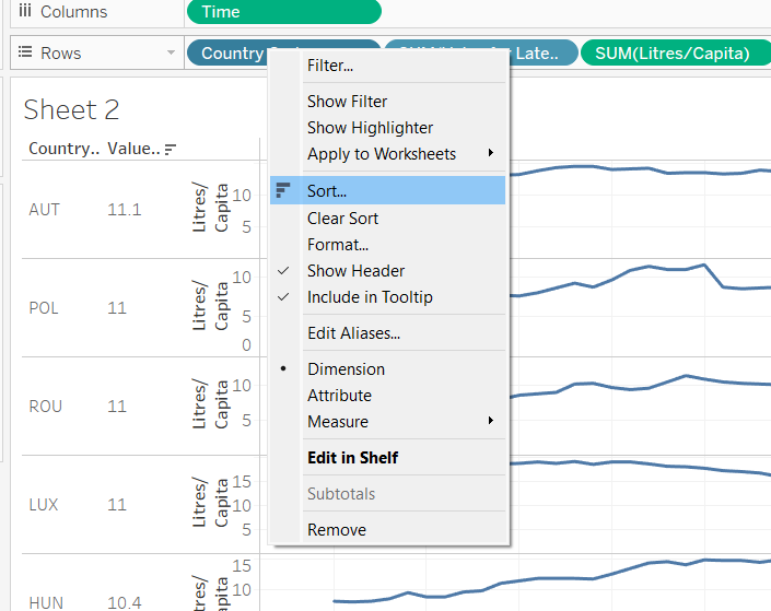
Step 4: Sort by your KPI
Right click on the Country Code pill, and select sort.
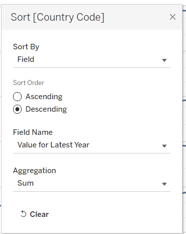
Select Sort By Field, Descending, and then the KPI that you want to sort by:
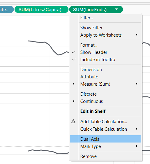
KPI completed! Our last step is to add the circles to line ends. This requires one last calc:
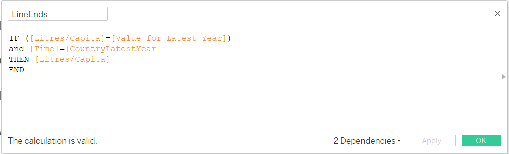
That is, only return the measure value if the measure value is the value for the last year of that country.
Drag this new calc to the end of your Rows and select duel axis:
Right click on the axis and synchronise the two axis:
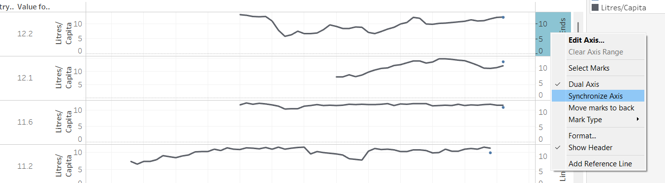
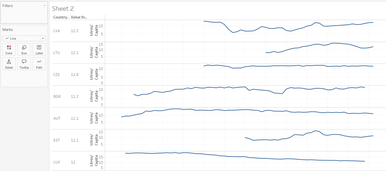
And now you can colour and format to your hearts desire!