


A beeswarm chart displays individual data points, arranged to avoid overlap, in order to provide a clear and detailed view of distribution. They are not however, easy to build intuitively within Tableau natively.
Let's walk through the process! I followed along this tutorial for reference: https://www.flerlagetwins.com/2020/11/beeswarm.html
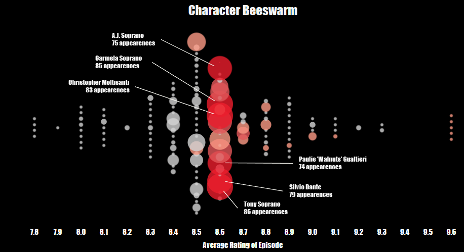
Here is my example, examining the average rating of episodes for each character in the soprano's:
Step 1: Create Bins
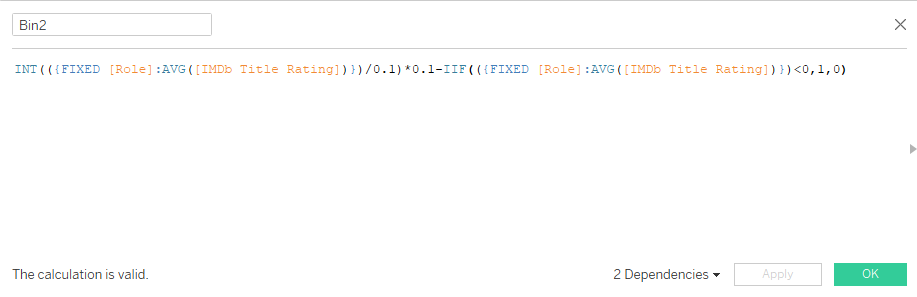
Replace my fixed calculation with your own measure, and replace my 0.1's with your desired bin size (if in doubt you can use a parameter here and easily edit it down the line).
Step 2: Calculate the number of points in each vertical line
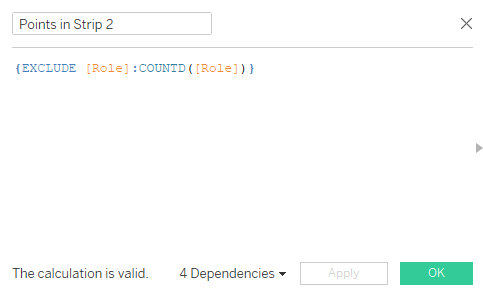
Next, we create a calculated field to get the number of points in each strip (each line of dots). This will allow us to then figure out the positioning of each dot so that they are center aligned.
Replace my [Role] field with your own dimension.
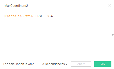
Step 3: Find your maximum coordinate
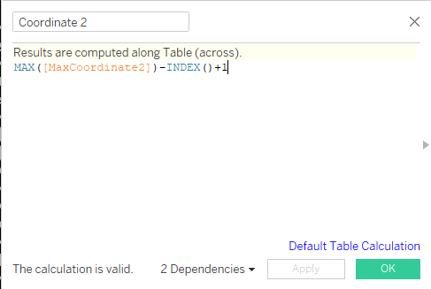
Step 4: Find your coordinate
Step 5: Build your chart
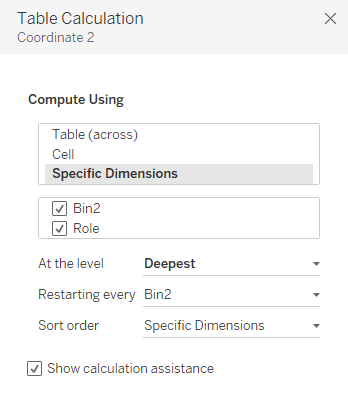
Ensure your Bin field is a dimension and bring it to the rows shelf. Drag ID to detail and bring your Coordinate field to columns. Right click on the Coordinate field and ensure its table calculation is set up as follows:
Step 6: Format until you drop!
And their you have it.. native Tableau Beeswarm charts! There is an excellent extension from LaDataViz for some more dynamic variations:

but if you are like me (cheap), then I am happy to report that they are still possible.