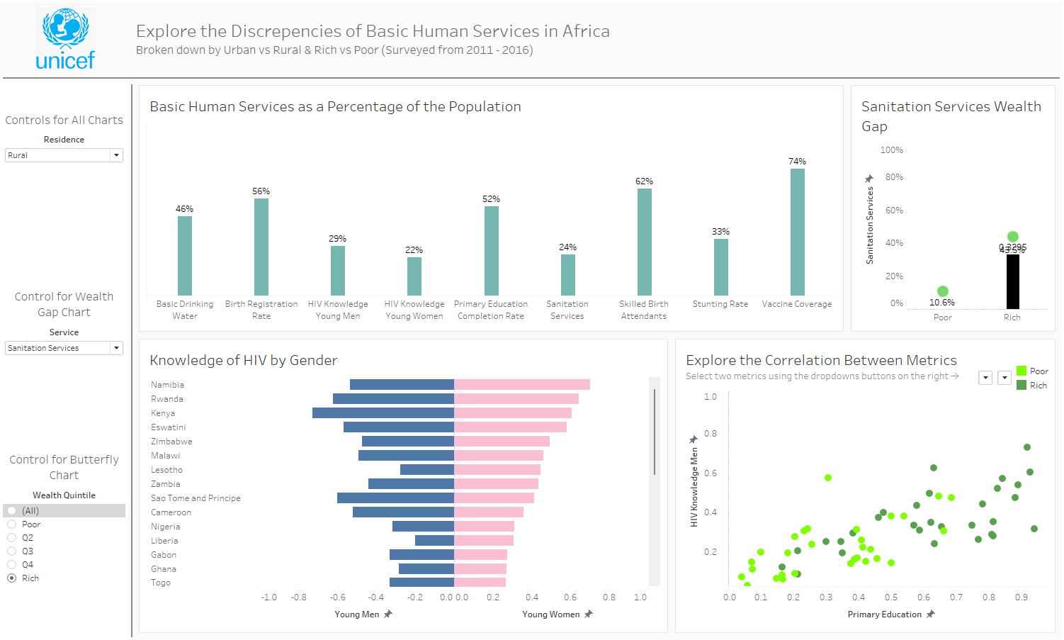
Today we were given a task to go to the UNICEF site and find a dataset that interested us and to build a beautiful and informative dashboard on the data. For this project I chose to do a dashboard on the urbanization of specifically Africa. There were other continents in the dataset, but they were very limited in the amount of countries surveyed so I didn't feel it was right to use that data. I started off with looking at the data in alteryx. I realized I needed to pivot the data in order to create the dashboard. I used crosstab to do this then the select tool to remove the unwanted fields. I then began to picture how I could use this data to make some valuable insights. I figured that I could look at the disparity between different continents. I drew a sketch down on a few charts that could highlight this topic. I wanted to show differences between rich and poor as well as rural vs urban. I began creating a bar chart that I thought I could change into a waterfall chart. Since we were going after visually pleasing dashboard I thought that this could really add value and make the dashboard look very nice. I made a solid attempt at it, but couldn't manage to get it working. After spending more time than I should have working on the waterfall chart I moved on. With the waterfall chart dropped I began to create the charts that I have sketched out. After looking at the charts I realized that there wasn't much data on the continents except Africa so I then began filtering a creating charts specifically looking at Africa. I had a hard time coming up with questions from the dataset to specifically focus in on and find insights to highlight. I went with a more exploratory dashboard. I think having so much time doing business dashboards has removed the creative side of how I think and build dashboards now. This was shown with the dashboard I have created. This was definitely a project I struggled more with than yesterday. I would have liked to research the topic more in doing so I may have found more insights to look at and highlight. With the time given I was glad to have something on the dashboard to present. Tomorrow I would like to be able to dive deeper into the the data and pull out more informative insights.