


One of the analytical features that Tableau offers is the capability to build a trendline with just a couple of clicks. However, trendlines in Tableau do have some limitations, among them is that you can’t use them within your calculations. This becomes especially troublesome if, for example, you want to calculate the distance to the trendline or do any other calculation that interacts with the trendline.
Hence, the goal of this post will be to create a linear trendline manually, that allows you to be used within your calculations. However, before starting building calculations I believe it is important to provide a brief explanation about simple linear regression and trendlines.
What is the point of linear regression?
The idea behind linear regression is to model the relationship between two continuous variables by using a linear equation that interacts with both variables. These variables are commonly known as the independent variable and the dependant variable. Therefore, linear regression models are used to understand how changes in the independent variable affect the dependant variable.
For the linear regression model, we refer to the equation of a straight line, which has the following formula:
Y = b0 + b1 * X
Where “Y” is the dependant variable, “X” the independent variable, b0 is the intercept and b1 is the slope. When deciding how well the model fits the data, we usually refer to the R-squared value (or coefficient of determination). The R-squared value is a statistical measure that defines how close the data fits into the regression model and can be calculated in Tableau using the CORR function.
If you want to elaborate more on these concepts and understand the calculations behind them, you can check Anna Foard’s (@stats_ninja) blog post here. Also, make sure to check her webinars too, as a former math teacher she is very easy to follow (https://thestatsninja.com)!
Building the line:
What are the components of the line?
As we start to build the line, we need to understand what it is actually in the line. Using Superstore, if we add Sales to the columns and profit to the rows (with disaggregated measures) and then we plot a linear trendline, we will get the following:
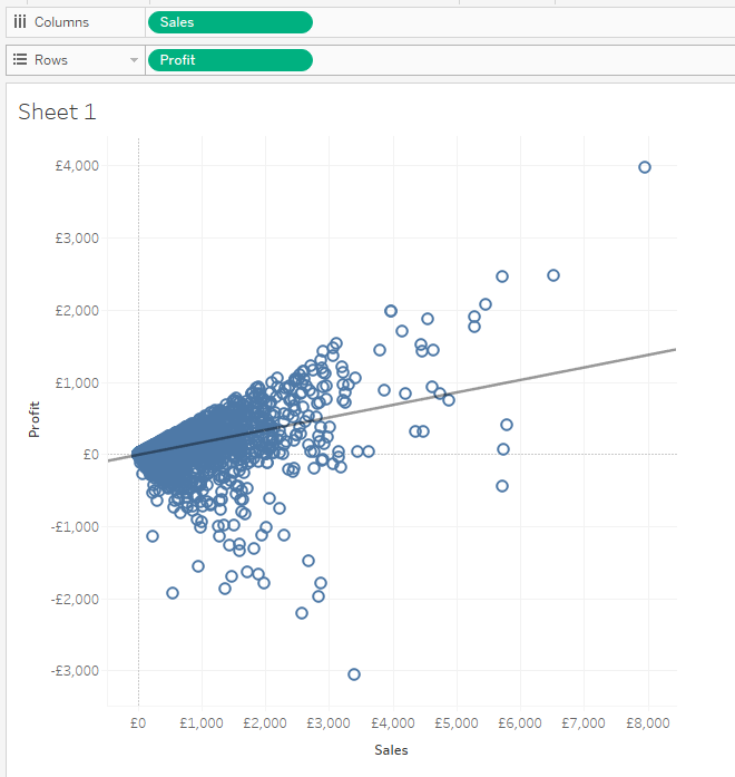
But what are the components of the line? If we right click on it and select “Describe Trendline” we will be able to see the following screen. As we can see, the trendline (highlighted in yellow) has a familiar structure.
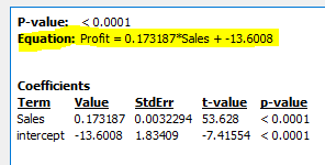
Y (SUM[Profit]) = b0(Intercept) + b1(Slope) * X (SUM[Sales])
Calculating the Slope:
In the previous equation we can see that our two measures are displayed but there are also two very strange numbers. One of them is the slope of the line, which measures the changes in Y for each change in a unit of X along the line. In a linear regression model this slope it is calculated by the covariance between the two measures divided by the variance of the independent variable (more on that here) https://mysite.du.edu/~jcalvert/econ/regress.htm.
Luckily, this can be easily achieved in Tableau as it provides us with covariance and variance formulas. Therefore, to plot the slope of our line we would have to write the following calculation:
WINDOW_COVAR(SUM([Sales]),SUM([Profit]))/WINDOW_VAR(SUM([Sales]))
Calculating the Intercept:
The intercept is the constant of our equation and it is defined as the value of Y when X=0.
With the slope previously calculated, we can just refer to the previous equation and do a bit of algebra to get the intercept.
Y = b0 + b1 * X -> b0= Y – b1 * X
In Tableau this would look like this:
WINDOW_AVG(SUM([Profit]))-WINDOW_AVG(SUM([Sales]))*[Slope]
Putting it all together:
With all the calculations ready, now you just need to put them all together following the equation of the line. It should look like this:
SUM([Sales])*[Slope] + [Intercept]
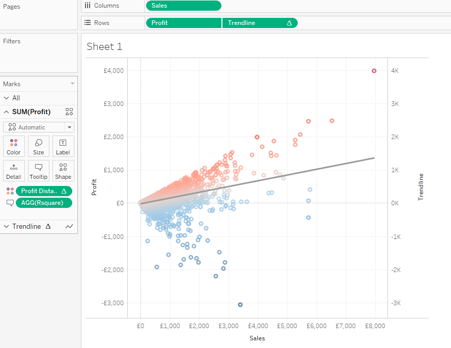
Adding it to the view:
Now, the last step is to put the trendline in the view. To do this, simply add your new Trendline calculation next to your dependant variable (in this case profit). Then, you will have to select dual axis and synchronize the axes. At last, change your mark card to line and you should have a dynamic trendline that you will be able to use within calculations.
Hope it helps!
For any comments you can find me in Twitter @DiegoTParker