


Week Six (14/01/19 – 18/01/19)
As we are currently in week 11, I must confess I have fallen behind on my journaling. However, before the memories fade completely I’ve decided to write a small recap of the things that we did and learnt during week six. The week was divided in two main blocks that occupied most of our time, a new client project and learning Tableau Intermediate.
What did we do this week?
The client project
Week six was our second client project and in a completely different sector than the first one. Whilst in the first one we worked with a real state agency, this time we worked with a company that does business cards and stationaries. Within the company we worked with people from the data engineering and business service teams. As it is with every client project, we started the week with their presentation of the company and running through their data. Afterwards, with the team we had our usual discussion of the client’s requirements and divided the tasks. If you want to read more about the “project management” part of it, I’ll recommend you read Seffana’s blog who was the assigned PM for the week.
In comparison to the previous week I found this project much easier to tackle, as their data was very clear, and I had a very clear idea since the first day. The project was also a great opportunity to practice everything we had been learning during the week, especially the power of parameters in allowing self-serve data and how to add dynamism to your dashboards.
Tableau Intermediate
The transition between Tableau Essentials and Tableau Intermediate is marked by the Order of Operations, Table Calculations and Level of Detail Expressions (LODs). However, before jumping into these topics we had a small refresher of things we had been covering during Tableau Essentials.
One of the topics we put a high emphasis before moving into Tableau Intermediate was parameters. In order to practice parameters, we had to create a worksheet in which practically everything could be changed using parameters; such as axes, granularity, titles, colour and labels.
After finishing with our parameter lessons, we spent the rest of the week diving deeper into the power of LODs and Table Calculations, mainly doing a great number of exercises given by Andy . To comprehend LODs a bit more we inevitably had to go back to the order of operations to understand when LODs are calculated. Doing this allowed us to also compare context filters with measures and dimensions filters. Whilst a context filter would affect all LOD expressions, a measure/dimension filter won’t affect a FIXED LOD. If you are interested in reading more about LODs and Table Calculations I recommend you to have a look through The Data School blog as there are many blogs on these topics.
External Session
Before ending the recap I thought interesting to talk about one external session we had during the week. By mid-week, Simon Beaumont (sport viz Sunday, Tableau Health and BI JLL) came to show us a bit how things were done at JLL. Besides being an opportunity to meet someone from one of our possible placements, he showed us really good practices for both Tableau Server and Tableau Desktop. He started by talking about managing and properly documenting your databases in Server. Afterwards, he talked about he importance of proper documentation in your workbooks (which Louise from DS11 wrote about) and showed us the way he adds instructions to his workbooks.
The arrows trick
As you are probably wondering about Simon’s instruction tip, I’ll write about it here.
When you are designing a dashboard is very important that your user has instructions that tell him where they should click/hover. If your dashboard does not have instructions it may lead to the user missing the amazing interactivity or tooltips that you have created. However, sometimes instructions may seem bulky and may clutter your dashboard in a way you won’t like. To avoid this, Simon proposed us two things:
- Have a “CONTROLS” bar in the dashboard where your user gets all the filters and parameters, so it knows exactly where they can change things.
- To avoid lengthy text, you could just add some symbols that you can display next to each worksheet indicating which possible actions that worksheet has.
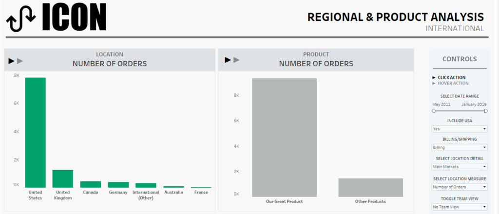
BONUS: Whilst applying this trick at the Data School, Carl came with the idea that to make this technique stronger, you could create a worksheet with the symbols, so you can display a tooltip over them that tell the user what the action will actually do in the view.
That’s all for this week! If you have any doubts or comments, feel free to use the box below or contact me in Twitter @DiegoTParker