Tableau’s definition of a table calculation: ‘A table calculation is a transformation you apply to the values in a visualisation’. A table calculation is a calculation that is applied to aggregated measure.
Aggregated measures in Tableau show the option ‘Quick Table Calculation’ or ‘Add Table Calculation’ when right clicked.
How to approach:
First I would always suggest bringing all the necessary fields to view as a text table. This will allow you to make sure your table calculation is working properly before you create a chart.
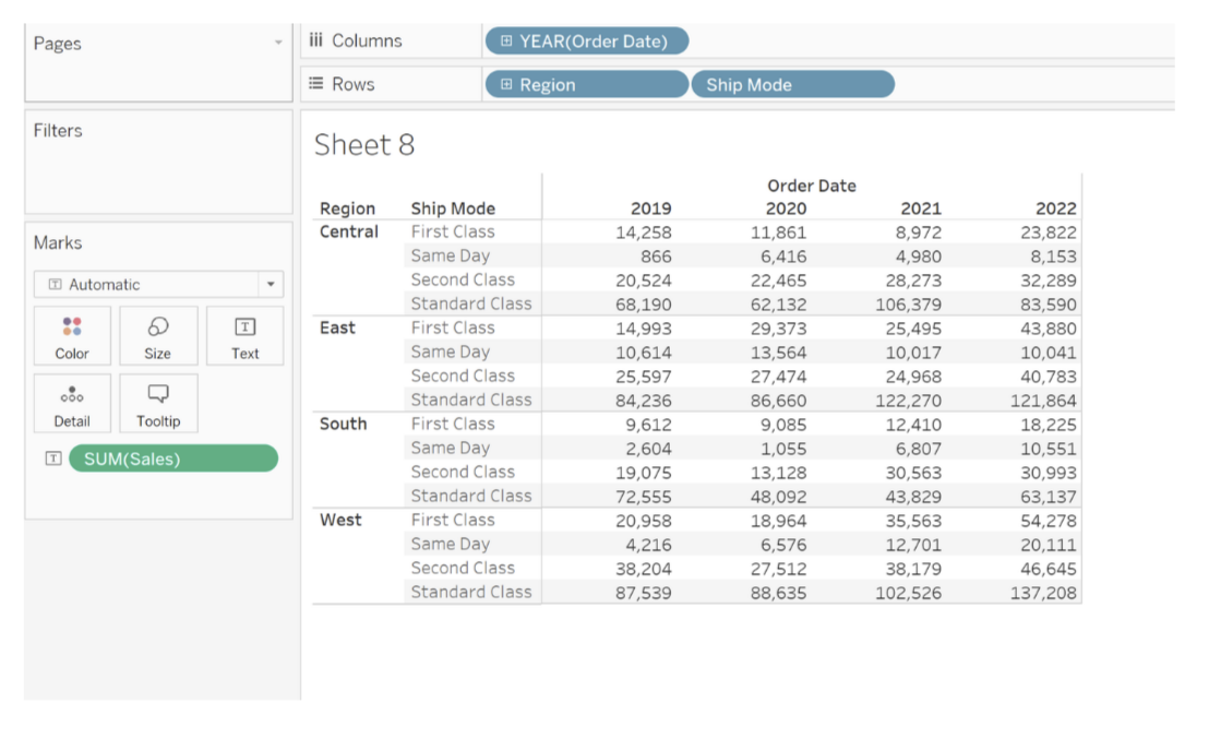
In the example below the aggregated measure is Sales.
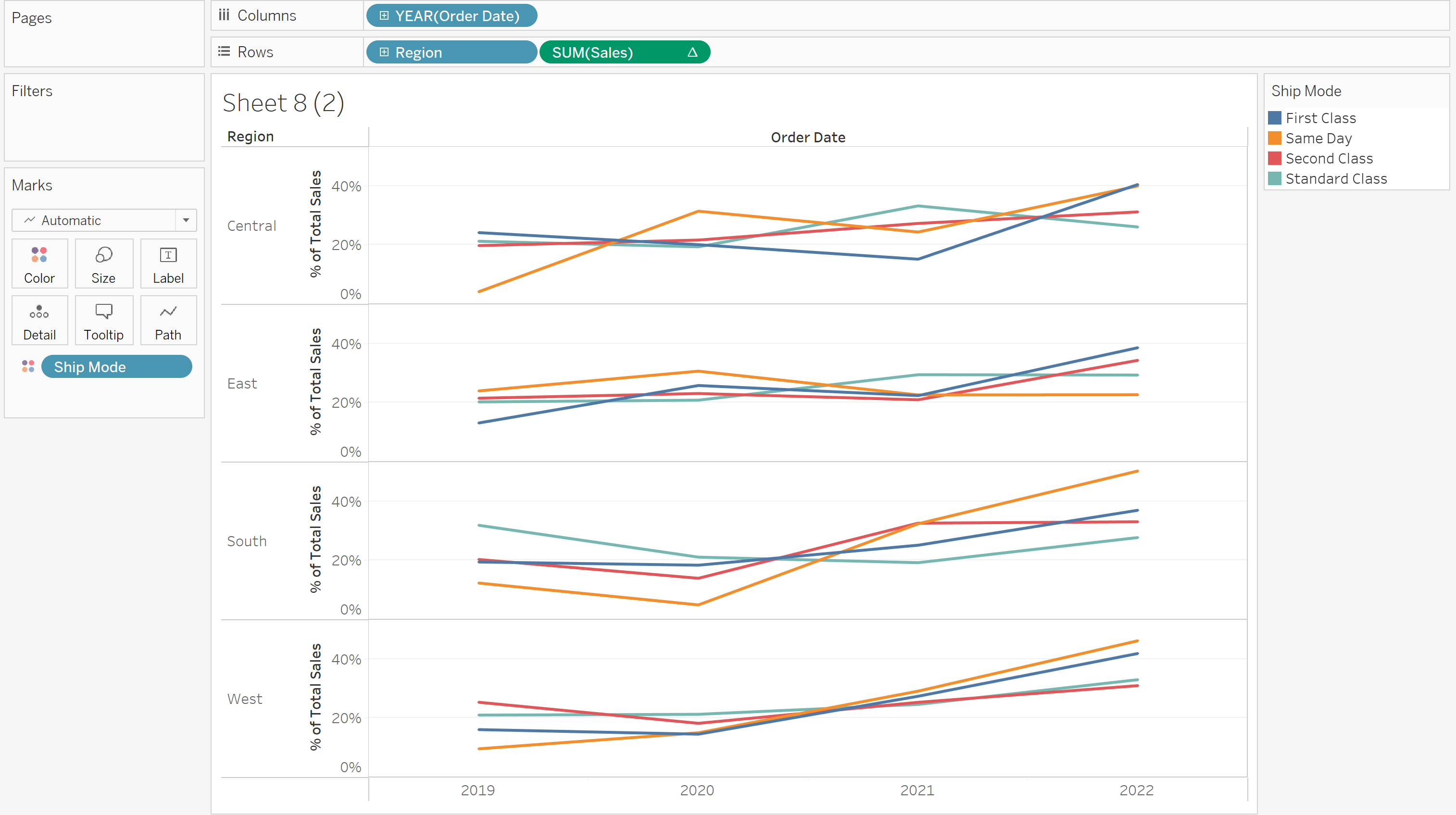
We are interested in seeing the percentage of total by region and ship mode for each year.
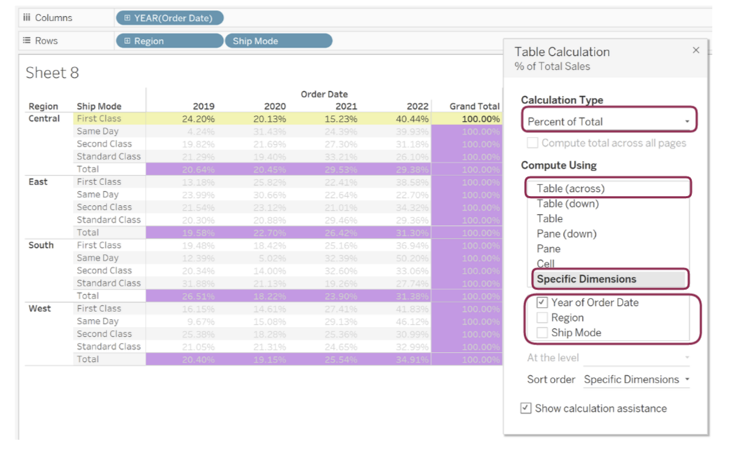
So we right click on SUM(Sales) and select ‘Add Table Calculation’ this can also be achieved by hoovering over ‘Quick Table Calculation’ then selecting the type you want, in this case we are interested in percentage of total. If you used the ‘Quick Table Calculation’ method and you want to change the way the calculation is working you need to right click SUM(Sales) again and select ‘Edit Table Calculation’.
Bringing Order Date, Region, Ship Mode and Sales creates the creates the text table shown below.
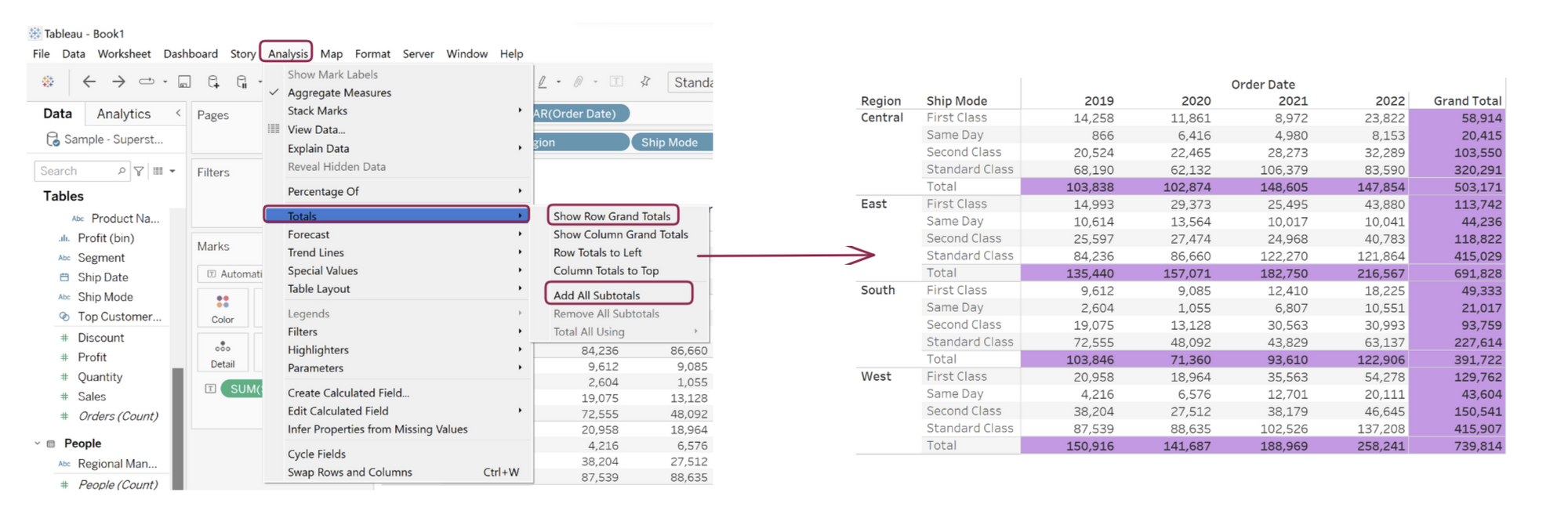
Because we are interested in totals, we will also display grand total and subtotal. This is achieved by clicking the analysis tab, hoovering over ‘Total’ and selecting ‘Show Row Grand Totals’ and ‘Add All Subtotals’.
Next step: Select ‘Add Table Calculation’, this brings up the Table Calculation window, from here select Percentage of Total. We can see already that ‘Compute Using’ is set to Table Across, since that is what we want we are going to lock that in by clicking ‘Specific Dimension’. Selecting specific dimension means that no matter how we change the order of the pills in Row/Column, the way Tableau computes the percentage of total remains the same.
In this example the Table calculation is basically saying For each ship mode and region calculate the percentage of total by the year.
Looking at the canvas we can see that the calculation is restarting every row. Since it is doing what we want we can now create. Drag Sales to row and Ship Mode to colour and there we have it a chart showing percentage of total by region.