


This blog with be covering some of the content you need to know in preparation for the tableau data analyst certification. I am going to be covering Create Charts, section 3.1.
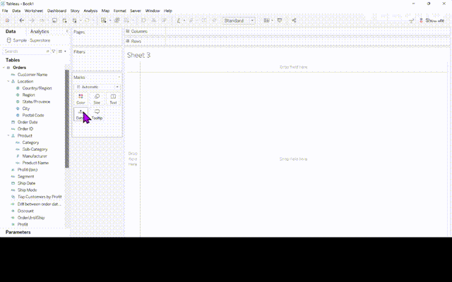
6) Create a Gantt Chart
Step 1) Right click drag and drop Order Date to the Columns, select WEEK(Order Date), the green one showing continuous.
Step 2) Add Sub-Category and Ship Mode to the rows shelf
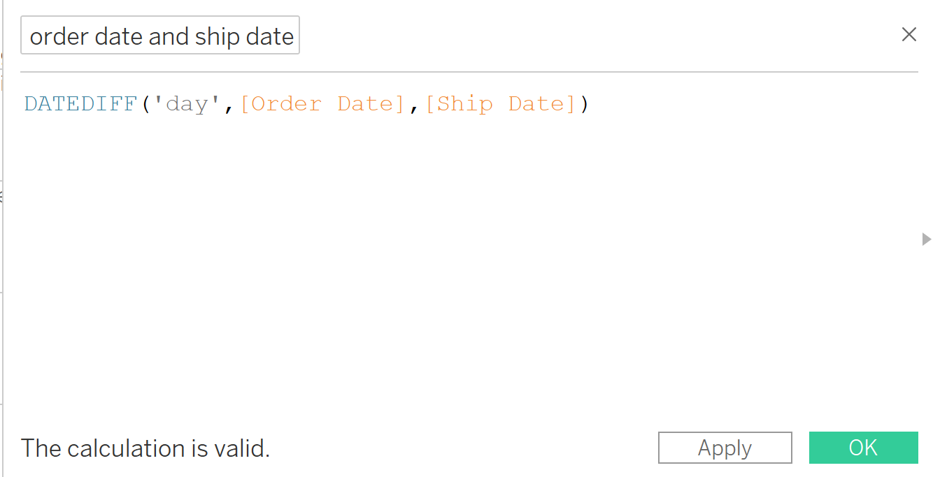
Step 3) Create a calculated field that calculates the difference in days between Order Date and the Ship Date as shown below. I have called my calculated field diff between order date and ship date.
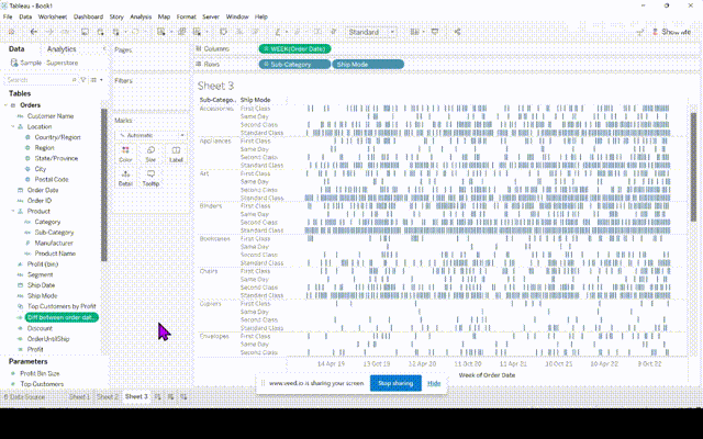
Step 4- Drag the calculated field you have just created to the Size part of the Marks card.
Step 5- Filter the date to only show 4 months by putting Order Date on Filters.
Step 6- Finally add Ship Mode to color.
7) Create Highlight Table
Step 1- Drag Segment to columns and Region and Sub-Category to rows.
Step 2- Drag Profit to color. Click on the color mark and change to your taste.
8) Create Histogram
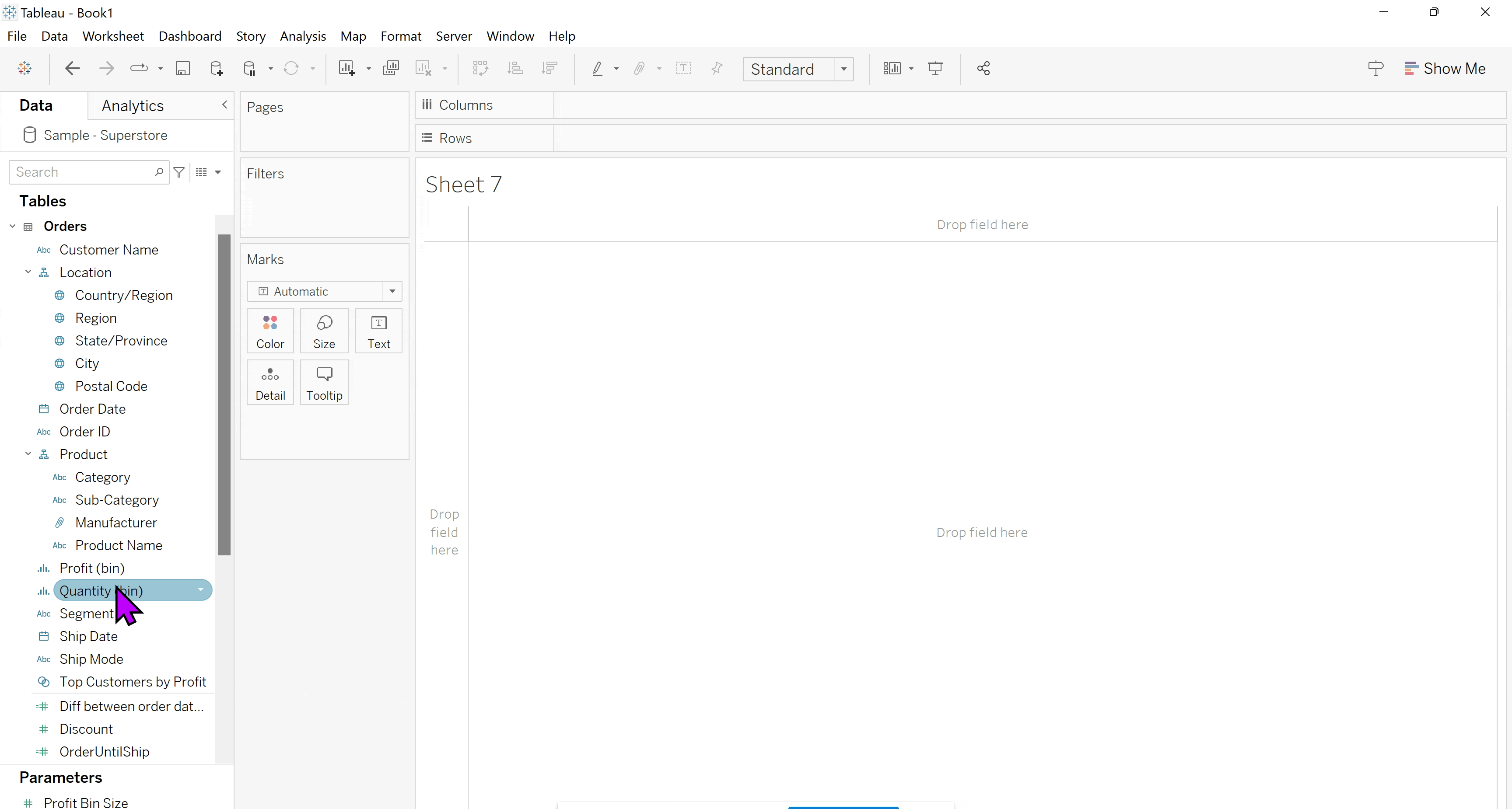
Step 1- Create a bin- Right click the Quantity field and hoover over create and select Bins and click OK.
Step 2- Drag and drop the quantity bin you have just created to the columns and change it to continuous. Drag Quantity to rows and change it to CNT.
9) Create Line Chart
Step 1- Drag Order Date to columns and change it to continuous Months and drag Sales to Rows.
10) Create a Packed Bubble Chart
Step 1- Add Category to Text and Sales to Size on the Marks card.
Step 2- Change the Marks type to Circle.
Step 3- Add Category to Color and further break up the view by adding Region to Detail.
Part 3 will be out soon