This blog with be covering some of the content you need to know in preparation for the tableau data analyst certification. I am going to be covering Create Charts, section 3.1.
1) Create an Area Chart
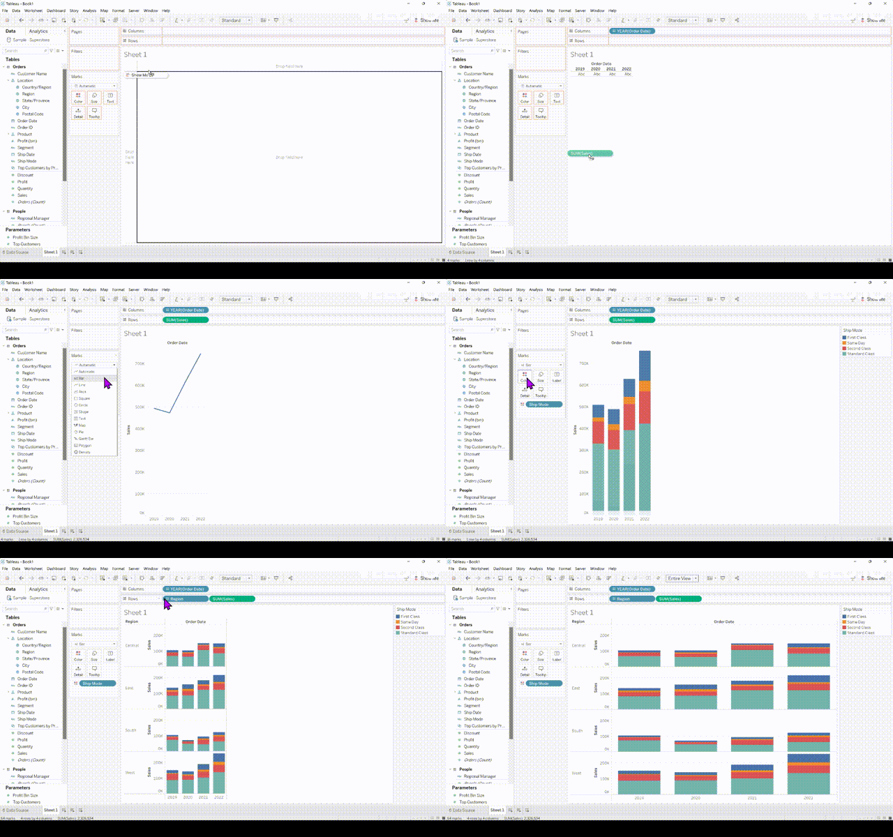
Step 1- Right click drag and drop Order Date on the Columns, select MONTH(Order Date). Drag and drop Sales to the rows.
Step 2- Break up the view by dragging Ship Mode to the color part of the Marks card and change the Marks type from Automatic to Area.

2) Create Bar Chart
Step 1- Drag and drop Order Date to columns and Sales to rows
Step 2- Change mark type from Automatic to Bar
Step 3- You can break up your view further with dimentions. So, drag Region to the rows in front of Sales and drag Ship Mode to the color part of the Marks card.
3) Create a Box Plot
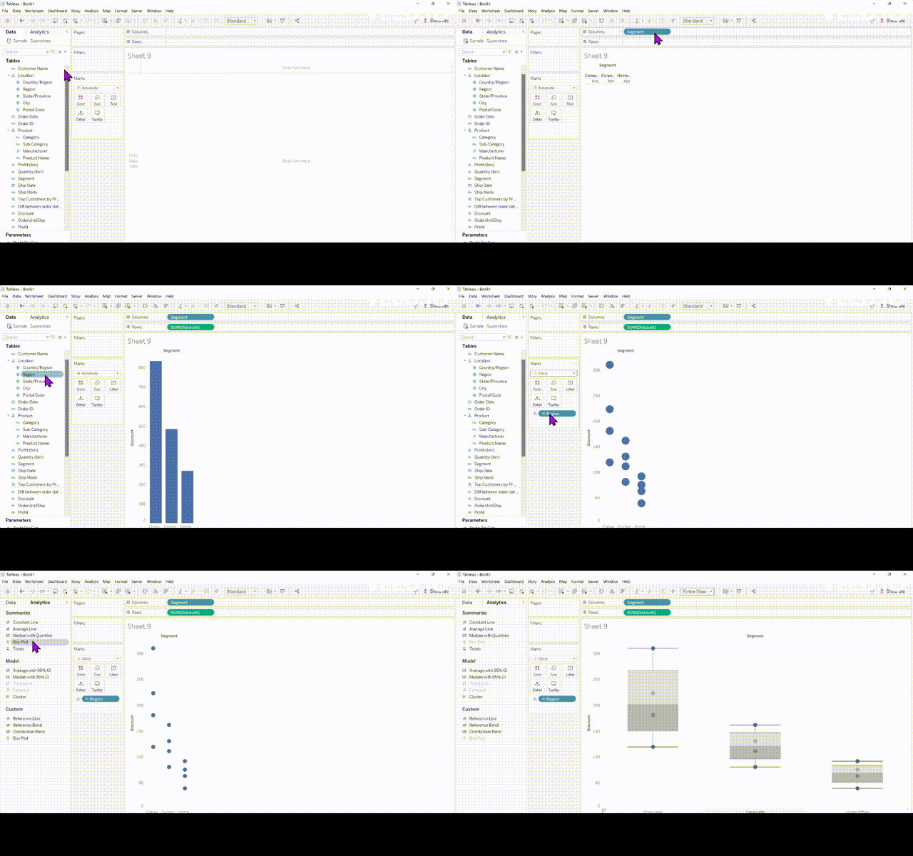
Step 1- Drag and drop Segment to the columns and Discount to the rows.
Step 2- Drag Region to the Details part of the marks card and change the marks type from Automatic to Circle.
Step 3- Go to the Analytics pane and drag Box Plot to cells.
4) Create the Bullet Graph
This visualisation with be using the World Indicators dataset in Tableau
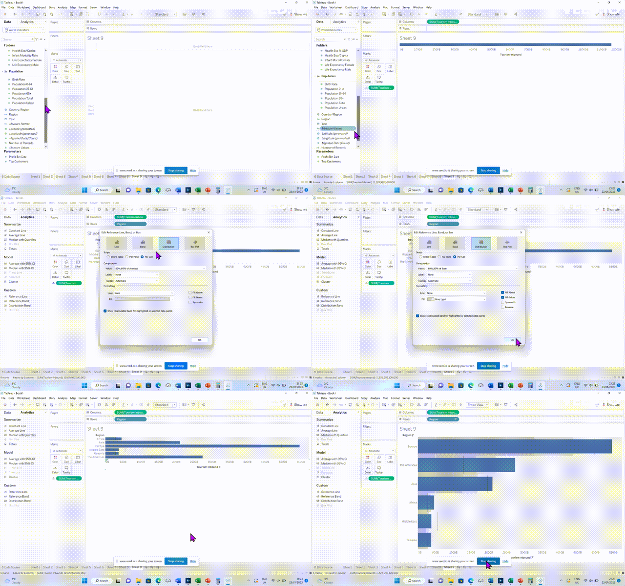
Step 1- Drag the field Tourism Inbound to the Columns and Tourism Outbound to the details part of the marks card.
Step 2- Drag and drop Region to the Rows shelf.
Step 3- Click on the Analytics pane and select Distribution band, drop that on the cell pop up.
Step 4- On the Distribution pop up, tick Fill Above and Fill Below.
Step 5- On the Analytics pane, drag the Reference Line on the cell pop up. On the Line section of the pop up, change value to Tourism Outbound and Sum and click OK
5) Create Density Marks (Heatmap)
This visualisation with be using the World Indicators dataset in Tableau
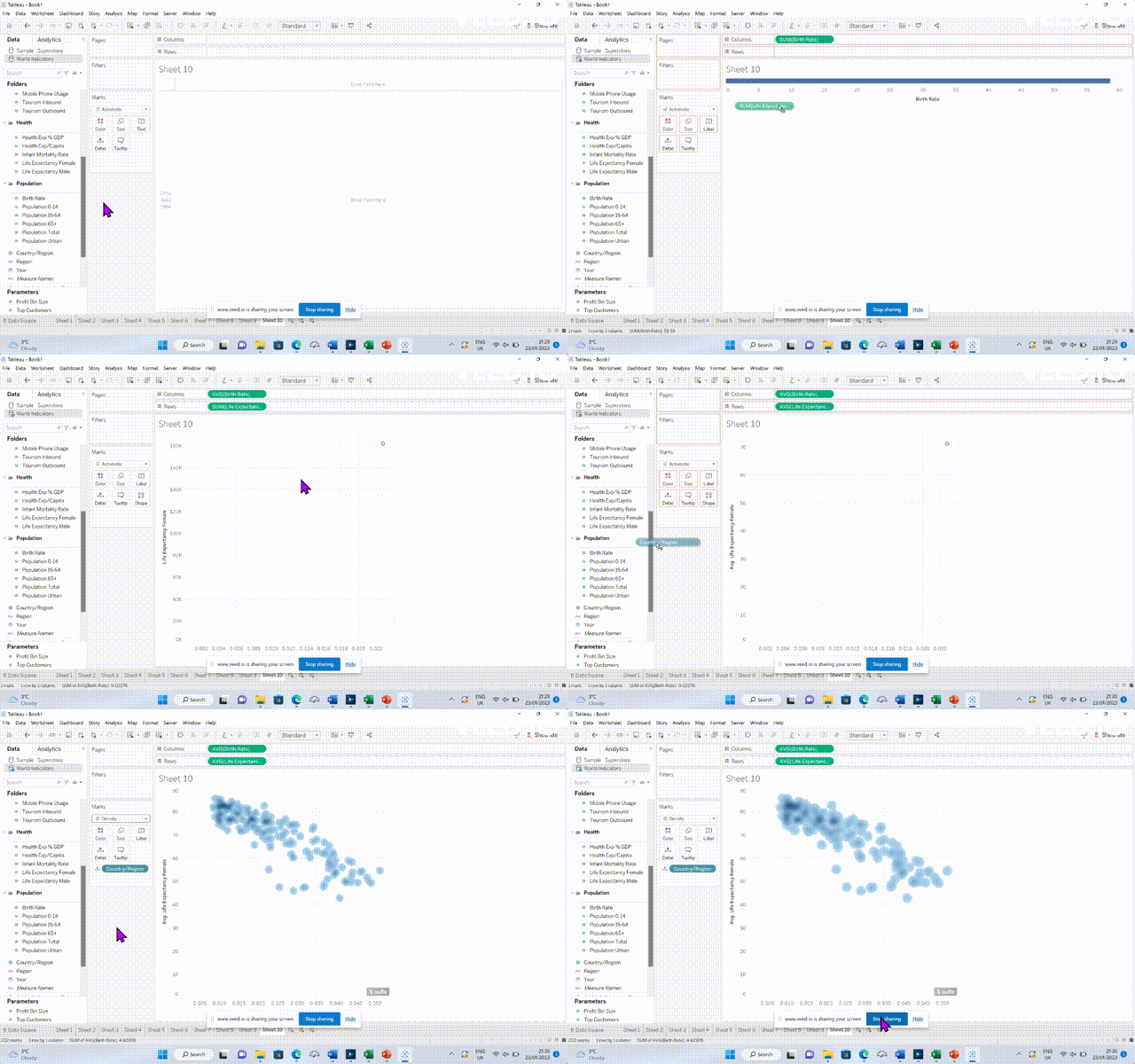
Step 1- Drag and drop the field Birth Rate to the Columns and Life Expectancy Female to the rows.
Step 2- Change both the fields to an average.
Step 3- Drag and drop the field Country/Region to the Detail marks card
Step 4- Change the marks type from Automatic to Density.
Part 2 and 3 will be following shortly
